Monday, February 14, 2022

Unwanted Valentines: It Conquered the World (1956)

 Unwanted Valentines:
It Conquered the World (1956)

Hey, one more Unwanted Valentine for V.D. (does the "V.D." stand for "Valentine's Day" or "Venereal Disease"?  Why not both?  You to decide!  Oh, boy, talk about "Unwanted Valentines"...). 

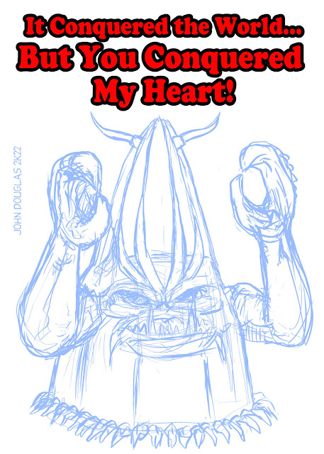
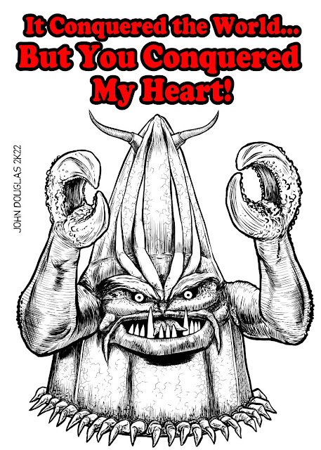
This time, it's Zontar from "It Conquered the World", another of the steady diet of B-Movies from my youth casting its long shadow over my adult, er "adult", life!  This movie, like "Invasion of the Saucer Men" and "Plan 9 From Outer Space", were ones I watched as a child and stuck deep within my psyche (what little there is).  And, yes, as a kid I found them terrifying.  As an adult, they are terrifying, but for different reasons... 😱

That said, the movie isn't terrible (of course, it isn't that good, either).  Lee Van Cleef and Peter Graves are featured in the movie, before either one of them became semi-cultural icons.  Another case of Roger Corman launching the career of many a movie star in his B-Movie crew.  Something about Corman's "Let a thousand flowers bloom" attitude actually worked with his stable of actors and directors.

* * *

STEP ONE:  Here are the blue-line, digital pencils on a 2,000px x 2,800px @ 300dpi canvas.

* * *

STEP TWO:  And here are the digital inks...

* * *

STEP THREE:  Finally, here are the colors, done on a separate layer below the inks.

* * *

Done digitally with Clip Studio Paint.

.

Saturday, February 12, 2022

Unwanted Valentines: Pennywise from "It" (2017) and (2019)

Unwanted Valentines:
Pennywise / "It" (2017) and (2019)

It's time again for "Unwanted Valentines"--which are so nerdy and unwanted I'm sure would lead to divorce and break-ups a plenty if you were to actually give them to a loved one!  Anyhoo, this time it's Pennywise from the "It" movies (and based on Stephen King's novel, of course).

"We all float down here..."

* * *

STEP ONE: Here are the blue-line, digital pencils on a 2,000px x. 2,800px @ 300dpi canvas.

* * *

STEP TWO: Followed by the digital inks...

* * *

STEP THREE: And here are the colors, done on a separate layer below the inks.

* * *

Done digitally with Clip Studio Paint.

.

Wednesday, February 2, 2022

Happy Groundhog Day (Or, Too Many Two's To Do Today)

GROUNDHOG DAY 2-2-22
Two-Face

I asked semi-rhetorically in an earlier post what year would be best exemplified for Two-Face than 2022?  And, in that year, I thought today of all days would also be best for our ol' pal, Harvey Dent, with the date 2/2/22.  I spent an inordinate amount of time trying to figure out what (if anything) to do involving Two-Face today and my stupid brain just barely figured it out at the last minute.  So, with a couple hours to spare, I did up a quick, semi-passable Bill Murray from "Groundhog Day" (1993)/Two-Face Mash-Up.

P.S.: The movie "Groundhog Day" (1993) is great!

* * *

STEP ONE:  Here are the digital pencils, done on a 1,000px x 1,500px canvas @ 300dpi.

* * *

STEP TWO:  And here are the digital inks.

* * *

STEP THREE:  And the colors, man, the colors!

* * *

Done digitally with Clip Studio Paint.

.

Monday, January 31, 2022

Batman-uary #3 - Rainbow Batman

BATMAN-UARY
Rainbow Batman

One last Batman-uary entry, just under the wire.  This time, it's the "Rainbow Batman" from Batman #241, with the original cover drawn by Sheldon Moldoff.  Sure, Robin calls him out for wearing the Red Costume, but most of the time the cover shows more of a pink Bat-Suit.  I decided to carry on that tradition by amping it up to HOT pink.

It amused me to do a Silver-Age cover with the anachronistic armored Batman from "Batman V Superman: Dawn of Justice", and keeping Robin more on model with Shelly Moldoff's drawing rather than try to modernize him for the cover redux.

The basics of the story involve Batman using the different colored Bat-Costumes to distract everyone from Robin's injured arm and keep people from noticing Dick Grayson had an identical injury to his arm, too.  Ah, simpler times!

* * *

STEP ONE:  Here are the scribbled pencils done on a 2,000px x 3,000px @ 300dpi canvas in Clip Studio Paint.  

* * *

STEP TWO:  And here are the inks.  I will admit to cheating a bit when it comes to the lettering, as I just traced it--including the logos.  I considered just importing it into one of the various vector drawing programs, but then went with the hand-traced look.  Although, it may have inspired me to do future digital hand-lettering, rather than my usual generic comic book font.  Maybe.  Also, I obviously drew out one of the background armored suits and just copy/pasted 'em to get the consistent, Rainbow Batman costumes in the background.

* * *

STEP THREE:  And here are the added colors.  I went back-and-forth as to whether to do shading, or keep everything closer to color flats; shading won out.

* * *

STEP FOUR:  As a final touch, I ran it through the "Pixelate" filter in Photoshop to give it more of a BenDay Dot/Silver-Age feel.  I did the filter as a 10% opacity on its own layer, as to keep the effect subtle and to not have the moire pattern overwhelm everything.  In fact, it's so subtle, you probably wouldn't have even noticed it too much if I hadn't pointed it out.  Oh, well...

* * *

Done digitally in Clip Studio Paint with an assist from Photoshop.

.

Tuesday, January 18, 2022

Batman-uary #2 - Zebra Batman

BATMAN-UARY
Zebra Batman

Hey, it's Batman-uary, where I riff on some of the many peculiar and various costumes... or whatever Batman-related nonsense strikes my fancy and amuses me.  This time it's Zebra Batman from "Detective Comics #275"!

Zebra Man... Something something... lines of force, which show through the person's costume and skin...  While fighting Zebra Man, Robin accidentally activates the ray machine that gave Zebra Man his power which hits Batman...  Something something, Batman can't control the power.  It ends with them using Zebra Man's belt, which controls his power, to turn it off and Zebra Man becomes normal again; Batman puts on the belt next and does the same to himself to turn the power off and he becomes normal again, too.  Ta da!  The actual story is rather trippy.

Here's the cover to the original story for "Detective Comics #275" featuring Zebra Man/Zebra Batman.  I'm sure most people have seen it on one of the many, many "Top 20 Weirdest Batman Costume" lists out there.

And here's the original ad for "Batman: Year One" by David Mazzucchelli which I was referencing, being a huge fan of his work--both "Batman: Year One" and "Daredevil: Born Again".  (Yeah, I'm old enough to have bought them originally off the newsstand.) 

* * *

All righty, stay tuned for the next installment of BATMAN-UARY!
Same BATMAN-UARY Time, Same BATMAN-UARY Blog!

* * *

STEP ONE:  Here are the digital pencils done on a 2,000px x 3,000px @ 300dpi canvas, roughly scribbled out in Clip Studio Paint.

* * *

STEP TWO:  Here are the digital inks to the Batman part of it, trying to ape David Mazzucchilli's drawing style as much as possible (although, there is a looseness to some of his pen work I would have been better off trying to emulate).

* * *

STEP THREE:  The stripes where then added using the black digital ink, or carved out with the transparent/eraser brush.  I originally added some blue for shading, but then decided it went against the spirit of Zebra Batman: He should be black-and-white--no color!

* * *

This was done digitally in Clip Studio Paint.

.

Saturday, January 15, 2022

Happy (Belated) New Year / Batman-uary - Part 1

 HAPPY (Belated) NEW YEAR/
BATMAN-UARY

Sure, January is nearly half-over, but what better way to ring in 2022 (Belatedly) than with Two-Face?  In this case, it is Two-Face from "Batman #50" (1948), so he's purple rather than the usual green-hue.

Here's the original cover, by the way.

We'll call it a Two-Fer--New Years well wishing and the first entry for this year's Batman-uary!  Harvey Dent, himself, would be proud of that one... Marginally.  OK, Two-Face would have approved if it was the second post of the year.  Oh, well...  Personally, I always thought it would be fun to explain most of Harvey Dent's transformation into Two-Face as psychosomatic, rather than the result of any sort of acid attack.  It just made more sense to be that way, to me, anyways.

So, anyhoo, it's BATMAN-UARY, where I do up some Batman-related posts for fun  (I admit it, I'm far more of a Superman guy than a Batman guy, but some of those way-out 50's designs and covers just scream out for something to be done with 'em).  I even went through the trouble of doing up a dumb logo for BATMAN-UARY and everything.  Yeah, my love of puns, portmanteaus, and grammar-based humor gets me in trouble yet again...

Here's to hoping the New Year is better than the previous two years combined (a low bar, I know)!

* * *

STEP ONE:  Here are the really basic pencils, scribbled out on a canvas in Rebelle 5 on a 2,250px x 3,000px canvas @ 300dpi.  I did cheat a little bit and copy/flip the hands so they matched--a mirror effect for Two-Face.

* * *

STEP TWO:  Here's the first pass with Rebelle 5.  While I like the way it works generally, I'm still getting used to it and the way it blends, etc.  The watercolor engine in Rebelle and some of the blending is pretty amazing... Now I just gotta start applying some of those effects to some of my posts in the future.

* * *

STEP THREE:  I admit it, I got a little impatient and just imported it into Clip Studio Paint to finish it up, as I know exactly what most of the brushes I use do to get desired effects.  Well, that and I wanted to use the iPad, rather than sitting in front of the computer desk all day (they have Clip Studio Paint for iPad, but no Rebelle for iPad, alas).  It still looks a little "cutout" and "digital" for my general tastes, but I think with this one it may have been a little difficult to avoid.  Onward, to the next one!

* * *

Done digitally in Rebelle 5 and Clip Studio Paint.

.

Thursday, December 30, 2021

Year in Review 2021: It's a Good Life

2021 Year in Review
"It's a Good Life"

It seems that every year gets a bad review by me, making me seem like a negative kind of guy (I'm not, really!) but, well, the past bunch of years have been pretty crappy, generally.  So, there's that.  Anyhoo, about this time of year I'm always trying to wrack my meager brains to figure out some mildly amusing/clever take on the previous year.  And, as usual, I was drawing a blank and running out of time.  I used Bizarro for the past two years... I guess I'll use him again and beat that joke into the ground, why not?

So, while trying to think of some Bizarro-esque comment on the year, I happened to have MeTV on in the background and saw Bill Mumy on an old, black-and-white episode of "Lost in Space" as the young Will Robinson.  Seeing him in black-and-white, I immediately flashed on his famous episode of "The Twilight Zone", "It's a Good Life" (a remarkably faithful adaptation of the short story of the same name by Jerome Bixby), and immediately knew I had my Year in Review for 2021.

Good on you, 2021, for giving me an idea just when I needed it.  You still suck, though, and I'm wishing you to the Cornfield...

Here's to hoping for a better 2022 for everyone!

* * *

STEP ONE:  Here is the original idea, scribbled on a scrap piece of paper with a ballpoint pen.  Rather than do a few panels as a comic with "2021" slowly fading out, I thought it would be funnier to do it up as yet another animated .GIF.

* * *

STEP TWO:  Here's the first pass in Clip Studio Paint, done on an 2,700px x 3,600px canvas @ 300dpi.  While the face is almost recognizable as a generic, tow-headed kid that might have been in that one episode of "The Twilight Zone", it's really quite a ways from Bill Mumy.  The eyes are too small, and the nose/mouth are just a bit off.  It took a bit of back-and-forth to even get that close to a semi-adequate likeness.  I was also gonna include the lamps in the background, and part of the phonograph, but it was just visually confusing and simplified everything by leaving them out.

* * *

STEP THREE:  Here's the finished digital painting, with 2021 partially fading out.  It took an inordinate amount of drawing and re-drawing to try and get it to a relatively OK likeness of young Bill Mumy (while mostly there, I think there are still a few little spots that aren't quite right--but I also realized that's about as close as I'm gonna get).  As I've said many times before, I am always amazed at what a difference an 1/8" here and a 1/16" there can do to make-or-break a likeness.   I also slid the top image over a little to the left to make better room for the word balloon(s) and make a marginally improved composition.

I used had the "2021" on a separate layer, and changed the opacity to 65%, then 30%, and lastly 0%, to make it seem like it is fading to the cornfield; then imported the images into Photoshop to make an animated .GIF.

Also, here's something probably only myself and a half-dozen other people will notice, but there is a coincidence of edge on the spring and the top line of the shelf--the edge of the spring visually touches the top edge of the shelf.  Of course, I didn't realize it until I already did all of the work with the .GIF and uploaded all the images.  I'll let it go, but it still bugs me...

* * *

Don't digitally in Clip Studio Paint with an assist from Photoshop.

.

Saturday, December 25, 2021

Merry Sithmas - Darth Bane

 MERRY SITHMAS
Darth Bane

Hey, I got another Merry Sithmas card done for the holidays, this time it's Darth Bane, founder of the Rule of Two for Sith.  I was gonna have the shading of his eye be either a Christmas bulb (it just looked like a couple black eyes) or a Christmas Tree (I've already used Christmas Trees too much recently).  So, I went with a star shape, instead.  

I even added some Rankin-Bass type primitive snowflakes this time around.  Marginal improvements to the animated .GIF.

* * *

STEP ONE:  Here are the digital pencils, done in Clip Studio Paint.  It is a 2,00px x 2,791px document at 300dpi.  I used the Symmetry Tool to keep everything, well, symmetrical between the two sides, then turned it off for the hat and a couple other random bits.

* * *

STEP TWO:  And here are the digital inks.  They were mostly done with a 15pt digital brush.

* * *

STEP THREE:  Here are the colors, done in a variety of layers under the inked layer before the animation lights were applied.  For the animation, two images were imported into Photoshop in the Timeline, and exported as an animated .GIF.

* * *

Done digitally in Clip Studio Paint (with the animated .GIF produced in Photoshop).

.

Thursday, December 23, 2021

Merry Sithmas - Darth Talon

MERRY SITHMAS
Darth Talon

Key, Kids, do you have your stocking hung by the chimney with care, in hopes that Darth Talon will soon be there for Sithmas?  That's right, it's Sithmas-time again, this time with Darth Talon, the red, tattooed Twi'lek who worked with Darth Krayt and Darth Nihl.

I always thought she looked pretty cool, so I had her on the list (hmmm, on my naughty list?) for Sithmas.  Last year, I had the Darth Talon card about 98% finished, when my iPad ate my homework--every artist's worst fear.  Of course, it didn't delete the whole thing, it just took it back to the pencil stage, which I found even more infuriating, as it was just mocking me at that point.  I mean, totally destroying it, I can understand that; just leaving enough for me to realize I have to redo most of it was just sadism on the part of my iPad.

I have some more Sith from the Expanded Universe I hope to do in the future.  Not sure if I want to do another Sithmas card this year (one is tempted to say "always two there are..." but that is not always accurate for my Sithmas posts).  I have another Christmas-based post I am hoping to get in under the wire.  I guess we'll see which one (if any) gets to the finish line!

* * *

STEP ONE:  Here are the digital pencils, done in Clip Studio Paint.  It is a 2,00px x 2,791px document at 300dpi.  I used the Symmetry Tool to keep everything, well, symmetrical between the two sides.

* * *

STEP TWO:  And here are the digital inks.  They were mostly done with a 15pt digital brush.

* * *

STEP THREE:  Here are the colors, done in a variety of layers under the inked layer before the animation lights were applied.  For the animation, two images were imported into Photoshop in the Timeline, and exported as an animated .GIF.

* * *

Done digitally in Clip Studio Paint (with the animated .GIF produced in Photoshop).

.

Saturday, November 20, 2021

Frankenberry

Frankenberry

This was a commission of sorts.  It's a long, convoluted story, involving the purchase of the "King Shark" painting, that leading to a commission, which in turn lead to this commission (of sorts).  As the "31 Days of HELL-O-Ween" just concluded, I thought it would be amusing to paint a picture of the Boris Karloff Frankenstein hot pink and label him Franenberry, and then added the usual accoutrements of the various pressure gauges and Steam Punk-ish goggles.  Ta-da!

I've been meaning to do some more work with Frankenberry and update the Monster Cereal drawings I did a while ago.  Heck, I even thought about doing a 5-10 page comic of a "Monster Squad" style mash-up with the Monster Cereal characters... and may still in the near future.  Keep coming back to find out!

As for the actual commission which started this whole thing off, I'm not sure if I'll be posting it next week, or in March, during March M.O.D.O.K. Madness, since it involves M.O.D.O.K.  Maybe both!  Again, keep coming back and watch this space!  (Quiet, Admiral Ackbar, it's NOT a trap!)

* * *

STEP ONE:  Here are the pencils, scribbled out on 6" x 9" Canson (#140) watercolor paper.

* * *

STEP TWO:  This is the first pass with acrylic paint.  I decided to keep it as monochromatic as possible by using only Quinacridone Magenta and Titanium White.  One problem was that Quinacridone Magenta is semi-opaque at best, and I had been a little heavy-handed with my pencils--using a regular, 2B lead.  If I had been thinking ahead, I probably should have used either a red lead or some other reddish colored pencil/watercolor pencil I had laying around.  It took a lot more work to cover some of those pencil lines.  Then again, a few of them sort of add to the drawing, so who knows?

* * *

STEP THREE:  And here's the finished painting.  I avoided adding Carbon Black into the painting, as I sort of liked the effect of it looking like a Magenta plate from a printing press.  It does make it a bit more challenging to have the darkest value in the painting be about a 70% black in value, but it also made it stand out a bit more for adjusting the gamut of values of the painting.

* * *

This was done with acrylic paint on 6" x 9" Canson XL (#140) watercolor paper.

.

Sunday, October 31, 2021

Day 31: John Carpenter's The Thing (1982) - 31 Days of HELL-O-Ween 2021

31 Days of HELL-O-Ween 2021:
John Carpenter's The Thing

Huzzah, I made it!  Also, you didn't really think I was gonna do a "31 Days of HELL-O-Ween" without a "John Carpenter's The Thing" posting, did you?  It's one of my favorite Sci-Fi/Horror movies, after all.  This time, it's a self-portrait as the Blair Thing.

Time to look back at this year's "31 Days of HELL-O-Ween" and review...


THE GOOD:

While I am usually my own worst critic, I think some of the paintings I did this year turned out not too bad, or to quote "The Simpsons", I feel "less shame" about them.  The ones I think turned out well are this one, "The Thing"; "The Shining" twins painting; Ash from "Evil Dead 2"; "Haxan", Pennywise from "It"; "Invisible Man" was an interesting, stylistic challenge; "Frankenstein" turned out OK; Leatherface from "Texas Chain Saw Massacre"; "Rawhead Rex"; "The Fog" digital scratchboard (the most popular of my posts so far for "31 Days of HELL-O-Ween", go figure); and "Halloween 3: Season of the Witch".  There are bits-and-pieces of even the bad ones which turned out not-too-bad.

It was the case that the traditional paintings have a lot more subtlety and detail (even the not-so-good ones), which is lost during the scan.  Oh, well, you can't win 'em all.  Sigh...


THE BAD:

Of course, they can't all be winners, and there are some which are somewhat disappointing.  As much as I like the "Re-Animator" painting, I am disappointed that it didn't quite resemble the actor enough--it was a good face, too bad it wasn't quite actor David Gale's/Dr. Hill's.  The painting of Dr. Freudstein from "The House by the Cemetery" is just sort of blah, as was "The Prince of Darkness", the "Bride of Chucky", and "Blood of Dracula"  Oh, and the Sugar-Plum Fairy from "The Cabin in the Woods", while mostly accurate, the mouth looks a bit off-kilter.  Lastly, the first post of myself in a comic strip from "They Live", well there's 10 lbs. of crap in that 6-panel grid.


THE UGLY:

Are there some stinkers?  You betcha!  That "Mars Attack!" one in particular embarrasses me.  Not the painting itself (it actually turned out not too bad), just the background scanned in terribly.  The attempt to fix that digitally with the airbrush tool in Photoshop didn't quite turn out well, though.  It was the cover-up being worse than the crime, perhaps.  Alas, it was a case of  me literally having 10 minutes to finish it up before having to leave for work, so a very quick attempt to digitally airbrush over the blotchy mess that was the background--Now it's a smeary, blurry mess!  I may circle back to it and fix my attempt to fix it.

Also, I was very disappointed with "Psycho Goreman"; it was a fun movie and I was looking forward to painting it, but the final result just... passable.


FINAL THOUGHTS

It was a good exercise in working on trying to get a good likeness, and it forced me to practice for hours with each painting.  Time on the paintings did start to increment up to the point where I was spending 6-8 hours on a painting.  While that amount of focus on painting really helped improve my work, IMHO, it was also a crazy amount of time and stress to get 'em done in time for posting each day.

Of course, every year I think there's no way I can do it, but I luckily haven't missed a day, yet (fingers crossed, I won't in the future, either).  Also, halfway through, I begin to think "I'll never be able to think of enough Horror Movie Monsters to finish this Quixotic bit of self-punishment...", and then when I'm finished, I have about a dozen left over I realize I wanted to do but didn't get to 'em.  Next year...

* * *

STEP ONE:  Here are the digital pencils, done on a 1,500 x 2,100 canvas @ 300dpi.  I did take a picture of myself as a reference, as well as a screenshot of the Blair Thing and it was just a matter of synthesizing them together.

* * *

STEP TWO:  Here's the halfway point, give-or-take.  I thought it was creepier to add my mouth and extra teeth to transform up the side of the Blair Thing side.

* * *

STEP THREE:  After a LOT of noodling and adjustments, here's the finished digital painting.  I spent a lot of time trying to nail down my own likeness (which makes me seem like I am marginally more of a narcissist than usual), and expanded the side-mouth out a little bit more.  The shirt could have used more work, but it wasn't all that much of a focus and I was running out of time.  So, we'll call it done enough!  And, speaking of "Done"... that's it for this year's "31 Days of HELL-O-Ween".

* * *

This was done digitally with Clip Studio Paint on an iPad.

.