Monday, December 26, 2011

Happy (belated) Merry Everything!

I hope everyone has a Happy Merry Everything this holiday season!

In the spirit of the season, here is an old, old cartoon I did over 20 years ago which was published in "The Comics Buyers' Guide" (the January 12, 1990 issue, to be exact), which I scanned in and colored in PhotoShop.


This was done with pen and ink on 5-1/2" x 8-1/2" paper and colored in PhotoShop

.

Friday, December 2, 2011

Repaneled: Animal Man #19

Animal Man #19 
by Grant Morrison, Chas Truog, and Doug Hazelwood

Yet another submission to Anthony's delightful Repaneled Blog.  Poor Anthony has to be getting sick of my constant spamming of his Inbox... :-) 

Here's the original: 


Here's my repaneled version:


"Animal Man" was one of my favorite comics (along with "Doom Patrol") back in the late 80's (holy crap, can it REALLY be that long ago?) and, being a sucker for meta-fictional stories, the entire story arc where Buddy Baker/Animal Man discovers he is a comic book character (#19 - #26) was right up my alley.  This moment is when, after taking peyote and tripping out, he turns to the reader and says "I can see you!".  Or, in this case, the blog reader, I suppose.  ;-)

Overall, I felt it was a brilliant run and did a much better job of setting up (and resolving) the "Second Crisis" than all of "Infinite Countdown to Final Crisis" ever did, IMHO.  Sure, "Final Crisis" had some cool stuff in it, but the Second Crisis in "Animal Man" was much better, more enjoyable, and brought back the fun, long gone characters for a while (as well as many new ones). 

* * *


Step 1:  Here's the pencilled page on 11" x 15" Stonehenge 140# paper.

* * *


Step 2:  Next up, I did some under painting to set up where the shadow would be on the face, using a mixture of Ultramarine Blue and Burt Sienna (it makes a great neutral color), as well as the under painting colors for the lips, eyes, and hair.  I also erased all the pencils, since they tend to get washed out with watercolor and can gray out some colors.  Gee, at this stage he almost looks like the illegitimate offspring of the Joker and John Constantine...  :-)

* * *


Step 3:  I added a wash of skin tone over the face, which gave me a sort of base coat to the rest of the picture, which I could then begin building on and finishing.

* * *


Step 4:  I finished up the shading, did some work on the hair and eyes, and generally tried to finish stuff up.  I intentionally left the t-shirt as a sort of line drawing, as I felt the contrast between the shaded, painted face and the line drawing of the shirt tied into the story and sort of amused me.  That and it saved me a little bit of time painting.  :-)

* * *


Step 5:  I imported it into Photoshop, deleted the paper background, and added the lettering (copied directly from a scan of the page). There are a few things which could have been better, now that I look at it: The teeth, for example, should be shaded a bit more--I think they stand out a little bit too much.  The eyes probably need some bottom lashes, which I completely overlooked (Ha!  Unintentional pun!) until it was too late to fix..  But, maybe that would have looked weird, too, ala Alex from "A Clockwork Orange".  And the eyebrow on the right-hand side bothers me a little bit.  Oh, well... Live and learn!  Well, live, anyways...

This was done with watercolor on 11" x 15" Stonehenge 140# paper.

.

Wednesday, November 9, 2011

Replaneled: The Eternals #7, Page 18

REPANELED SUBMISSION: The Eternals #7, page 18


Originally drawn by Jack Kirby and Mike Royer

* * *


Here's yet another submission of the delightfully fun REPANELED Blog.  In this case, it is from Jack Kirby's 1977 series "The Eternals", issue 7, page 18.  I found most of the series run in a back issue box when I was in my late teens and scooped them up.  Grant Morrison was beginning his run on "Doom Patrol" and "Animal Man", so I thought I was used to seeing crazy-imaginative ideas on the comic page.

While Morrison is still one of my favorite writers today, the ideas put forth by Kirby are truly astonishing in their scope and grandeur.  In this case, it was the story of space gods (the Celestials) returning after millennia to check up on their genetic experiments (ie. Humans, Eternals, and Deviants).  One of the Celestials, Arishem, had a symbol on his thumb which would end the world when activated if the experiment (ie. Earth) was deemed a failure.  How cool is that?  Later issues include the Uni-Mind--a sort of group-mind of individuals given a literal, psychic form of a collective consciousness.  And that's only the beginning.  Every issue had some new concept in it (and in many cases more than just one) which thrilled and dazzled the imagination.

Sure, the execution of those ideas may have left a little something to be desired--the dialogue was a bit clunky and the stories seemed to shift around and were a bit flighty... but the core ideas within the comics were absolutely amazing.  Morrison, Ellis, Moore, and Millar... Kirby had much BIGGER, cosmic ideas and was doing them a decade or two before they even got started.

There is just something about the dynamism of Jack Kirby's work--both in the art and the stories--which continues to fascinate me and I have grown to appreciate more as time goes by.  He was truly a genius!


As usual, here's the process (click on the pictures to embiggen):

* * *


First, I did a series of 30 second to one minute sketches to work out the composition of the panel I wanted to recreate. I used ball-point pen and/or marker on typing paper, with the images typically being about 2" x 3", give-or-take. In one of the sketches, I had considered putting in a flock of birds flying past Arishem's outstretched arm, but thought it would be more distracting and confusing to the image. The panel was going to be busy enough with all the lettering and the Kirby Crackle and such, so it didn't need the addition of the birds for drama--there was enough going on at it was.

After I decided on the composition, it was time to get painting...

* * * 


STEP ONE:  On a 10" x 15" gessoed piece of illustration board, I quickly painted a generic sky scene...

* * *


STEP TWO:  And all of the interesting parts of the sky were then covered over by the underpainting of the Celestial, Arishem. Sigh... When will I learn? :-)

I did the underpainting in black-and-white to establish the general values (lights and darks) of the page.

* * *


STEP THREE:  I went back in and painted more clouds/sky on the other side of the panel, as I probably should have done in the first place, had I been thinking about it for about 10 seconds.  I also added a bit more detail to the black-and-white underpainting, trying to get the shadows and highlights worked out.

* * *


STEP FOUR:  Here's the final acrylic painting. I painted color over top of the black-and-white underpainting, trying to keep the values matched to what was underneath. I'm not entirely sold on the whole process of doing an underpainting and about half the time I just go straight into painting with color on the board.  But, sometimes, it seems to help.  **Shrug**

* * *


STEP FIVE:  I imported it into PhotoShop and did a little digital tweaking. I added a glow to the face mask of Arishem and the doomsday glyph o his thumb with a Gaussian blur. To do that, I copied the areas I wanted to glow to a new layer in PhotoShop and applied the blur filter. I also added a "Kirby Crackle" on a new layer using the Paintbrush and Eraser tools, then selected the "crackle" and used the circular Gradation Tool going from white to black, and reduced the opacity to 60%.

* * *


STEP SIX:  Of course, most of the Kirby Crackle I spent about 20 minutes figuring out how to create was covered up by the lettering. Again, WHEN WILL I LEARN? And why is the answer to that question always "NEVER!"? Sigh. However, even if you don't wind up using those parts in your art, all of it is good practice, I suppose. :-)

Anyways, I added the lettering, threw an 8-pixel border around it, called it "DONE!", and sent it off to Anthony for his site. Ta da!  UPDATE: It's up at the REPANELED Site today, November 9, 2011.  Thanks, Anthony!  :-)

* * *

This was done with Acrylic paint on 10" x 15" gessoed illustration board with digital alterations and additions.

.

Tuesday, November 1, 2011

Happy Halloween - Zombie Dark Phoenix

Happy Halloween!

OK, technically it isn't Halloween anymore, as I am posting this after 12:00am CST, but as I haven't gone to bed yet, I'm still counting it as the same night as far as I'm concerned.  In your face, Greenwich Mean Time!  :-)


For a Halloween picture, I thought I'd do a zombie version of Dark Phoenix.  Sure, Zombies in general, and Marvel Zombies in particular, seem a little over-exposed, but 'tis the season.  Oh, well--What're ya gonna do?

I left it as black-and-white for the moment, as I wanted to get this up on the blog ASAP.  Perhaps I'll colorize it in the near future...  I plan on using the same pose for a non-zombie version of Dark Phoenix I will painting in a few weeks.

Just for fun, here is the process I used:


STEP ONE:  I roughly sketched out the figure on 12" x 18" gray bogus paper (BOGUS, man!  I will never get tired of saying that...).  Bogus paper is sort of like a thicker, slightly rougher newsprint.  I prefer the gray tone, as you can add darks and highlights on top of the gray tone.  I always say it is like cheating, because you get three values (Black, Gray, and White) for the price of two (Black and White used for the drawing).  And, when you add white to it (see below), the highlights really stand out.

* * *


STEP TWO:  I then immediately smear everything all out into a blurry mess and start tightening the linework, adding shadows, and using my kneaded eraser to begin carving out where I want the highlights to go.

* * * 


STEP THREE:  More shading and linework.  I'm about halfway finished with the drawing at this point. 

* * * 


STEP FOUR:  I begin to add white and highlights, as well as some of the final darks to the drawing.  I'm about three-quarters of the way finished for this drawing and heading into the home stretch...

* * * 


STEP FIVE:  Here, I finished all the highlights and shadows.  I will call it done for now.  I didn't intend to take quite so much time on this drawing; I intended to just do a quick sketch to post and get back to some other projects I'm starting/finishing.  The usual.  But, I once I started I just kept working at it more and more.

And, in case anyone is wondering, the "lights" coming off the top of the Phoenix wings in the costume were going to be part of a radiating light coming off the costume, as well as surrounding the figure as a manifestation of the Phoenix Force.  I may work on that further, as I am still trying to figure out exactly what I want to do with that.  So, I just kind of left that there as a placeholder.  However, now that I look at it again, I also think it looks a little strange out all by itself as it currently is.  Sigh...

* * *

This was done with charcoal and white chalk on 12" x 18" gray bogus paper (Bogus, man!).  

.

Thursday, October 20, 2011

What Do You Want On Your Tombstone?

It's (almost) Hell-O-Ween! 

Well, it was time to drag out the Halloween decorations...  In 2009, I made a giant castle and painted up some tombstones for around our house.  Some of these pictures were from two years ago and I posted 'em on my other Arty-Farty blog (in fact, my first "real" posting before it became almost exclusively dedicated to figure drawing) and I thought it would be amusing to post them on this one, as well.  


Here I was working on painting the castle in our garage in Oct. 2009.... and the finished castle is below.


This castle is about 16' wide and about 8-1/2' tall.  It was done with 4 sheets of plywood bolted together and painted with an outdoor acrylic paint.  Ye Gods, this took a while to build and paint (almost two weeks of work, off-and-on).
*****

Here are the tombstones.  Each one is done on 1" thick plywood, measures about 24" x 36", and is done with black and white acrylic paint.  Originally, they were going to just be done up as Victorian portraits, but I thought it would be more amusing to do them up as Victorian Zombies...


Here is my tombstone.


Here is the tombstone for my wife


I did this one for a friend.


*****

The two tombstones for the kids, below, are just off the easel earlier today.  I was originally going to do them with the other ones in 2009, but they didn't have room for them at their apartment... and I ran out of time, anyways.  However, this year I decided I should get 'em done and have them out by our tombstones.  They are slightly smaller (child-size, if you will), measuring about 18' x 32"  on 1" thick plywood and used black-and-white acrylic paint.  They are also a little more detailed and "Zombiefied" than our portraits--but, I guess that's what two years more painting practice will get ya...  :-)


.
Friday, September 23, 2011

Green Lantern #76 - Cover Replica

Green Lantern #76 

Here's the original by Neal Adams:


Well, I've been extra-busy the past month, so sorry for the delays in posts.  I **FINALLY** finished the latest cover recreation for my pal, Jim, for his comic shop here in Winona, MN (Jimmy Jams).  Here's the process for those who are interested.  For those who aren't interested... well, I guess you don't have to read any further.  :-)


STEP ONE:  I glued down a sheet of 140 lb. Stonehenge paper (it is 100% cotton rag) to a 20" x 30" hardboard.  I then used a mixture of size (glue) and gesso to prepare the painting surface.  I drew out a grid and started drawing the picture.  I did some outlines in black acrylic along some of the edges so I could still see it after I started laying in colors.  Speaking of which, I then started laying in flat colors for the painting.  


STEP TWO:  I started painting in more of the flat colors areas...


STEP THREE:  And then I went back over those flat areas with line work.  


STEP FOUR:  I continued with more line work, started working on the shattered lantern, and did the lettering (I believe I have mentioned once or twice in my blog that I HATE LETTERING... It is painfully slow for me to letter).  ;-)  I also drew out the radiating lines from the lantern with a ruler and Sharpie Marker.


STEP FIVE:  I finished up the last bits of lettering (I don't think I've mentioned how much I hate lettering for a paragraph or so), Green Lantern and Green Arrow, and various bits and pieces and called it DONE.  I then treated it with a varnish for acrylic paint and delivered it to Jim.  

This was done with acrylic paint on 20" x 30" gessoed Stonehenge paper glued to hardboard.
  

Thursday, September 1, 2011

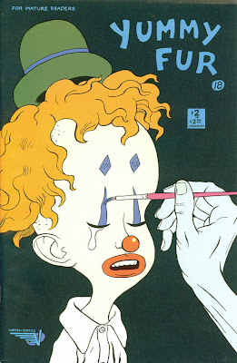
Yummy Fur #18: Cover Recreation

Here's the original cover to "Yummy Fur" #18:


Hey, Kids!  Another submission to the excellent and entertaining Covered Blog which Robert was kind enough to post today!

See?  This blog isn't all superheroes and such.  I also read some alternative comics here-and-there... and they don't get too much more alternative than the late 80's comic, "Yummy Fur".  It featured surreal adventures of Ed the Happy Clown--who generally wasn't all that happy, space aliens, vampires, serial killers, punks, an alternate universe version of Ronald and Nancy Reagan, and a bevy of out there characters.

Ed the Happy Clown was probably the most well-known character from the series for one of the most outrageous reasons: through a series of accidents, Ed winds up with a talking penis--the head of his penis is replaced by the head of Ronald Reagan from an alternate dimension.

After that story arc was finished with #18, the series mostly turned to more autobiographical vignettes, and featured backup features throughout the run from the New Testament (books of Mark and Matthew if I remember right--it's been a while since I last re-read it).

The cover to issue #18 really stuck in my head and when I saw the Covered Blog, I knew this would have to be one of the covers I would do.  The fact "Yummy Fur" was mentioned in the Submission Guides for the site sealed the deal for me.

And here's the process:


STEP ONE:  For this one, I shot a couple reference pictures of myself in roughly the same position and had it on the computer monitor next to my easel.  I taped down a 12" x 18" sheet of 80 lb. Dick Blick sulphite paper onto a drawing board I made from a cut down 1/4" sheet of hardboard.  I then used soft vine charcoal to layout where I vaguely want everything to go.  Then, moments later, I smear the whole thing to a soft, blurry mess on the paper and then begin the task of building up shadows, highlights, and mid-tones on the face.


STEP TWO:  I began tightening the drawing of the face by layered shading with vine charcoal, a 4B and 6B charcoal pencil, and using a kneaded eraser to lift out highlights and carve around shapes.  Also, for some reason I had it stuck in my head that Ed was wearing a fez.  I also notice the hand/arm is way too large and correct it to match the pose of the cover.

I guess that's what I get when I just glance quickly at the source material before trying to recreate it.  :-)


STEP THREE:  I fixed Ed's hat and made it into a derby, and finished work on the face and shirt.  Ed is wearing an ill-fitting wig, so I tried to make the hair seem as fake as possible.  Although, to be honest, it wasn't all that difficult, as hair tends to be something I have some trouble with and need to work on a LOT.  :-)  Next up, the hand holding the paintbrush.


STEP FOUR:  The hand is now done, too.  On the left-hand side, you can even see some of the very low-tack tape I used to tape it to the board.  (Manco "Perfect Release" Duck Tape, if you're wondering.  It was in a multi-color pack: Purple, Blue, and Green.)


STEP FIVE:  I imported the picture above into PhotoShop.    On a separate sheet of paper, I filled in an area about 8" square with charcoal and took a picture of that, too, rather than just using a flat black in PhotoShop.  The pattern was more interesting that way.  I used it as the dark background pattern in PhotoShop using the Clone tool.  I used the Multiply Layer to colorize the picture, added the logos and lettering, and called it "Done!"


This was done with charcoal and digital color on 12" x 18" Dick Blick 80 lb. sulphite paper.


.

Monday, August 29, 2011

Batman: Beginning, Middle, and End

 My Three Batmen
[Queue the theme song to "My Three Sons"] 

This is something I did as a bit of a joke for my pal, Dave, for his birthday last year.  I was originally going to paint it with just the very first version of Batman (with purple gloves, gun in hand, and all that) and the Dark Knight version of Batman with the giant, Kryptonite gloves.  A picture of Batman at the very beginning and a Batman at the very end of his career in comics.  But, then I realized I needed to have the 60's version of Batman in there, as well.

The camera caught the glare from the painting a little bit, so that is minorly annoying.  :-)


Looking at the picture now, there are a few things I would like to correct...  The Adam West bat symbol is a little off for some reason.  How did I not go back and fix that before I mailed it to him?  Sigh.  And the mid-section/abdomen of the Adam West Batman looks a little weird, as well.  The Dark Knight Batman's face can use a little more work, too.

It's sort of painful and embarrassing looking at parts of this now, but, on the bright side, part of improving means knowing that you could do better work now, I suppose.  

This was done with acrylic paint on 18" x 24" gessoed 1/8" hardboard panel.  

.

Saturday, August 27, 2011

Repaneld: Fantastic Four #5

Here's the original from "The Fantastic Four" #5 by Jack "King" Kirby and Joe Sinnot:

Here's yet ANOTHER submission to the delightful REPANELED Blog.  In this case, it is from "The Fantastic Four" #5, where the FF are transported back in time by Doctor Doom to get Blackbeard's treasure... it's a LONG story.  Well, not THAT long, but you know what I mean... and it's been reprinted plenty of times so go ahead and read it if you can!

Rather than my usual colorized black-and-white gouache paintings as done in some previous posts, this was done with charcoal on 12" x 18" Dick Blick Sulphite paper (80 lb).  For those of you who just can't get enough of the process, here it is.  For all the rest, be prepared to be bored!


STEP ONE:  With vine charcoal, I **VERY** loosely blocked in where I wanted everything to roughly fit on the page in an almost cartoonish manner.


STEP TWO:  And then almost immediately smeared the whole thing into an amorphous mess.  (That's the way I usually work with charcoal.)


STEP THREE:  I start to tighten up the drawing a bit with a 4B and 6B charcoal pencil and use my kneaded eraser a LOT--both to clean up the mess left by STEP TWO and to shape the form and add highlights.  Yes, kids, the eraser can ALSO be used to draw and not just erase mistakes.  :-)

I also settled on how I wanted Ben's pirate hat to look and, for my amusement, changed the original background guy in the panel to vaguely resemble a better-known pirate from a certain movie series.


STEP FOUR:  Ben Grimm (A.K.A., The Thing) is mostly done, now.  Again, this was done with continued layering of softer charcoal pencils and kneaded eraser to lift out lighter areas and highlights.  Time to work on that pirate fellow in the background...


STEP FIVE:  Well, here's the finished charcoal drawing.  I took a picture of it with my camera and then imported it into PhotoShop to colorize it.


STEP SIX:  Here it is colorized and cropped in PhotoShop, along with the added words.  It was basically the same method I used in previous posts: Over top the original picture, I added color on the Multiply Layer, as well as lightened some areas/retouched, and added a background with a generic Cloud Filter.


Done with charcoal on 12" x 18" Dick Blick Sulphite paper (80 lb.) and colorized in PhotoShop.

I realized a little too late that I didn't leave myself enough room to rotate the image a bit as I originally intended until after I had already copped it and got most of the way through colorizing.  I should have either drawn it at the tilted, Dutch-angle in the first place (preferred), or cropped it AFTER I rotate the image and BEFORE I start colorizing the image.  I'm sure there's a lesson in there somewhere for me.  :-)

Now that I look at it, I almost like the black-and-white charcoal drawing better than the colorized version.  Sigh...  On top of that, in comparison, I think Kirby did a better job of capturing the pathos of Ben Grimm (well, he **IS** the "King", after all).

.