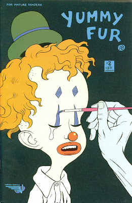
Here's the original cover to "Yummy Fur" #18:
Hey, Kids! Another submission to the excellent and entertaining
Covered Blog which Robert was kind enough to post today!
See? This blog isn't all superheroes and such. I also read some alternative comics here-and-there... and they don't get too much more alternative than the late 80's comic, "Yummy Fur". It featured surreal adventures of Ed the Happy Clown--who generally wasn't all that happy, space aliens, vampires, serial killers, punks, an alternate universe version of Ronald and Nancy Reagan, and a bevy of out there characters.
Ed the Happy Clown was probably the most well-known character from the series for one of the most outrageous reasons: through a series of accidents, Ed winds up with a talking penis--the head of his penis is replaced by the head of Ronald Reagan from an alternate dimension.
After that story arc was finished with #18, the series mostly turned to more autobiographical vignettes, and featured backup features throughout the run from the New Testament (books of Mark and Matthew if I remember right--it's been a while since I last re-read it).
The cover to issue #18 really stuck in my head and when I saw the Covered Blog, I knew this would have to be one of the covers I would do. The fact "Yummy Fur" was mentioned in the Submission Guides for the site sealed the deal for me.
And here's the process:
STEP ONE: For this one, I shot a couple reference pictures of myself in roughly the same position and had it on the computer monitor next to my easel. I taped down a 12" x 18" sheet of 80 lb. Dick Blick sulphite paper onto a drawing board I made from a cut down 1/4" sheet of hardboard. I then used soft vine charcoal to layout where I vaguely want everything to go. Then, moments later, I smear the whole thing to a soft, blurry mess on the paper and then begin the task of building up shadows, highlights, and mid-tones on the face.
STEP TWO: I began tightening the drawing of the face by layered shading with vine charcoal, a 4B and 6B charcoal pencil, and using a kneaded eraser to lift out highlights and carve around shapes. Also, for some reason I had it stuck in my head that Ed was wearing a fez. I also notice the hand/arm is way too large and correct it to match the pose of the cover.
I guess that's what I get when I just glance quickly at the source material before trying to recreate it. :-)
STEP THREE: I fixed Ed's hat and made it into a derby, and finished work on the face and shirt. Ed is wearing an ill-fitting wig, so I tried to make the hair seem as fake as possible. Although, to be honest, it wasn't all that difficult, as hair tends to be something I have some trouble with and need to work on a LOT. :-) Next up, the hand holding the paintbrush.
STEP FOUR: The hand is now done, too. On the left-hand side, you can even see some of the very low-tack tape I used to tape it to the board. (Manco "Perfect Release" Duck Tape, if you're wondering. It was in a multi-color pack: Purple, Blue, and Green.)
STEP FIVE: I imported the picture above into PhotoShop. On a separate sheet of paper, I filled in an area about 8" square with charcoal and took a picture of that, too, rather than just using a flat black in PhotoShop. The pattern was more interesting that way. I used it as the dark background pattern in PhotoShop using the Clone tool. I used the Multiply Layer to colorize the picture, added the logos and lettering, and called it "Done!"
This was done with charcoal and digital color on 12" x 18" Dick Blick 80 lb. sulphite paper.
.


