Thursday, December 30, 2021

Year in Review 2021: It's a Good Life

2021 Year in Review
"It's a Good Life"

It seems that every year gets a bad review by me, making me seem like a negative kind of guy (I'm not, really!) but, well, the past bunch of years have been pretty crappy, generally.  So, there's that.  Anyhoo, about this time of year I'm always trying to wrack my meager brains to figure out some mildly amusing/clever take on the previous year.  And, as usual, I was drawing a blank and running out of time.  I used Bizarro for the past two years... I guess I'll use him again and beat that joke into the ground, why not?

So, while trying to think of some Bizarro-esque comment on the year, I happened to have MeTV on in the background and saw Bill Mumy on an old, black-and-white episode of "Lost in Space" as the young Will Robinson.  Seeing him in black-and-white, I immediately flashed on his famous episode of "The Twilight Zone", "It's a Good Life" (a remarkably faithful adaptation of the short story of the same name by Jerome Bixby), and immediately knew I had my Year in Review for 2021.

Good on you, 2021, for giving me an idea just when I needed it.  You still suck, though, and I'm wishing you to the Cornfield...

Here's to hoping for a better 2022 for everyone!

* * *

STEP ONE:  Here is the original idea, scribbled on a scrap piece of paper with a ballpoint pen.  Rather than do a few panels as a comic with "2021" slowly fading out, I thought it would be funnier to do it up as yet another animated .GIF.

* * *

STEP TWO:  Here's the first pass in Clip Studio Paint, done on an 2,700px x 3,600px canvas @ 300dpi.  While the face is almost recognizable as a generic, tow-headed kid that might have been in that one episode of "The Twilight Zone", it's really quite a ways from Bill Mumy.  The eyes are too small, and the nose/mouth are just a bit off.  It took a bit of back-and-forth to even get that close to a semi-adequate likeness.  I was also gonna include the lamps in the background, and part of the phonograph, but it was just visually confusing and simplified everything by leaving them out.

* * *

STEP THREE:  Here's the finished digital painting, with 2021 partially fading out.  It took an inordinate amount of drawing and re-drawing to try and get it to a relatively OK likeness of young Bill Mumy (while mostly there, I think there are still a few little spots that aren't quite right--but I also realized that's about as close as I'm gonna get).  As I've said many times before, I am always amazed at what a difference an 1/8" here and a 1/16" there can do to make-or-break a likeness.   I also slid the top image over a little to the left to make better room for the word balloon(s) and make a marginally improved composition.

I used had the "2021" on a separate layer, and changed the opacity to 65%, then 30%, and lastly 0%, to make it seem like it is fading to the cornfield; then imported the images into Photoshop to make an animated .GIF.

Also, here's something probably only myself and a half-dozen other people will notice, but there is a coincidence of edge on the spring and the top line of the shelf--the edge of the spring visually touches the top edge of the shelf.  Of course, I didn't realize it until I already did all of the work with the .GIF and uploaded all the images.  I'll let it go, but it still bugs me...

* * *

Don't digitally in Clip Studio Paint with an assist from Photoshop.

.

Saturday, December 25, 2021

Merry Sithmas - Darth Bane

 MERRY SITHMAS
Darth Bane

Hey, I got another Merry Sithmas card done for the holidays, this time it's Darth Bane, founder of the Rule of Two for Sith.  I was gonna have the shading of his eye be either a Christmas bulb (it just looked like a couple black eyes) or a Christmas Tree (I've already used Christmas Trees too much recently).  So, I went with a star shape, instead.  

I even added some Rankin-Bass type primitive snowflakes this time around.  Marginal improvements to the animated .GIF.

* * *

STEP ONE:  Here are the digital pencils, done in Clip Studio Paint.  It is a 2,00px x 2,791px document at 300dpi.  I used the Symmetry Tool to keep everything, well, symmetrical between the two sides, then turned it off for the hat and a couple other random bits.

* * *

STEP TWO:  And here are the digital inks.  They were mostly done with a 15pt digital brush.

* * *

STEP THREE:  Here are the colors, done in a variety of layers under the inked layer before the animation lights were applied.  For the animation, two images were imported into Photoshop in the Timeline, and exported as an animated .GIF.

* * *

Done digitally in Clip Studio Paint (with the animated .GIF produced in Photoshop).

.

Thursday, December 23, 2021

Merry Sithmas - Darth Talon

MERRY SITHMAS
Darth Talon

Key, Kids, do you have your stocking hung by the chimney with care, in hopes that Darth Talon will soon be there for Sithmas?  That's right, it's Sithmas-time again, this time with Darth Talon, the red, tattooed Twi'lek who worked with Darth Krayt and Darth Nihl.

I always thought she looked pretty cool, so I had her on the list (hmmm, on my naughty list?) for Sithmas.  Last year, I had the Darth Talon card about 98% finished, when my iPad ate my homework--every artist's worst fear.  Of course, it didn't delete the whole thing, it just took it back to the pencil stage, which I found even more infuriating, as it was just mocking me at that point.  I mean, totally destroying it, I can understand that; just leaving enough for me to realize I have to redo most of it was just sadism on the part of my iPad.

I have some more Sith from the Expanded Universe I hope to do in the future.  Not sure if I want to do another Sithmas card this year (one is tempted to say "always two there are..." but that is not always accurate for my Sithmas posts).  I have another Christmas-based post I am hoping to get in under the wire.  I guess we'll see which one (if any) gets to the finish line!

* * *

STEP ONE:  Here are the digital pencils, done in Clip Studio Paint.  It is a 2,00px x 2,791px document at 300dpi.  I used the Symmetry Tool to keep everything, well, symmetrical between the two sides.

* * *

STEP TWO:  And here are the digital inks.  They were mostly done with a 15pt digital brush.

* * *

STEP THREE:  Here are the colors, done in a variety of layers under the inked layer before the animation lights were applied.  For the animation, two images were imported into Photoshop in the Timeline, and exported as an animated .GIF.

* * *

Done digitally in Clip Studio Paint (with the animated .GIF produced in Photoshop).

.

Saturday, November 20, 2021

Frankenberry

Frankenberry

This was a commission of sorts.  It's a long, convoluted story, involving the purchase of the "King Shark" painting, that leading to a commission, which in turn lead to this commission (of sorts).  As the "31 Days of HELL-O-Ween" just concluded, I thought it would be amusing to paint a picture of the Boris Karloff Frankenstein hot pink and label him Franenberry, and then added the usual accoutrements of the various pressure gauges and Steam Punk-ish goggles.  Ta-da!

I've been meaning to do some more work with Frankenberry and update the Monster Cereal drawings I did a while ago.  Heck, I even thought about doing a 5-10 page comic of a "Monster Squad" style mash-up with the Monster Cereal characters... and may still in the near future.  Keep coming back to find out!

As for the actual commission which started this whole thing off, I'm not sure if I'll be posting it next week, or in March, during March M.O.D.O.K. Madness, since it involves M.O.D.O.K.  Maybe both!  Again, keep coming back and watch this space!  (Quiet, Admiral Ackbar, it's NOT a trap!)

* * *

STEP ONE:  Here are the pencils, scribbled out on 6" x 9" Canson (#140) watercolor paper.

* * *

STEP TWO:  This is the first pass with acrylic paint.  I decided to keep it as monochromatic as possible by using only Quinacridone Magenta and Titanium White.  One problem was that Quinacridone Magenta is semi-opaque at best, and I had been a little heavy-handed with my pencils--using a regular, 2B lead.  If I had been thinking ahead, I probably should have used either a red lead or some other reddish colored pencil/watercolor pencil I had laying around.  It took a lot more work to cover some of those pencil lines.  Then again, a few of them sort of add to the drawing, so who knows?

* * *

STEP THREE:  And here's the finished painting.  I avoided adding Carbon Black into the painting, as I sort of liked the effect of it looking like a Magenta plate from a printing press.  It does make it a bit more challenging to have the darkest value in the painting be about a 70% black in value, but it also made it stand out a bit more for adjusting the gamut of values of the painting.

* * *

This was done with acrylic paint on 6" x 9" Canson XL (#140) watercolor paper.

.

Sunday, October 31, 2021

Day 31: John Carpenter's The Thing (1982) - 31 Days of HELL-O-Ween 2021

31 Days of HELL-O-Ween 2021:
John Carpenter's The Thing

Huzzah, I made it!  Also, you didn't really think I was gonna do a "31 Days of HELL-O-Ween" without a "John Carpenter's The Thing" posting, did you?  It's one of my favorite Sci-Fi/Horror movies, after all.  This time, it's a self-portrait as the Blair Thing.

Time to look back at this year's "31 Days of HELL-O-Ween" and review...


THE GOOD:

While I am usually my own worst critic, I think some of the paintings I did this year turned out not too bad, or to quote "The Simpsons", I feel "less shame" about them.  The ones I think turned out well are this one, "The Thing"; "The Shining" twins painting; Ash from "Evil Dead 2"; "Haxan", Pennywise from "It"; "Invisible Man" was an interesting, stylistic challenge; "Frankenstein" turned out OK; Leatherface from "Texas Chain Saw Massacre"; "Rawhead Rex"; "The Fog" digital scratchboard (the most popular of my posts so far for "31 Days of HELL-O-Ween", go figure); and "Halloween 3: Season of the Witch".  There are bits-and-pieces of even the bad ones which turned out not-too-bad.

It was the case that the traditional paintings have a lot more subtlety and detail (even the not-so-good ones), which is lost during the scan.  Oh, well, you can't win 'em all.  Sigh...


THE BAD:

Of course, they can't all be winners, and there are some which are somewhat disappointing.  As much as I like the "Re-Animator" painting, I am disappointed that it didn't quite resemble the actor enough--it was a good face, too bad it wasn't quite actor David Gale's/Dr. Hill's.  The painting of Dr. Freudstein from "The House by the Cemetery" is just sort of blah, as was "The Prince of Darkness", the "Bride of Chucky", and "Blood of Dracula"  Oh, and the Sugar-Plum Fairy from "The Cabin in the Woods", while mostly accurate, the mouth looks a bit off-kilter.  Lastly, the first post of myself in a comic strip from "They Live", well there's 10 lbs. of crap in that 6-panel grid.


THE UGLY:

Are there some stinkers?  You betcha!  That "Mars Attack!" one in particular embarrasses me.  Not the painting itself (it actually turned out not too bad), just the background scanned in terribly.  The attempt to fix that digitally with the airbrush tool in Photoshop didn't quite turn out well, though.  It was the cover-up being worse than the crime, perhaps.  Alas, it was a case of  me literally having 10 minutes to finish it up before having to leave for work, so a very quick attempt to digitally airbrush over the blotchy mess that was the background--Now it's a smeary, blurry mess!  I may circle back to it and fix my attempt to fix it.

Also, I was very disappointed with "Psycho Goreman"; it was a fun movie and I was looking forward to painting it, but the final result just... passable.


FINAL THOUGHTS

It was a good exercise in working on trying to get a good likeness, and it forced me to practice for hours with each painting.  Time on the paintings did start to increment up to the point where I was spending 6-8 hours on a painting.  While that amount of focus on painting really helped improve my work, IMHO, it was also a crazy amount of time and stress to get 'em done in time for posting each day.

Of course, every year I think there's no way I can do it, but I luckily haven't missed a day, yet (fingers crossed, I won't in the future, either).  Also, halfway through, I begin to think "I'll never be able to think of enough Horror Movie Monsters to finish this Quixotic bit of self-punishment...", and then when I'm finished, I have about a dozen left over I realize I wanted to do but didn't get to 'em.  Next year...

* * *

STEP ONE:  Here are the digital pencils, done on a 1,500 x 2,100 canvas @ 300dpi.  I did take a picture of myself as a reference, as well as a screenshot of the Blair Thing and it was just a matter of synthesizing them together.

* * *

STEP TWO:  Here's the halfway point, give-or-take.  I thought it was creepier to add my mouth and extra teeth to transform up the side of the Blair Thing side.

* * *

STEP THREE:  After a LOT of noodling and adjustments, here's the finished digital painting.  I spent a lot of time trying to nail down my own likeness (which makes me seem like I am marginally more of a narcissist than usual), and expanded the side-mouth out a little bit more.  The shirt could have used more work, but it wasn't all that much of a focus and I was running out of time.  So, we'll call it done enough!  And, speaking of "Done"... that's it for this year's "31 Days of HELL-O-Ween".

* * *

This was done digitally with Clip Studio Paint on an iPad.

.

Saturday, October 30, 2021

Day 30: The Shining (1980) - 31 Days of HELL-O-Ween 2021

31 Days of HELL-O-Ween 2021:
The Shining

"Come play with us, Danny..."  Probably one of the spookiest scenes in "The Shining", it's the Overlook's favorite sisters, the super-creepy Grady Twins along with the elevator of blood.

Tomorrow, "31 Days of HELL-O-Ween" wraps up!  Will I actually make it or will I drop the ball on the last day of this dumb, self-imposed, vainglorious endeavor?  Be there AND be square to find out!

* * *

STEP ONE:  Pencils done on 8-1/2" x 11" toned cardstock.

* * *

STEP TWO:  Here's the first pass in acrylic paint.  There's always that awkward middle-stage, where nothing looks right, and this is one of them.  At this point in the painting, they both look like middle-aged escapees from a Wes Anderson  movie.  Y'know, 'cuz of the symmetry an all that.

* * *

STEP THREE:  Here's the finished acrylic painting.  Also, I noticed the left eye of the sister on the right was a little higher up and moved it--and the rest of the eye socket--down about an 1/8th of an inch.  It's always surprising how much of a small change of an 1/8" here and an 1/8" there can make such a big difference.

* * *

This was done with Acrylic Paint on 8-1/2" x 11" toned cardstock.

.

Friday, October 29, 2021

Day 29: Gaia (2021) - 31 Days of HELL-O-Ween 2021

31 Days of HELL-O-Ween 2021:
Gaia

This movie was a mix of the 1963 Japanese B-Movie "Mantango/Attack of the Mushroom People"--a movie I was planning on doing during one of these "31 Days of HELL-O-Ween", but haven't gotten around to it (SPOILERS: I didn't get to it this year, either)--and a non-humorous, cinematic version of the "Creepshow" segment, "The Lonesome Death of Jordy Verrill".

The movie was well-shot and had some good effects for being a relatively small movie featuring people turning into plant monsters.  Eat your heart out, Alec Holland (A.K.A. Swamp Thing from DC Comics).

* * *

STEP ONE:  Here are the pencils, done on an 8-1/2" x 11" piece of toned cardstock.

* * *

STEP TWO:  And here is the quick, first layer of acrylic paint.

* * *

STEP THREE:  And, after much noodling, this is the finished painting.

* * *

This was done with Acrylic paint on 8-1/2" x 11" toned cardstock.

Thursday, October 28, 2021

Day 28: Evil Dead 2 (1987) - 31 Days of HELL-O-Ween 2021

 31 Days of HELL-O-Ween 2021:
Evil Dead 2

"Evil Dead 2" had one of the creepiest posters (the one with eyes looking out at you from a skull), which may have put me off from renting it for a few weeks when I was a late teen.  Something about that poster was just off-putting.

However, when I did rent it, I found it a hilariously gory and just a fun B-movie.  Actual comedic beats that mixed with the puppets, stop-motion, and gallons of fake blood.  You can tell it's a Sam Raimi film through and through, and Bruce Campbell brings in the right amount of camp.  ("Evil Dead 3: Army of Darkness" is also great: the Three Stooges-esque cemetery scene makes me laugh every time I see it.)

* * *

STEP ONE:  This is the scribbled pencils on 8-1/2" x 11" toned cardstock.

* * *

STEP TWO:  Here is the first layer of acrylic to lay out the general form, lights and shadows.

* * *

STEP THREE:  And here's the final painting, which actually scanned better than I thought it would.

* * *

This was done with Acrylic paint on 8-1/2" x 11" toned cardstock.

.

Wednesday, October 27, 2021

Day 27: Prince of Darkness (1987) - 31 Days of HELL-O-Ween 2021

31 Days of HELL-O-Ween 2021:
Prince of Darkness

Hey, it another John Carpenter movie, this time his under-rated (IMHO) "Prince of Darkness".  It really hit all the right buttons for me: a Cosmic Horror being kept in the basement of an old church and a group of scientists trying to stop an intrusion by the Anti-God, which would bring about unimaginable horrors to the planet.  All that and a recurring dream which all the characters share which is an encoded message from the future sent back via Tachyons.  Cool!

Granted, watching it today, it is a little more slow moving and does have some strange acting/writing choices, but overlooking those, I think it still holds up.  I mean, in an 80's sort of way.

There's something about the understatement of "I've got a message for you, and you aren't going to like it" which I find somewhat amusing, as he discorporate into a pile of bugs.

* * *

STEP ONE:  The pencils were quickly scribbled on 8-1/2" x 11" toned cardstock.

* * *

STEP TWO:  Here's the real quick first layer of acrylic paint.

* * *

STEP THREE:  And here's the finished painting, although the scanner just refused to do a proper job on this one.  It seems to mostly happen with painting with higher contrast.  I'll have to look into that at some later time when I'm not trying to get these done as soon as possible.

* * *

This was done with Acrylic paint on 8-1/2" x 11" toned cardstock.

.

Tuesday, October 26, 2021

Day 26: Haxan: Witchcraft Through the Ages (1922) - 31 Days of HELL-O-Ween 2021

 31 Days of HELL-O-Ween 2021:
Haxan: Witchcraft Through the Ages

"I'm Batman!  No, wait, I'm Man-Bat!"  Nope, it's the Devil from "Haxan: Witchcraft Through the Ages" (1922).  He's busy showing off his Zaddy Dad-Bod and making booty calls.

Haxan is a pretty wild movie for 1922, and I've had it on the list to use for a while.  The first part is a series of depictions of witches in the past and various woodblock prints, drawings, etc., and then moves on to various alleged practices by witches, instruments of torture, and a slight parable through to today (well, 1922).  But, that middle section has some pretty crazy things going on.  The effects are surprisingly good and add to the sense of being an object out of time.

Like "Nosferatu", the fact it is a silent (well, there is a score), black-and-white (well, there are color tints on the film, which are interesting) movie, gives it an additional level of surreal strangeness and makes it slightly more unnerving and creepy.

Also, this movie is just flat out horny--and not just the ones on the demon's and devil's heads.  The Devil is constantly knocking on doors and knocking boots; He's Netflix and Chillin', to put it in the vernacular of today so you kids may understand.

If you want to watch it, Haxan is in the Public Domain and you can watch it on YouTube.

* * *

STEP ONE:  I thought I should do this one as digital, as my scanner seems to hate blue, monochromatic paintings.  So, here are the pencils on a 1,400px x 2,100px canvas @ 300dpi in Clip Studio Paint.

* * *

STEP TWO:  And here's the first pass with large brushes, just to model the figure.  Actually, this one was all too similar to the weekly Figure Drawing Sessions I attend, so it was relatively quick and easy.

* * *

STEP THREE:  Like the previous Pennywise painting, I did most of this one on a single layer, just 'cuz.

* * *

This was done digitally in Clip Studio Paint.

.

Monday, October 25, 2021

Day 25: It (1990) - 31 Days of HELL-O-Ween 2021

31 Days of HELL-O-Ween 2021:
It - Pennywise

Hey, it's Pennywise from the 1990 TV Series of "It".  To be honest, aside from a few scenes here and there, it's mostly not all that good.  It's rather weird in tone, slow-moving, meandering, and being a made-for-television series, the effects weren't all that good (although, with a few exceptions, given the 1990's technology, it probably wouldn't have been all that great on the big screen, either).

I also get to be the person who says "The book is better"... well, aside from the really, REALLY problematic scene...  Pennywise's origins have a more Cosmic Horror, Lovecraftian feel to it.

The more recent movie versions of "It" (2017 and 2019) are superior in the focus on the horror and the effects, of course, but Tim Curry's version of Pennywise has a certain creepy charm... (not to take anything away from Bill Skarsgard's version of Pennywise--they're both really good).

And, since I had a little "extra" time (done with two hours to spare--plenty of time!), I worked with it a little longer to try to make it extra pretty rather than... working... on the next... DARN IT!  I probably should have been working on the next one to get a head start, rather than puttering about with this one!  Oh, well.  Speaking of--On to the next one!

* * *

STEP ONE:  It's the scribbled, digital pencils on a 2,100px x 1,500px canvas @ 300dpi.

* * *

STEP TWO:  The first pass with a larger brush to layout the lights and shadows, and general areas of color.

* * *

STEP THREE:  And, after a lot of back-and-forth, tweaking colors, and correction of the shapes, here's the finished digital painting.  

Now that I look at it, I'm kinda glad I took the extra time with this one, as it really taught me a lot about color mixing and brush use in Clip Studio Paint--doing such things digitally can be frustrating (well, it's frustrating in traditional media, too, so I probably should have said "slightly more frustrating"...).

* * *

This was done digitally in Clip Studio Paint on in iPad.

.

Sunday, October 24, 2021

Day 24: It's the Great Pumpkin, Charlie Brown (1966) - 31 Days of HELL-O-Ween 2021

31 Days of HELL-O-Ween 2021:
It's the Great Pumpkin, Charlie Brown

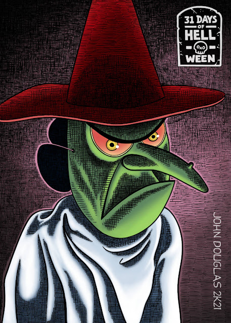
Time for something a little more light and fun to start the countdown to the final week of "31 Days of HELL-O-Ween".  It's another post from "It's the Great Pumpkin, Charlie Brown"--this time it's Lucy's costume of a witch mask and ghostly bedsheet.  I will admit I have a lot of nostalgia for The Great Pumpkin, having watched it yearly when I was a youngster (yes, kids, there was a time before VCR's and DVD's, or your Cartoon Networks, when you had only one chance per year to watch a cartoon special, or holiday-related show and you better hope you saw it or it was too bad 'til next year... Now THAT'S scary!).

I was very tempted just to do the simple, colored in pen-and-ink line drawing and call it done, but nnnoooooo, I just had to crosshatch, like, a billion lines.  When will I learn?  Onward to the final leg of this race toward the finish line!

* * *

STEP ONE:  In Clip Studio Paint, I created a 1,500px x 2,100px @ 300dpi canvas and quickly sketched out the digital pencils.

* * *

STEP TWO:  And here are the digital inks.  At first, I was thinking about doing a realistic style digital painting, but then thought about doing a highly detailed scratchboard effect...  Nah, how about a shadowed, digital pen-and-ink?  I finally settled on an inking style similar to Gahan Wilson or Robert Crumb with semi-dramatic lighting.

* * *

STEP THREE:  And here's the finished painting, with various layers of color added.

* * *

This was done digitally with Clip Studio Paint on an iPad.

.

Saturday, October 23, 2021

Day 23: Re-Animator (1985) - 31 Days of HELL-O-Ween 2021

 31 Days of HELL-O-Ween 2021:
Re-Animator

"Re-Animator" is another grotesquely fun, goofy, comedic horror adaptation of an H.P. Lovecraft short story from Stuart Gordon which barely resembles the actual story, itself (his other one is "From Beyond", which is also grotesquely fun).  It's over-the-top, 80's horror bliss!

* * *

STEP ONE:  Here are the pencils, roughly drawing on 8-1/2" x 11" toned cardstock.  Alas, the trying to draw the hands correctly took an absurdly amount of drawing and erasing.

* * *

STEP TWO:  And here's the quick underpainting, done in acrylic paint.

* * *

STEP THREE:  And here's the finished painting.  While I'm mostly pleased with the painting, itself, the resemblance to the actor, David Gale could be better.  Ah, well...  Next time.

* * *

This was done with Acrylic Paint on 8-1/2" x 11" toned cardstock.

.