Monday, December 30, 2013

Merry Krampus! (Part II)

THE KRAMPUS (Part II)


Sure, it's a little past Christmas, but I decided to do another Krampus drawing--This one is a little more on model.  Again, I thought it was more amusing to have him look like he decided to have his portrait done at the local K-Mart's Photo Center (it doesn't take much to amuse me, apparently).

Alas, after I had the drawing halfway finished I began to think it looked like something Ed "Big Daddy" Roth would have drawn.  I just needed to put Krampus in a dragster with a large gear shift and he would fit right in.

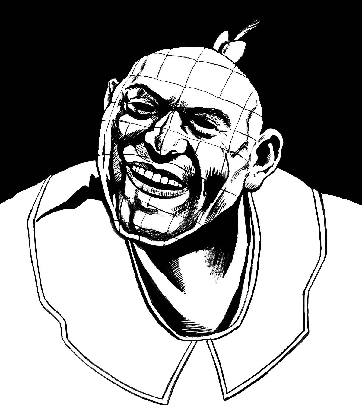
Krampus and Rat Fink -- Separated at Birth?

For those of you who are interested, here's the process:

* * *


STEP ONE:  I used vine charcoal to roughly draw out the figure on a 9" x 12" piece of Strathmore Gray Toned drawing paper.  I really like working on toned paper, as it gives three immediate values Light, Mid-Tone, and Dark, rather than just two (Dark marks on Light paper).

Once again, I didn't bother using a photo-reference this time, as I had just done about 8 hours of figure drawing throughout the week and felt I had this relatively simple portrait in the bag.  Of course, pride usually goes before the fall.  :-D

* * *


STEP TWO:  And, as I normally do, I smeared everything into a soft, blurry mess.  Usually, I do this to lay down some of the beginnings of where the shadows will go and to generally just keep the charcoal on the paper.  As vine charcoal is so soft and will smudge if touched, I find it better to smear it around to keep it on the page, ironically.

* * *


STEP THREE:  I then begin to use charcoal and carbon pencils to build up the darks and shadows within the picture and carve out highlights with a kneaded eraser to see where the light source will fall.  You may be surprised how much drawing you can do with an eraser.  :-)

 * * *


STEP FOUR:  I finished up the darks on the page.  In and of itself, the drawing is mostly OK as dark lines on mid-toned paper.  However, it is adding the white highlights which really make a drawing on toned paper "pop".

* * *


STEP FIVE:  I used a General's white charcoal pencil to add whites and highlights to the drawing.  The photo sort of fails to catch some of the subtle gradations, however, I was hoping it would show enough to demonstrate the big difference adding just a little highlight can make.  At this point, I just took a picture with my camera and imported it into PhotoShop to finish the drawing and begin adding color.

* * *


STEP SIX:  I decided to just finish the black-and-white portion in PhotoShop, since I would have to do the background and most of the finalized fur effects digitally, anyways.  For the fur, I used a brush which was included on the disc of one of the (many) "ImagineFX" magazines I have laying about the house; the brush consists of about a dozen or so dots of slightly differing sizes and line densities and give a really nice effect.

* * *


STEP SEVEN:  Over top the black-and-white drawing, I added a MULTIPLY LAYER to do most of the colorization, but also did some coloring overtop the drawing directly on a normal layer, as well--mostly for final highlights and areas that need a little more "brightness" to them.  At the end, I flattened all layers, did some minor adjustments to the levels, and called it "good 'nuff!" 

* * *

This was done with charcoal, carbon pencil, and white chalk on 9" x 12" Strathmore gray toned paper and digitally colored in PhotoShop.

.

Friday, December 20, 2013

Merry Krampus!

THE KRAMPUS


'Tis the Season for drawings of Santa's Little Helper, the Krampus.  Originally, I was going to a tripped out version, with his tongue out and all crazy.  But, I thought it would be more amusing to do a version of the Krampus as if he was just walked into the K-Mart Photo Center to have a portrait done.  I know, I'm a little off model for the Krampus--not nearly hairy enough and I kept his tongue in his mouth for the picture.  I figured it was funnier to have him seem like a middle-aged demon, balding, slight paunch, but just plugging away at his job.  :-)  I may have to do a corrected version of him in the near future.

Here is the process, for those of you interested...

* * *


STEP ONE I blocked everything in using vine charcoal on gray bogus paper (it's a step up from newsprint, but has more of a "tooth", which is really good for charcoal and such).  I didn't bother with a reference picture this time, as I had done quite a bit of figure/portrait drawing this week, so I thought I could handle it without this time.  :-)

* * *


STEP TWO I then smear it into a soft, blurry mess... Just to give an idea of where the shadows would fall and the light source, etc.

* * *


STEP THREE:  I begin to work on building up highlights by erasing out charcoal with a kneaded eraser and darken the shadows with a charcoal pencil and carbon pencil.

* * *


STEP FOUR:  More of the same.  I also add in some white chalk as an extra highlight.  The gray background is a good middle-tone--it's like getting three values for the price of two (dark, middle, light), rather than just the white and black of charcoal on white paper. 

* * *


STEP FIVE:  Here is the finished charcoal drawing.

* * *


STEP SIX:  I then scanned the drawing into PhotoShop and used a mix of the MULTIPLY Layer and standard layers to colorize it and do some minor painting.  

* * *

Done with charcoal, carbon pencil, and white chalk on 9" x 12" gray bogus paper, and then colorized in PhotoShop.

.

Thursday, December 12, 2013

Pinheads All The Way Down...

Pinhead - Pinhead - Pinhead Mash-Up


As part of the Halloween series of drawings, I intended to include Schlitzie the Pinhead from Tod Browning's movie, "Freaks", but just ran out of time.  I mentioned this to Todd, a chum of mine from work, and since he is a big fan of the movie he INSISTED that I had to do it!  He even suggested that I should do a mash-up of Pinhead from "Freaks" and Pinhead from "Hellraiser".  I decided to one-up that mash-up by also including Zippy the Pinhead from the "Zippy" comic strip by Bill Griffith, which is one of my favorite comic strips for its pop-surrealism.  (Zippy the Pinhead was also inspired by Schlitzie the Pinhead from the movie "Freaks", so it all comes full circle :-).

So, as Bill Griffith would say, "A tip o' the pen to Todd G."  Blame him (mostly) for this.

* * *


STEP ONE: Here are the pencils.  I did a real quick sketch from a screen cap of the movie.

* * *


STEP TWO: I did the inks using a No. 4 brush and India ink.  The head proportions in the pencils seemed a little... normalized, so I "fixed" that in the inks.  I intended to add the nails/pins for the Hellraiser Pinhead in Photoshop, as it seemed like there was too much to go wrong at that stage, and I wanted to be able to correct/remove them if worse came to worse and I goofed it all up.

* * *


STEP THREE: After scanning it in, I added the pins to the face.  I also realized that the collar for Schlitzie didn't quite read like Zippy the Pinhead from the comic strip as I originally intended.  I added Zippy's trademark collar into the picture, as well as the polka-dot muumuu.  I did sort of intentionally leave the line-weight the same for the collar and muumuu, so it would more closely resemble the comic strip.  But, I just wasn't sure about that decision...

* * *


STEP FOUR: I decided I didn't like the line weight being too much the same on the muumuu after all--the different art styles just clashed too much--and did what most artists would do in that situation: Blacked it all out.  I also thought it would add to the dramatic lighting.  :-)  I then colored the whole thing on a new MULTIPLY Layer and called it DONE!

* * *

Pen and ink on 8-1/2" x 11" card stock and digital coloring in Photoshop.

.


Thursday, November 28, 2013

When Will I Learn...

When Will I Learn (and Why is the Answer to That Question Always NEVER)?

I did a previous black-and-white painting of the Joker with gouache (an opaque watercolor) based on Conrad Veidt from "The Man Who Laughed" (whom the Joker's visual look was based on).  I decided to colorize it as a present to a long-time friend of mine.  I had just finished re-painting it in full color with gouache and was actually pleased by how the colorization turned out, except...

There was a section on top of the painting where the dark red paint refracted the light in a weird way, making it look like the painting was faded from some angles.  So, I was hoping that when I used a matte-based fixative on the painting, it would correct the problem by knocking down the shiny spots.


Fixative is generally used to help keep charcoal from smearing, watercolor from running, and to protect the drawing/painting.  However, I had a problem with some fixative on a watercolor painting I had done a long time ago: I sprayed it on the watercolor to protect it, but it essentially erased most of the painting; it was one step away from just spraying it with white spray paint.  As I couldn't remember the brand name of the spray and didn't have something handy to test it on (OK, mostly I was also just impatient to get the thing fixed and in the mail), I had another great idea!

I had just applied some Matte Medium with an extra-soft paint brush to some vine charcoal drawings earlier in the day with the intent of painting over them later.  I expected a mostly smeared mess, but there was surprisingly little movement of the charcoal.  (It wouldn't have mattered if it had smeared all over, it was just for testing purposes.)  Now, I'm sure you can see exactly where this is heading...

So, I said to myself "Hey, that worked great for something which should have become a gray mess all over... surely it will work even better on watercolor/gouache.  I'm sure any running should be minimal."  Here was the result:


As soon as I touched the brush to the watercolor painting, it began to smear.  Rather large areas of paint broke off and ran across the rest of the painting.  And, sadly, once started, I pretty much had no choice but to keep on going and finish it, trying to brush back as much of the damage as I could.


So, I re-painted the entire painting again (third time's a charm, I guess), this time with acrylic paint.  While the acrylic painting generally turned out well, I still think the colorized gouache was better.  (I also thought there was a bit too much lettering in the first previous one, so left off the "Keep on Smiling!")  Oh, well, live and learn!  Well, live, anyways... ;-)

Now, I'm sure most of you are sick of seeing this painting and have begun to wonder if I can really do anything else, so hopefully it will be the last time it will be featured on this blog.  :-D

* * *

This was done with Acrylic Paint on 6" x 9" Arches Hot Press paper which was glued to Medium Density Fiberboard with Acrylic Matte Medium.

.

Saturday, November 2, 2013

Nosferatu (1922)

Nosferatu (1922)


To round out this Hat Trick of Halloween, here's a drawing of the silent movie classic, Nosferatu (1922).  Max Schreck portrays one of the creepiest and scariest vampires out there IMHO, and the movie is still disturbing.

* * *


Here are the pencils on 8-1/2" x 11" cardstock.

* * *


And here are the inks, done with a No. 4 Round Brush and Speedball Super Black India Ink.

* * *


And, finally, I scanned it into Photoshop and colorized it with a MULTIPLY Layer in the same general style as the previous two drawings for "The Invisible Man" and "The Bride of Frankenstein".  I decided to do a third drawing in that style and Monochrome so there was an ersatz RGB Color Scheme of sorts to the series.  (I like to think I'm clever, even when I'm not.  ;-)

* * *

Done with pen-and-ink on 8-1/2" x 11" cardstock, colorized in Photoshop.

.

Friday, November 1, 2013

The Bride of Frankenstein (1935)

The Bride of Frankenstein (1935)


Sure, Halloween is officially over, but I'm still feeling vaguely inspired by the classic monster movies of yore.  This time, it's "The Bride of Frankenstein" (1935).  Sure, the Bride makes a brief appearance in the book before she is destroyed by Dr. Frankenstein, but here's the movie version of those 1 to 2 pages in the novel!  And, again, I was struck by the amount of slapstick in the movie.  It seemed very strange and jarring to me that I didn't remember it being quite so comedic in its attempt when I was younger.

The again, when I was a 7-year-old, I thought "Plan 9 From Outer Space" was pretty scary, too.  But, I may have said too much... :-D

* * * 


Here are the loose pencils on a sheet of 8-1/2" x 11" cardstock.  And, once more, I find the pencils to be generally superior to the inks.  Sigh.

* * *


And here are the inks, done with a No. 4 round brush with Speedball Super Black ink.

* * *


And here it is scanned it into Photoshop and colorized it as a monochrome with a MULTIPLY Layer.  I decided to do the coloration in the same manner as "The Invisible Man" (1933) post, below.

* * *

Done with pen-and-ink on 8-1/2" x 11" cardstock, colorized in Photoshop.

.

Thursday, October 31, 2013

The Invisible Man (1933)

The Invisible Man (1933)


I was watching the 1933 Universal Movie "The Invisible Man" with Claude Rains, and was inspired to do a drawing for Halloween.  In the scene, he has just come in out of a blizzard with his trademark bandages, round sunglasses, a wax nose, a fedora, and overcoat.

Visually, I've always thought "The Invisible Man" was interesting, but it is impossible not to think about the Doom Patrol's Larry Trainor/Negative Man/Rebis--particularly during Grant Morrison's run (my personal favorite).  I dunno, in the drawing above he sorta looks like Frank Miller's version of The Spirit after some sort of horrible accident in which he has to be bandaged up... :-D

On a side note, after watching several of the Universal Monster Movies lately, I don't remember them being quite so campy and filled with slapstick when I last saw them on TV as a sullen teenager.  The scene with the police and some bar patrons chasing Griffin/The Invisible Man around a table in a Keystone Cops manner while he strips down, laughing maniacally, and ends with a patron taking an accidental truncheon to the head made me laugh out loud--literally.  As a kid, I remember that scene as a lot more creepy.  Then again, compared to the horrors of raising kids and making mortgage payments, a cackling madman hellbent on ruling the world and running around naked is pretty funny.

* * *


Here are the loose pencils on a 8-1/2" x 11" piece of cardstock.

* * *


Here are the inks, done with an el-cheapo/generic No. 4 Round Brush and Speedball Super-Black India Ink.

* * *


I then scanned it into Photoshop and colorized it as a monochrome with a MULTIPLY Layer.

* * *

Done with pen-and-ink on 8-1/2" x 11" cardstock, colorized in Photoshop.

.

Wednesday, October 16, 2013

Handbook of the Marvel Universe: Aliens - Sligs

Sligs


Here is the original entry for the Alien Race: Sligs to the "Official Handbook of the Marvel Universe".

* * *


And here is my entry to the Official Handbook of the Marvel Universe: Redux.  

Fourth and final entry for the OHOTMU "Aliens: Sirians to Sligs" page!

* * *


Here are the pencils, done with blue pencil lead on 8-1/2" x 11" paper.

* * *


Here are the inks, done with PITT brush-nib pen.

* * *


After it was scanned and cleaned up in Photoshop, I used a MULTIPLY LAYER to colorize it.

* * *

Done with Pen-and-Ink on 8-1/2" x 11" paper, colored digitally.

.

Tuesday, October 15, 2013

Handbook of the Marvel Universe: Aliens - Sirusites

Sirusites


Here is the original entry for the Alien Race: Sirusites to the "Official Handbook of the Marvel Universe".

* * *


And here is my entry to the Official Handbook of the Marvel Universe: Redux.  

Three of four entries on the OHOTMU page.  One more to go!  :-)

* * *


Here are the pencils, done with blue pencil lead on 8-1/2" x 11" paper.

* * *


Here are the inks, done with PITT brush-nib pen.

* * *


After it was scanned and cleaned up in Photoshop, I used a MULTIPLY LAYER to colorize it.

* * *

Done with Pen-and-Ink on 8-1/2" x 11" paper, colored digitally.

.

Friday, October 11, 2013

Handbook of the Marvel Universe: Aliens - Siris

Siris


Here is the original entry for the Alien Race: Siris to the "Official Handbook of the Marvel Universe".

* * *


And here is my entry to the Official Handbook of the Marvel Universe: Redux.  

This is two of four entries on the OHOTMU page.  Two down, two to go!  :-)

* * *


Here are the pencils, done with blue pencil lead on 8-1/2" x 11" paper.

* * *


Here are the inks, done with PITT brush-nib pen.

* * *


After it was scanned into Photoshop, I used a MULTIPLY LAYER to colorize it.

* * *

Done with Pen-and-Ink on 8-1/2" x 11" paper, colored digitally.

.