
DETECTIVE COMICS #31
Here's the original by Bob Kane:

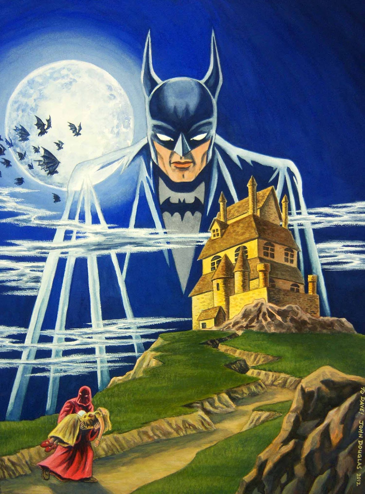
And here's my version:
I did this as a (belated) birthday present for a friend of mine, as he is a fan of Batman. Come to think of it, I send him some drawing/painting that is Batman-related EVERY birthday... I wonder if he is getting sick of them, yet? Well, if he is, he can just use 'em for starting his fireplace, or to keep himself warm on those cold, winter nights in Ohio. :-)
For some reason, the blue in the sky kept shooting a little brighter than the finished painting. I'm gonna blame my camera for that one. :-)
For some reason, the blue in the sky kept shooting a little brighter than the finished painting. I'm gonna blame my camera for that one. :-)
Here's the process, for those even mildly interested...
* * * * *

STEP ONE: Here are the pencils. This time around, I used a sheet of 140# Arches Cold-Press watercolor paper. Cold Press paper is a little more rough than I normally use, as I prefer a smoother drawing and painting surface. But, I bought a few sheets to see if I liked it or not. I generally like Arches, but I think I will generally stick more often with the Hot Press surface.
* * * * *

STEP TWO: I painted over the pencils in a light wash (darkened here so you can actually see 'em) so I could erase the pencils out. I usually don't like the pencils showing through if I can help it, and they can blend in with the painting and make the colors a little muddy.
* * * * *

STEP THREE: I did a light wash to start laying in some basic color.
* * * * *

STEP FOUR: More painting... Starting to work on the forms and modeling a bit more, adding some shading.
* * * * *

STEP FIVE: Even more watercolor painting...
* * * * *

STEP SIX: This is where I was last week "On the Easel".
* * * * *

STEP SEVEN: Here is the finished painting. First, I added a little more texture to the grassy areas with a fan brush and some light green and dark green gouache. I also tried--with moderate success--to fix the graduation of color in the sky. It is still a little streaky, but every time I would try to fix it, it would still look streaky. Ah, well, one of the problems with watercolor/gouache, sometimes. I'll just have to call it good, for now.
I pushed some darks/shadows and went back in with some white gouache to the clouds/fog/mist to break up the edges so they didn't seem so "cut out". I also had finally gotten around to adding the bats in the air; I'm still "iffy" on that part. I may either remove a few, or add some more. I also moved the robed guy's right hand a little bit. It was really weird, before; now it is just a little weird.
I also decided to leave stars out of the picture, as I think it would have been a little too distracting.
I also decided to leave stars out of the picture, as I think it would have been a little too distracting.
* * * * *
Watercolor and gouache on 12" x 16" Arches Cold Press (140#) watercolor paper.
.
Hey Johh, this cover looks great. Can I post it on Covered?
ReplyDelete"Johh"? I mean "John". Typing too fast.
ReplyDeleteHey, Robert! :-)
DeleteThanks and Absolutely! Let me put the logo info on it and I'll submit it to you... Probably tomorrow.
For anyone out there who hasn't already, go IMMEDIATELY to Robert's Covered Blog: http://coveredblog.blogspot.com/
Great! Thanks.
ReplyDeleteHey John Just saw this on Covered. It looks great. I just wanted to tell you that I really appreciate your reliance on traditional media, something that's getting rarer these days, it seems. Good work!
ReplyDeleteThanks Max! :-)
DeleteI must say it is NOT for lack for trying. So far, I haven't been able to do much more than colorize/correct a few things and a bit of dabbling with digital art. I think I am FINALLY getting to the point where I am gonna get a nice digital tablet to work on. (I currently use a Wacom ET-0405-U, which is so old I have to use a Window's Vista driver to run it on my Win7 machine.)
All that said, I still prefer the tactile feeling of working on paper or canvas, holding brushes/pens/charcoal/paint. And I probably always will.
P.S.: I meant to reply to your REPANELED post that Fantagraphics put out a book of Fletcher Hanks stuff: "I Shall Destroy All the Civilized Planets" I checked it out from our local library and enjoyed it for how surreal and primitive it was.
You have some GREAT stuff on your Blog, btw. :-)
John, thanks! Ooo, I'm going to have to lay my hands on that Hanks book. What a great title. Yeah, I'll probably always do all my prelim work/drawing with traditional media as well, it's the tactile quality, like you say. I'd prefer to color in the 'real world' too, but I'm still finding my way in the graphic field. Watercolors are a lot of fun though.
ReplyDeleteOuch on the tablet. I've got a fairly small Wacom Bamboo one that works well enough, but upgrades are always nice!