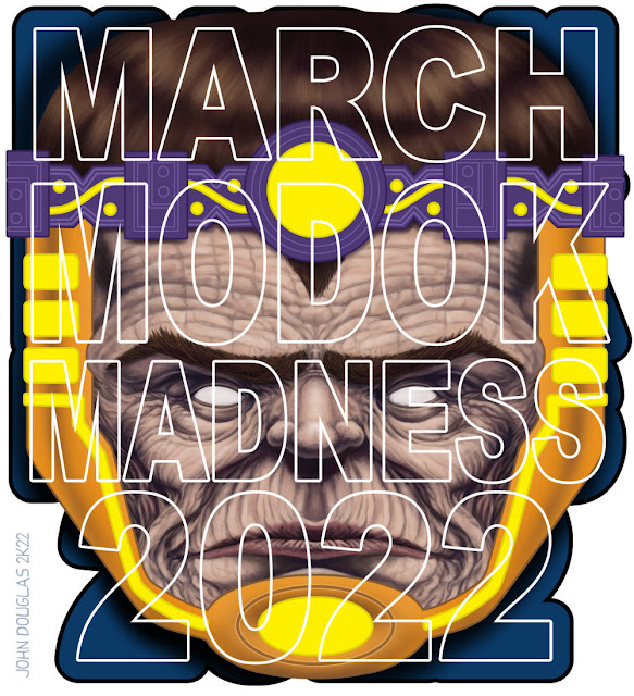
March M.O.D.O.K. Madness 2022
(Mental Organism Designed Only for Killing)
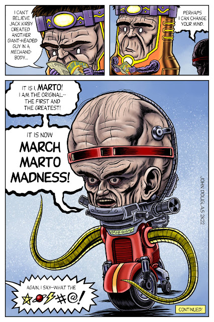
Alas, it's the final submission to the March M.O.D.O.K. Madness Blog for 2022. I still had about a half-dozen or more ideas for M.O.D.O.K. that I just didn't have time to get to this year--so here's looking to next year.
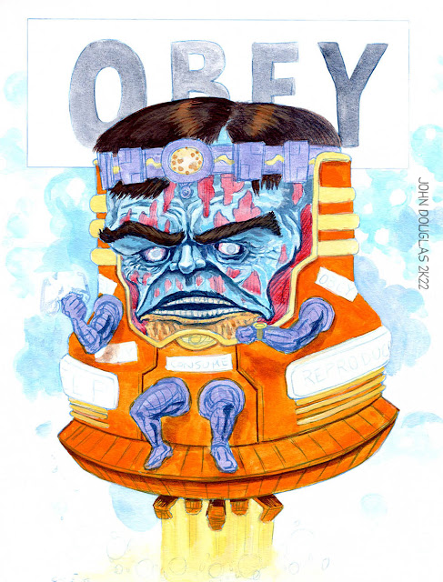
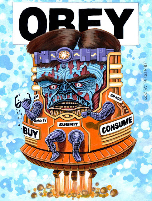
This time around, it's M.O.D.O.K. as the giant, floating head from the 1974 movie, "Zardoz". It actively earns it reputation as a strange, oblique, and did I say strange? film. It's best known for the meme-able picture of Sean Connery wearing what looks like a red diaper with matching bandoliers while holding a pistol. Another famous bit from the movie is where the giant, stone head floats over the landscape intoning "The gun is good. The penis is evil." while it vomits up rifles and bullets. So, it has that going for it. If you're into weird movies, this is one.
I considered doing Captain America ala Sean Connery's red diaper, but it would have been a little too small at scale. Well, that and was running out of time. Although, maybe I have a half-dozen +1 ideas for next year. Hmmm...
* * *
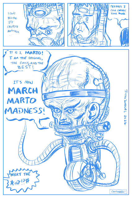
STEP ONE: Here's the original, 30-second quick doodle that became the idea for digital painting which was done in the digital margins of the page I was figuring out the "Marto Saga" (see previous posts... or the next one tomorrow where I combine 'em all together and include the original notes and behind the scenes buffoonery). Not that the idea was all that grand... it was just "Hey, what if one if that giant head from "Zardoz" (1974) was shaped like M.O.D.O.K.?" So, I guess I can't claim it's all that deep of an idea.
* * *
STEP TWO: In ArtStudio Pro, I created a document of 2048px x 2732px @ 300dpi on a tan colored canvas. Then, I used on of the digital oil painting brushes and just did a quick, general layout with the background on one layer, the head on a separate layer, and the poorly scrawled lettering on another (which was just used as placeholder for the composition until I could do the "real" lettering later on in Clip Studio Paint). Hmmm, I should do these real quick studies more often--they are really good practice.
* * *
STEP THREE: This one is the second pass with ye olde digital brushes, where I'm tightening up the painting and working in some details. Oh, and for the word balloon, I thought having it be 100% white was just too distracting, as the rest of the digital painting was full of grays and generally duller hues, so I went with a 50% opacity.
* * *
STEP FOUR: And here's the finished digital painting. I quick-exported the images as .png files for minimal loss of image quality (well, without resorting to a ginormous file size), which I then opened in Clip Studio Paint so I could put in the lettering, which I then exported again--this time as .jpg's. Yeah, it's a weird process I setup for this one, but it worked, I guess.
* * *
This was done digitally in ArtStudio Pro on the iPad, with an assist in Clip Studio Paint.
.


