Friday, March 30, 2012

Harley Quinn & The Joker

This is my submission to the SuperPunch Blog, which I visit regularly.  They are having a contest to create a mock-up of a movie poster based on a DC character and win a DC Chess Set, so here it is.


Here's the process:

* * * * *


STEP ONE:  As usual, I used a mixture of gesso and size (glue) to prime a 10" x 15" Crescent Illustration Board (#215).  I then drew out the image with a blue pencil, as it seems to smear a little less when I'm working with it.  I didn't have a reference for Harley Quinn at the time I sketched it, so the head dress is a little off character.  I also didn't bother to use picture references for the painting, either, so I suppose that is fitting.  I also wasn't quite sure what I wanted to do with Harley Quinn's hand, so I left that sort of vague at that moment.

* * * * *


STEP TWO:  I did some black-and-white wash underpainting, trying to determine some vague modeling for the figure.  For complaining about the concept of underpainting in some previous posts, I sure seem to use it a lot.  Anyway, I then started laying some acrylic color over top the black-and-white washes.  Also, I didn't feel the Joker's eyes were quite "crazy" enough in the pencil drawing, so I tried to correct that a bit.  And I still wasn't sure what I wanted to do with Harley's other hand not holding the giant hammer.

* * * * *


STEP THREE:  Here's the finished painting.  When I took the picture, there was a bit of glare on large chunks of the background of the painting from the lighting (you can sort of see it in the previous picture in STEP TWO).  So, I decided to use the Dodge-and-Burn tool in PhotoShop to darken and burn-out highlights for the background, rather than just use the paintbrush to give it a single color.  That seemed to work.  And, I **FINALLY** decided to give Harley Quinn one of those guns with a "Bang!" flag in it.  It seemed in character.

* * * * *


STEP FOUR:  I added the lettering in PhotoShop for the faux poster and submitted it to SuperPunch.

* * * * *

Speaking of the SuperPunch Blog, I was in one of their Illustration Roundups for February 21, 2012 with my "Watchmen: The Squid" cover.  It was very surreal seeing my stuff on someone else's blog (with credit AND a link to my blog--that's especially nice).  Especially as it is a blog I read every week or so and I wasn't expecting it at all...  Cool!

- - - - - 

This was done with acrylic paint on 10" x 15" gessoed Crescent Illustration Board

Friday, March 16, 2012

ROM: Spaceknight #1: Page Recreation

ROM: Spaceknight #1, Page 1

Here is the original 


And here is my recreation of the page:


I have very fond memories of ROM: Spaceknight--a comic from my misspent youth in the early 1980's, so I wanted to do another ROM painting.  The "Arrival" scene was always one of my favorites.

For those who are interested, here is the usual process...

* * *


Step One:  First, I primed a 15" x 20" piece of #215 Crescent Board with a mixture of size (glue) and gesso.  Then, I measured off the 12" x 16" painting area, doing the panel lines in Sharpie.  For the series of three panels at top, I extended the panel lines outside the painting area, as I was pretty sure the panel lines would be painted over (I was right, and the panel edges were, indeed, painted over.)  :-)

I then used a blue-lead pencil to draw out the page. I used to do a lot of drawings with blue-line for pen-and-ink work and always liked it.  I recently found one of my blue pencils and decided to use it.

* * *


Step Two:  I begin by laying down some color with acrylic paints...

* * *


Step Three:  More painting...

* * *


Step Four:  I taped off the panel series at the top of the screen.  I painted the edges with some clear acrylic medium to keep the edge as sharp as possible and to prevent paint from bleeding under it.  For the space nebula effect, I used a spray bottle of water and white paint and built up several layers of wet-on-wet paint.  When it was dried, I went over top of it with some watered down blue paint to color it.  Lastly, I took some black paint and reworked some of the edges.

Also, I wasn't paying attention and somehow got it in my head that the second panel was showing ROM entering the Earth's atmosphere, but after I read the caption again, I realized it should be much closer to the ground.  Of course, I didn't realize this until I was finished painting the panel with Earth from space (including clouds and everything) and had to redo the whole thing.  Sigh...

* * *


Step Five:  Finished painting!  I repainted the second panel, finished up some of the fire effects (well, some of them could be better, IMHO), and pushed some of the shadows and highlights.

* * *


Step Six:  I added lettering in PhotoShop and called it DONE!  I also sent a copy of the last panel on to Anthony with the Re-Paneled Blog.

* * *

This was painted with Acrylic on 12" x 16" sized and gessoed #215 Crescent Board

.

Thursday, March 8, 2012

On the Easel - March 8, 2012 - Rom: Spaceknight

On the Easel - Rom: Spaceknight Page Recreation

Greetings!  I just got back from a bit of an extended vacation, so I'm still trying to catch up on all sorts of other, random stuff.  So, this posting is a bit of a cheat, but here's what's on the easel at the moment: a page recreation of Rom: Spaceknight #1, page 1


I may make this a semi-regular feature, if there is any interest.  First, it is pretty easy to just take a picture of a work-in-progress and post it, so it can allow me to post more often (albeit, it is somewhat inflated and a bit of a cheat, as mentioned above), but I am also curious what other people are working on.  I'm thinking particularly of Ashley Wood, who often posts picture of what he has on his easel at the moment. 

I'm hoping to have it finished next week and have the process posted.  So, we'll see how that goes... :-)

.

Thursday, February 23, 2012

RELAUNCHED - Watchmen Too: The Squid

Watchmen Too - The Squid


With the new Watchmen sequels/prequels being launched by DC (I'll give 'em a shot and see what happens), the great Relaunched site is doing their own versions of Watchmen Too.  Being such a big fan of Watchmen, I thought I'd play along. 

If you ask me, one of coolest characters from "Watchmen", after Dr. Manhattan and Rorschach, was The Squid--which is why I was so disappointed it didn't get a chance to be seen in the movie... well, aside from the acronym S.Q.U.I.D., but that really doesn't count, IMHO. 

Here's the text portion of my story submission:

Engineered from the cloned brain of a telepath, The Squid is the centerpiece in Adrian Veidt’s plan to save the world from itself.

Within the tank, The Squid grows, reaching self-awareness and begins to develop its burgeoning psychic powers.  The Squid learns Veidt is planning to teleport it into the heart of New York City, killing millions, with the hope of preventing World War III and saving billions.  The Squid is to be the savior of mankind, a role it gradually accepts.

Using its growing psychic abilities, The Squid begins to direct Veidt's geneticists how to build a better monster and correcting any errors they make.  It also telepathically suggests to Veidt how best to carry out his plans, as well as people who may stand in his way--and how he may have to deal with those people.

The Squid was created by Alan Moore and Dave Gibbons.

But, you may be asking yourself, how did The Squid "influence" Veidt before he was created?  Just to tie everything up in a nice, little bow: part of ending to the story would involve The Squid using the time-traveling particles, Tachyons, to send a telepathic message to Veidt back in time, giving him the idea to build the Squid in the first place. The Squid also suggests that The Comedian will have to be killed when he finds out about it, which starts "The Watchmen" storyline going in the first place.

Well, on the the steps used to create this monstrosity...  :-)

* * * * *


STEP ONE:  I used a 7-1/2" x 10" piece of 102 Crescent Illustration Board, primed with a mixture of size (glue) and gesso.  I then did the painting from black and white acrylic paint.  Once finished, I through it on my scanner and imported it into PhotoShop.
* * * * *


STEP TWO:  In PhotoShop, I created a new layer set to "Multiply" and laid down the flat colors.

* * * * *


STEP THREE:  On the "Multiply" layer, I added highlights and shadows (Save often, kids!).  On a new layer, I also added the highlighted reflections on The Squids eye.  I also used the "Blur" filter to the sides around the eye to shift focus to the eye, itself.

* * * * *


STEP FOUR:  I cropped the cover a little on the sides and added the logo and side panel to bring it in line with the "Watchmen" prequels/sequels and called it "Done!"

* * * * *

Acrylic paint on 7-1/2" x 10" Crescent illustration board digitally colored in PhotoShop.
.

Sunday, February 19, 2012

The Breakfast Club (Count Chocula)

Count Chocula 


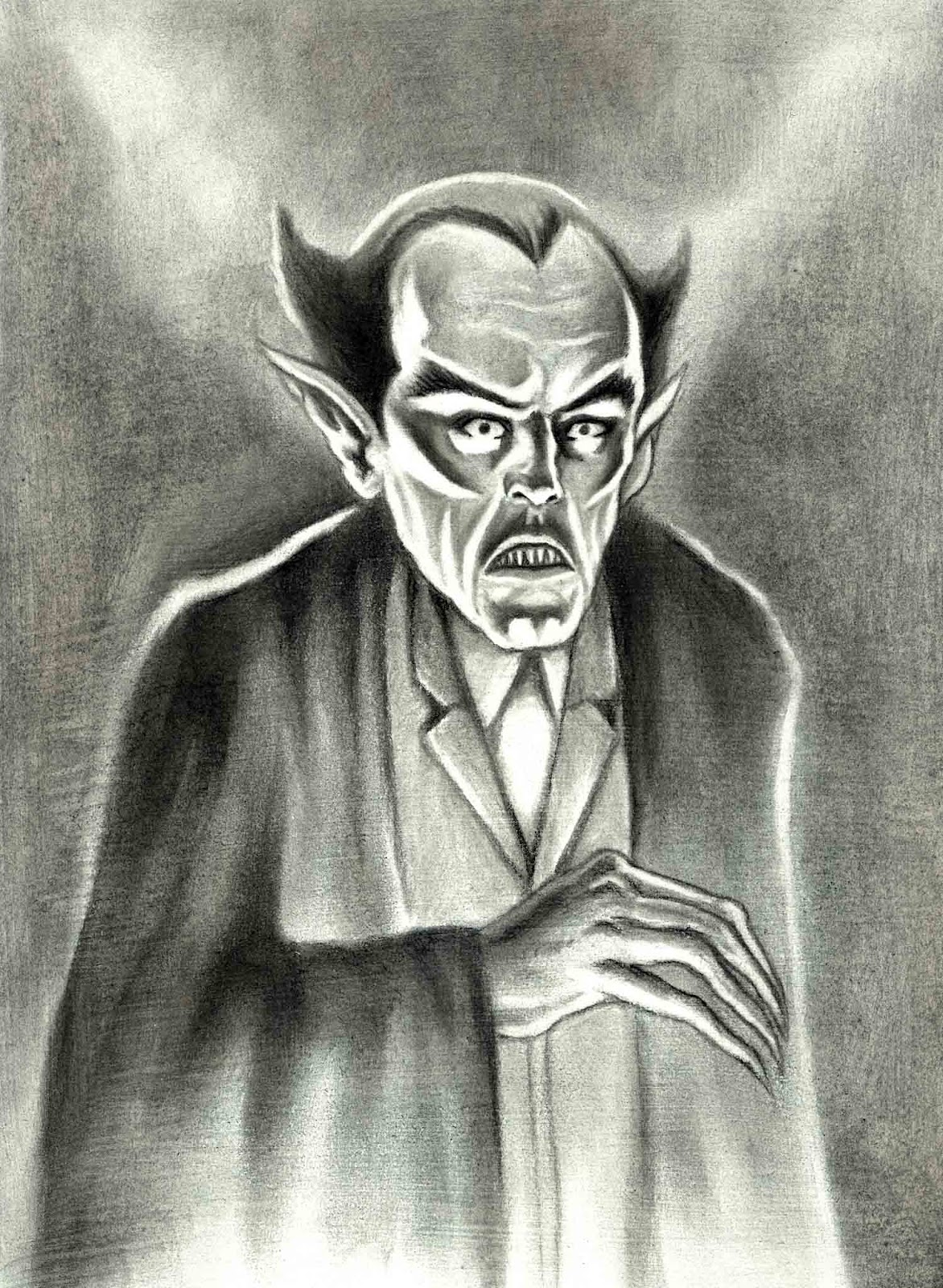
Next up for the Monster Cereal characters, here's Count Chocula.  I had re-watched the 1922 classic, "Nosferatu", this past Halloween (IMHO, one of the creepiest versions of a vampire yet put on screen), so it was obvious for Count Chocula to be modeled after him, of course.  As the movie was relatively fresh in my mind, I didn't bother with any photo references this time around, either.

For those interested in the process, well, you know the drill... :-)

* * * * * 


STEP ONE:  I used a mixture of gesso and size (glue) on a 5" x 7-1/2" piece of Crescent 102 illustration board.  I then drew out the image with vine charcoal, charcoal pencil, and carbon pencil, using a kneaded eraser to lift out any highlights, or to lighten an area (although, many times, I use the kneaded eraser to draw almost as much as my pencils/charcoal).  Once finished, I imported it into PhotoShop.

* * * * *


STEP TWO:  In PhotoShop, I created a new layer set to "Multiply" and did a linear gradient from a lighter brown on the bottom to a darker brown on the top.

* * * * *


STEP THREE:  To keep everything monochromatic, on the gradient layer I did highlights with light browns and white, and shadows with darker browns.  I really tried to push the darks and lights, to give it more of a sense of forced drama--trying to give it a little bit of the movie "Nosferatu" feel to it.

* * * * *

This was done with charcoal and carbon pencil on a 5" x 7-1/2" Crescent 102 illustration board, then colored digitally in PhotoShop.

.

Friday, February 10, 2012

The Breakfast Club (Booberry)

BooBerry


Continuing on with the re-imagining of the Monster Cereal characters, here's BooBerry.  I pictured him as more of an undead zombie/ghost in a rumpled fedora and bow tie.  Again, no real photo references and, again, it probably shows.

Here's the process for those who are interested... And, if you aren't, why are you still reading this?  :-)

* * * * *


STEP ONE:  Once more, I used a mixture of gesso and size (glue) on a 5" x 7-1/2" piece of Crescent 102 illustration board (I have a bunch of 10" x 15" pieces that I cut into quarters).  I then used vine charcoal and carbon pencil to draw out BooBerry.  To give it more of a ghostly/ethereal look to it, I left a few more lost and softened edges, and also left many areas in low contrast.  Once it was done, I scanned it into my computer and imported it into PhotoShop. 

* * * * *


STEP TWO:  In PhotoShop, I created a new layer set to "Multiply" and did a linear gradient from a lighter blue on the bottom to a darker blue on the top. 

* * * * *


STEP THREE:  Next, I did some highlights with white and light blue on the gradient layer, along with some darker blue shadows.  Finally, I created a new layer on top set to "Normal" and used white to push some highlights on his face.

* * * * *

This was done with charcoal and carbon pencil on a 5" x 7-1/2" Crescent 102 illustration board, then colored digitally in PhotoShop.

.

Thursday, February 2, 2012

The Breakfast Club (Frankenberry)

Frankenberry


One of the ways I'm hoping to do more posts on this blog is to do little things between the bigger projects I'm currently working on.  While doodling, I thought it would be amusing to do a re-imagining of the Monster Cereal characters; in this case Frankenberry as a literal (literary?) Frankenstein's Monster.  

I didn't bother with a reference picture in this case (and it may show), but I think it has an almost Fritz Lang sort of feel to it.  

Here's the process for those who are interested....

* * * * *


STEP ONE:  I used a mixture of gesso and size (glue) on a 5" x 7-1/2" piece of Crescent 102 illustration board.  Then I drew Frankenberry with charcoal and carbon pencil.  The gesso/glue mixture had a good tooth to it so the charcoal worked well.  Also, you could really lift off the charcoal if needed and erase almost back to the white underneath.  In this case, it was small enough to throw on my scanner and import it into PhotoShop.

* * * * *


STEP TWO:  In PhotoShop, I created a new layer set to "Multiply", which will save the line work and shading while overlaying color over top.  I did a simple linear gradient from a light magenta on the bottom, to a darker magenta on the top to match the lighting from below.

* * * * *


STEP THREE:  Next, I did some highlights with white and light magenta on the gradient layer, pushed a few shadows with a dark magenta on a separate "Multiply" layer, and a few little touch-ups and final highlights on the top layer set to "Normal".  I figured it was good enough and here it is.

* * * * *

This was done with charcoal and carbon pencil on a 5" x 7-1/2" Crescent 102 illustration board, then colored digitally in PhotoShop.

.

Saturday, January 21, 2012

Killing Joke - Cover Replica

Batman: The Killing Joke
By Alan Moore and Brian Bolland


Here's the original by Brian Bolland

* * *


Well, I **FINALLY** finished my big project: a 20" x 30" recreation of "Batman: The Killing Joke".

Unfortunately, I was in a hurry and snapped the picture about 10 minutes before I took it out the door to deliver; it looked just fine on the thumbnail preview on my camera, but when I got the picture ready for upload, the colors seem washed out and there was a reflection on top.  Alas, PhotoShop can only manipulate so much before the fixing in one spot completely distorts another.  Sigh...  Oh, well. I guess the pic is good enough for our needs.  :-)

Anyway, for those who are interested, here's the step-by-step:

* * *


STEP ONE:  As I usually do for these cover recreations, I glued down a 22" x 30" sheet of 140 lb. Stonehenge paper (100% cotton rag) to a 20" x 30" hardboard and trimmed off the excess paper.  I then used a mixture of size (glue) and gesso to prepare the painting surface.  I drew out a 2" x 2" grid and started drawing the cover.

* * *


STEP TWO:  After getting the pencils and layout finished, I did some outlines in black acrylic and filled in large areas so I could still see it after I started laying in colors.  It almost looks like a Frank Miller drawing at this point.  Either that or a "Scarface" poster.  :-)

* * *


STEP THREE:  Next, comes the flat colors in acrylic paint.  I choose the color scheme used in the Bolland-colored 20th Anniversary Deluxe Edition.  And, once again, I must ask if it has really been 20 years since I first bought my copy of "Batman: The Killing Joke", hot off the shelves?  (Of course, I also got the 20th Anniversary Deluxe Edition, as well.)  Time flies...

* * *


STEP FOUR:  I next added some shadows and highlights on the colors.  I tried several times, after LOTS of trial-and-error (mostly "error", alas) to mix the paint for all the changes in value and try to match the air-brush techniques used in the PhotoShop coloring of the color.  Sometimes acrylic can be a bit temperamental, streaky and difficult to blend... and trying to match colors after they dry can be quite a pain.

However, in this case I got an idea to use a drybrush technique, as I don't have an airbrush.  I used a No. 14 round hog-haired brush, dipped it in the paint color you want to use as the highlight/shadow, then brush off most of the paint with a newspaper or some other paper leaving a little bit of paint remaining on the brush.  Then you lightly brush the remaining paint on the picture and slowly build up lights and darks.  In my humble view, it looks a lot like an airbrush effect without actually having an airbrush.

* * *


STEP FIVE:  Lastly, it was time for the linework.  Lots and LOTS of linework.  Almost all lines were done with a No. 3 and No. 4 round brush, with a mixture of black acrylic paint and ink.  I did use an Ultra-Fine Sharpie for some of the straight edge and circle templates used on the camera.

Normally, I also include all the lettering on the cover and the logo.  However, in this case I decided to leave off the logo, with the image of the Joker just holding the camera and saying "Smile!".  It's so iconic, I didn't think many people would miss the logo.  I called it done (FINALLY!), sprayed the painting with an acrylic sealer, and took it in to my pal, Jim. 

* * *

This was done with acrylic paint on 20" x 30" gessoed Stonehenge paper glued to hardboard.
  
.

Friday, January 13, 2012

Happy (Belated) New Year!

HAPPY (Belated) NEW YEAR TO ALL!


Well, sorry I'm a little late about this, but I wanted to get SOMETHING posted for the New Year.  As far as I'm concerned, 2011 can take a running kick to the groin.  Make it to two or three...  Good riddance!  If the Earth ends in fire this year, as some are predicting, it will STILL be a modest improvement, methinks.  Ah, well...  Here's to the New Year being much better than the old...  :-)

My New Year's Resolution is to post more often on my (mostly) Comic Book Art Blog.  Speaking of which, I am planning on posting my big project next week, which it feels like I've been working on forever... (HINT:  For all those vaguely interested  it's a 20" x 30" cover recreation with the word "Smile!").  :-D

And, of course, for those interested in the process, see below:


  First, I did the pencils in non-photo blue...

* * * * *


Next: I did the inks with a No. 5 Round Brush and Ink.  I then scanned it into PhotoShop and did some really QUICK coloring and called it "Good!"  Nothing fancy... :-)

* * * * *

This was done with pen-and-ink on 9" x 12" Strathmore 300 Bristol Board (100#) and colored in PhotoShop.

.

Monday, December 26, 2011

Happy (belated) Merry Everything!

I hope everyone has a Happy Merry Everything this holiday season!

In the spirit of the season, here is an old, old cartoon I did over 20 years ago which was published in "The Comics Buyers' Guide" (the January 12, 1990 issue, to be exact), which I scanned in and colored in PhotoShop.


This was done with pen and ink on 5-1/2" x 8-1/2" paper and colored in PhotoShop

.

Friday, December 2, 2011

Repaneled: Animal Man #19

Animal Man #19 
by Grant Morrison, Chas Truog, and Doug Hazelwood

Yet another submission to Anthony's delightful Repaneled Blog.  Poor Anthony has to be getting sick of my constant spamming of his Inbox... :-) 

Here's the original: 


Here's my repaneled version:


"Animal Man" was one of my favorite comics (along with "Doom Patrol") back in the late 80's (holy crap, can it REALLY be that long ago?) and, being a sucker for meta-fictional stories, the entire story arc where Buddy Baker/Animal Man discovers he is a comic book character (#19 - #26) was right up my alley.  This moment is when, after taking peyote and tripping out, he turns to the reader and says "I can see you!".  Or, in this case, the blog reader, I suppose.  ;-)

Overall, I felt it was a brilliant run and did a much better job of setting up (and resolving) the "Second Crisis" than all of "Infinite Countdown to Final Crisis" ever did, IMHO.  Sure, "Final Crisis" had some cool stuff in it, but the Second Crisis in "Animal Man" was much better, more enjoyable, and brought back the fun, long gone characters for a while (as well as many new ones). 

* * *


Step 1:  Here's the pencilled page on 11" x 15" Stonehenge 140# paper.

* * *


Step 2:  Next up, I did some under painting to set up where the shadow would be on the face, using a mixture of Ultramarine Blue and Burt Sienna (it makes a great neutral color), as well as the under painting colors for the lips, eyes, and hair.  I also erased all the pencils, since they tend to get washed out with watercolor and can gray out some colors.  Gee, at this stage he almost looks like the illegitimate offspring of the Joker and John Constantine...  :-)

* * *


Step 3:  I added a wash of skin tone over the face, which gave me a sort of base coat to the rest of the picture, which I could then begin building on and finishing.

* * *


Step 4:  I finished up the shading, did some work on the hair and eyes, and generally tried to finish stuff up.  I intentionally left the t-shirt as a sort of line drawing, as I felt the contrast between the shaded, painted face and the line drawing of the shirt tied into the story and sort of amused me.  That and it saved me a little bit of time painting.  :-)

* * *


Step 5:  I imported it into Photoshop, deleted the paper background, and added the lettering (copied directly from a scan of the page). There are a few things which could have been better, now that I look at it: The teeth, for example, should be shaded a bit more--I think they stand out a little bit too much.  The eyes probably need some bottom lashes, which I completely overlooked (Ha!  Unintentional pun!) until it was too late to fix..  But, maybe that would have looked weird, too, ala Alex from "A Clockwork Orange".  And the eyebrow on the right-hand side bothers me a little bit.  Oh, well... Live and learn!  Well, live, anyways...

This was done with watercolor on 11" x 15" Stonehenge 140# paper.

.

Wednesday, November 9, 2011

Replaneled: The Eternals #7, Page 18

REPANELED SUBMISSION: The Eternals #7, page 18


Originally drawn by Jack Kirby and Mike Royer

* * *


Here's yet another submission of the delightfully fun REPANELED Blog.  In this case, it is from Jack Kirby's 1977 series "The Eternals", issue 7, page 18.  I found most of the series run in a back issue box when I was in my late teens and scooped them up.  Grant Morrison was beginning his run on "Doom Patrol" and "Animal Man", so I thought I was used to seeing crazy-imaginative ideas on the comic page.

While Morrison is still one of my favorite writers today, the ideas put forth by Kirby are truly astonishing in their scope and grandeur.  In this case, it was the story of space gods (the Celestials) returning after millennia to check up on their genetic experiments (ie. Humans, Eternals, and Deviants).  One of the Celestials, Arishem, had a symbol on his thumb which would end the world when activated if the experiment (ie. Earth) was deemed a failure.  How cool is that?  Later issues include the Uni-Mind--a sort of group-mind of individuals given a literal, psychic form of a collective consciousness.  And that's only the beginning.  Every issue had some new concept in it (and in many cases more than just one) which thrilled and dazzled the imagination.

Sure, the execution of those ideas may have left a little something to be desired--the dialogue was a bit clunky and the stories seemed to shift around and were a bit flighty... but the core ideas within the comics were absolutely amazing.  Morrison, Ellis, Moore, and Millar... Kirby had much BIGGER, cosmic ideas and was doing them a decade or two before they even got started.

There is just something about the dynamism of Jack Kirby's work--both in the art and the stories--which continues to fascinate me and I have grown to appreciate more as time goes by.  He was truly a genius!


As usual, here's the process (click on the pictures to embiggen):

* * *


First, I did a series of 30 second to one minute sketches to work out the composition of the panel I wanted to recreate. I used ball-point pen and/or marker on typing paper, with the images typically being about 2" x 3", give-or-take. In one of the sketches, I had considered putting in a flock of birds flying past Arishem's outstretched arm, but thought it would be more distracting and confusing to the image. The panel was going to be busy enough with all the lettering and the Kirby Crackle and such, so it didn't need the addition of the birds for drama--there was enough going on at it was.

After I decided on the composition, it was time to get painting...

* * * 


STEP ONE:  On a 10" x 15" gessoed piece of illustration board, I quickly painted a generic sky scene...

* * *


STEP TWO:  And all of the interesting parts of the sky were then covered over by the underpainting of the Celestial, Arishem. Sigh... When will I learn? :-)

I did the underpainting in black-and-white to establish the general values (lights and darks) of the page.

* * *


STEP THREE:  I went back in and painted more clouds/sky on the other side of the panel, as I probably should have done in the first place, had I been thinking about it for about 10 seconds.  I also added a bit more detail to the black-and-white underpainting, trying to get the shadows and highlights worked out.

* * *


STEP FOUR:  Here's the final acrylic painting. I painted color over top of the black-and-white underpainting, trying to keep the values matched to what was underneath. I'm not entirely sold on the whole process of doing an underpainting and about half the time I just go straight into painting with color on the board.  But, sometimes, it seems to help.  **Shrug**

* * *


STEP FIVE:  I imported it into PhotoShop and did a little digital tweaking. I added a glow to the face mask of Arishem and the doomsday glyph o his thumb with a Gaussian blur. To do that, I copied the areas I wanted to glow to a new layer in PhotoShop and applied the blur filter. I also added a "Kirby Crackle" on a new layer using the Paintbrush and Eraser tools, then selected the "crackle" and used the circular Gradation Tool going from white to black, and reduced the opacity to 60%.

* * *


STEP SIX:  Of course, most of the Kirby Crackle I spent about 20 minutes figuring out how to create was covered up by the lettering. Again, WHEN WILL I LEARN? And why is the answer to that question always "NEVER!"? Sigh. However, even if you don't wind up using those parts in your art, all of it is good practice, I suppose. :-)

Anyways, I added the lettering, threw an 8-pixel border around it, called it "DONE!", and sent it off to Anthony for his site. Ta da!  UPDATE: It's up at the REPANELED Site today, November 9, 2011.  Thanks, Anthony!  :-)

* * *

This was done with Acrylic paint on 10" x 15" gessoed illustration board with digital alterations and additions.

.