Showing posts with label Joker. Show all posts

Friday, January 31, 2020

Cover Replica: Batman - Harley Quinn #1

Harley Quinn #1


Here's the original "Batman - Harley Quinn #1" cover by Alex Ross.

* * *


And here is here's the cover replica for my pal (and Superman's), Jim, from Jimmy Jams Comics and Games in Winona, MN and La Crosse, WI.

It's been a while since I did one of these replicas... or, is it more accurate to call it a forgery?  Well, I guess I can kinda-sorta justify it as one of those "Master Reproductions", except with Alex Ross cover painting in this case rather than a Da Vinci or Michelangelo.  I also cheated a little bit and enlarged the figures of the painting and left off the logo (I still **HATE** lettering).

* * *


STEP ONE:  I cut a 20" x 30" piece of hardboard, and then glued a 22" x 30" sheet of Stonehenge (#140) paper using acrylic medium, and trimmed the excess paper after it dried.  I then used a mixture of gesso and acrylic medium to paint over top of the Stonehenge paper to prep it for painting.  When that was prepped, I drew a 1" x 1" grid and set to penciling the cover image.  For the pencils, I used a blue lead .07 mechanical pencil to keep the lead from smearing too much.

* * *


STEP TWO:  Here's the first pass with the acrylic paints.  I decided to go more with slightly more colorful version of Harley Quinn, rather than just black/gray and red.

* * *


STEP THREE:  And here is the finished piece--after another 2-to-50 more passes.  I will admit it is a little bit weird and tricky trying to mimic a watercolor/gouache painting with acrylics.  As usual, my camera didn't do the best job; since the painting is so large it is a bit difficult to get the lighting to be uniform from top-to-bottom without sacrificing detailed shading.  In this case, I did the best to split the difference.  Oh, well...

* * *

This was done with acrylic paint on 20" x 30" gessoed Stonehenge paper glued to hardboard.

.

Saturday, February 9, 2019

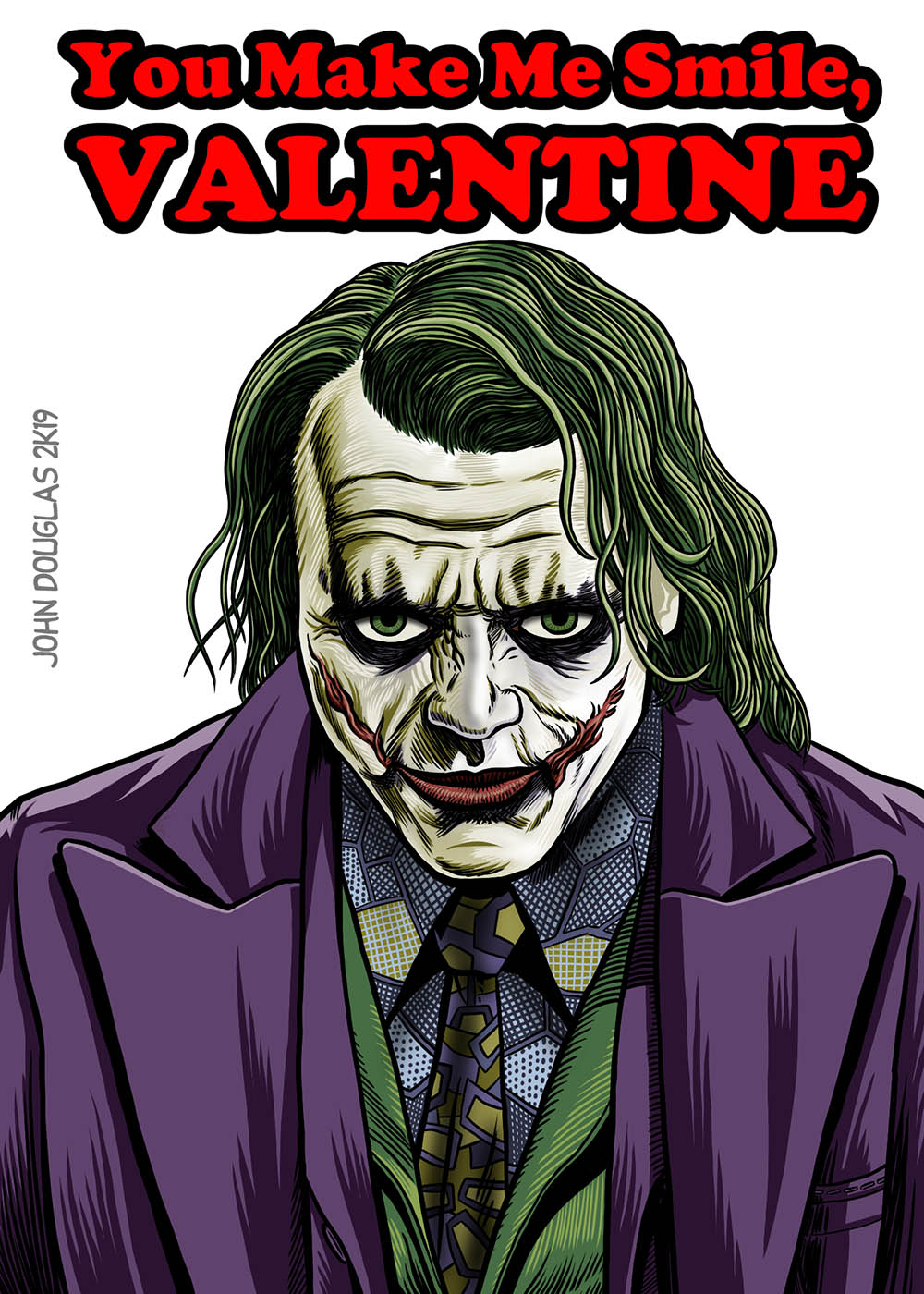
Unwanted Valentines: The Joker from "The Dark Knight" (2008)

Unwanted Valentines: 
The Joker from "The Dark Knight" (2008)


This time around, it is an Unwanted Valentine from "The Dark Knight" (2008).

I will admit I really wasn't sure what to think of the first production stills that were released showing Heath Ledger's version of the Joker.  I was a little apprehensive at first, but when I saw it in the theaters, it was a great performance.  (And, no, I don't buy all the nonsense about how Heath Ledger got in too deep with the darkness of the character and that's why he died.  Nah, that sounds like bubblegum, pop-psych B.S.)

Anyway, his version of the Joker really blew the other versions out of the water.  I thought the high-watermark was Jack Nicholson's version, but he seemed goofy and cartoonish next to Ledger's version.  Normally, I find dark, angsty comics/movies rather boring (I got my fill of those in the 90's, after all).  But, in this case, it really worked, firing on all cylinders--A scary, nihilistic terrorist who has absolutely nothing to lose and wants to watch the world burn.

"Let's put a smile on that face!"  Yikes!

* * *


STEP ONE:  Here are the digital pencils, done on a 1,500px x 2,100px at 300dpi.  I used a blue-line layer in Clip Studio Paint to quickly scribble the image.

* * *


STEP TWO:  The digital inks were also done in Clip Studio Paint over top the digital pencils.

* * *


STEP THREE:  I finally got around to figuring out how to do the same lettering effects in Clip Studio Paint as I do in Photoshop, with the wide stroke/outline around the red letters.  I also used various brushes to color the image.  Then the canvas was re-sized to 200dpi (which dropped the size down to 1,000px x 1,400px) and saved each layer as a separate .jpg. 

* * *

Done digitally in Clip Studio Paint

.

Friday, August 25, 2017

Cover Replica: Batman Adventures - Mad Love

Batman Adventures: Mad Love


Here's the original "Mad Love" cover by Bruce Timm.

* * *


And here is here's the cover replica for my pal (and Superman's), Jim, from Jimmy Jams Comics and Games here in Winona, MN and La Crosse, WI.

Once again, these things seem to take forever.

* * *


STEP ONE:  I cut a 20" x 30" piece of hardboard, and then glued a 22" x 30" sheet of Stonehenge (#140) paper using acrylic medium, and trimmed the excess paper after it dried.  I then used a mixture of gesso and acrylic medium to paint over top of the Stonehenge paper to prep it for painting.  When that was done, I drew a 1" x 1" grid and set to pencilling the cover image.  For the pencils, I used a blue lead .07 mechanical pencil to keep the lead from smearing too much.

* * *


STEP TWO:  Once the pencils were done, I began to paint the large areas with acrylic paint.  The straight lines were done with a Sharpie marker and a ruler, while the other line work was done with a mixture of acrylic black paint and waterproof, acrylic black ink and painted on with a round brush.

* * *


STEP THREE:  Here is about the halfway point with the colors using acrylic paint.  I did some drybrushing for the shading and highlights to give it more of the feel of the original marker coloring.

* * *


STEP FOUR:  And here is the finished piece.  As usual, my camera didn't do the best job, and since it is so large, lighting it uniformly is problematic.  Sigh.

I did cheat a little bit by painting the cards with a darker blue, solid color, rather than trying to replicate the 50% screen effect.  I did try to use a Sharpie marker to recreate the screen, but it just didn't look right, so just went with the solid color, instead.  I guess I could have just used my printer and glued it onto the drawing, but that just doesn't feel right to me.  Ah, well.

* * *

This was done with acrylic paint on 20" x 30" gessoed Stonehenge paper glued to hardboard.

.

Saturday, July 23, 2016

Cover Replica: Batman #251

Batman #251


Here's the original cover of Batman #251 by Neal Adams.

* * *


Aaaaaaannnnddddd, at the risk of having to do another "Mea Culpa" (this time for Neal Adams rather than Brian Bolland), here's the cover replica I did for my pal (and Superman's), Jim, from Jimmy Jams Comics and Games here in Winona, MN.  

Ugh, these things are ginormous and take FOREVER to do!  Unfortunately, they are so large, the color is sort of off a bit and the lighting is a bit strange.  Oh, well.

The process is basically the same as my previous cover replicas...

* * *


STEP ONE:  I cut a 20" x 30" piece of hardboard, and then glued a 22" x 30" sheet of Stonehenge (#140) paper using acrylic medium, and trimmed the excess paper after it dried.  I then used a mixture of gesso and acrylic medium to paint over top of the Stonehenge paper to prep it for painting.  When that was done, I drew a 1" x 1" grid and set to pencilling the cover image.

Once the pencils were done, I began to paint the large areas with acrylic paint.  The straight lines were done with a Sharpie marker and a ruler.  The other line work was done with a mixture of acrylic black paint and waterproof India ink and painted on with a round brush.

* * *


STEP TWO:  Here it with most of the color laid in and the lettering about half-done in spots (less so in others).  Gee, I haven't mentioned that I hate lettering for quite a while!  Mostly 'cuz I'm not all that great at it and it is a painfully slow process for me.  Yeah, yeah, I'll get better with practice.  :-S

* * *


STEP THREE:  Here's the finished picture.  To blend in some of the light-purple effects on the gloves and the Joker's suit, I used a drybrush method with the acrylic paint.  To drybrush, you use a little bit of paint on a larger, round, hog bristle brush, wipe most of it off on a separate piece of paper, then lightly brush the remaining bit of paint across the picture, which gives it more of a soft, almost airbrush effect.  When it was done, I sprayed some Krylon UV-Resistant Archival spray as a varnish.

There are a few wonky areas that bother me, but I was generally pleased with the finished painting.  Mostly, however, I was glad it was done and I can move on to some other stuff, now.  :-)

* * *

This was done with acrylic paint on 20" x 30" gessoed Stonehenge paper glued to hardboard.

.

Wednesday, September 30, 2015

Bat-Joker

Bat-Joker


I did this for a friend as a (belated) birthday present.  (Sorry for the delay, Dave!)

For those of you interested, below are the Step-By-Step for the painting above...

* * *


STEP ONE:  Here are the pencils for the Bat-Joker picture.  I used a water-soluble, blue-gray colored pencil for the drawing.  Originally, there was going to be a mash-up of the Bat symbol and a "J" for Joker, which I pencilled in.

* * *


STEP TWO:  Here is the first pass for watercolors/gouache (I use both interchangeably in most of my paintings), using a #12 size brush.  I still left the the place to do the Bat-Joker symbol, but was still not sure if I liked it or not.

* * *


STEP THREE:  Shortly after I took the last picture, I decided I really didn't like the Bat-Joker symbol, as it looked too much like an umbrella and painted it over.  I pushed some of the darks a little more, worked on some more details, and mostly finished the painting at this step.

* * *


STEP FOUR:  I thought it needed a little more to it, so I masked off the figure and spattered some red gouache in the background.  Also, I mixed some Pro-White and yellow watercolor to make the "Ha! Ha! Ha!" and called it done, lest I keep messing with it 'til his next birthday comes and goes. :-D

* * *

This was done with watercolor on 9" x 12" Fluid (#120) watercolor paper

.

Thursday, November 28, 2013

When Will I Learn...

When Will I Learn (and Why is the Answer to That Question Always NEVER)?

I did a previous black-and-white painting of the Joker with gouache (an opaque watercolor) based on Conrad Veidt from "The Man Who Laughed" (whom the Joker's visual look was based on).  I decided to colorize it as a present to a long-time friend of mine.  I had just finished re-painting it in full color with gouache and was actually pleased by how the colorization turned out, except...

There was a section on top of the painting where the dark red paint refracted the light in a weird way, making it look like the painting was faded from some angles.  So, I was hoping that when I used a matte-based fixative on the painting, it would correct the problem by knocking down the shiny spots.


Fixative is generally used to help keep charcoal from smearing, watercolor from running, and to protect the drawing/painting.  However, I had a problem with some fixative on a watercolor painting I had done a long time ago: I sprayed it on the watercolor to protect it, but it essentially erased most of the painting; it was one step away from just spraying it with white spray paint.  As I couldn't remember the brand name of the spray and didn't have something handy to test it on (OK, mostly I was also just impatient to get the thing fixed and in the mail), I had another great idea!

I had just applied some Matte Medium with an extra-soft paint brush to some vine charcoal drawings earlier in the day with the intent of painting over them later.  I expected a mostly smeared mess, but there was surprisingly little movement of the charcoal.  (It wouldn't have mattered if it had smeared all over, it was just for testing purposes.)  Now, I'm sure you can see exactly where this is heading...

So, I said to myself "Hey, that worked great for something which should have become a gray mess all over... surely it will work even better on watercolor/gouache.  I'm sure any running should be minimal."  Here was the result:


As soon as I touched the brush to the watercolor painting, it began to smear.  Rather large areas of paint broke off and ran across the rest of the painting.  And, sadly, once started, I pretty much had no choice but to keep on going and finish it, trying to brush back as much of the damage as I could.


So, I re-painted the entire painting again (third time's a charm, I guess), this time with acrylic paint.  While the acrylic painting generally turned out well, I still think the colorized gouache was better.  (I also thought there was a bit too much lettering in the first previous one, so left off the "Keep on Smiling!")  Oh, well, live and learn!  Well, live, anyways... ;-)

Now, I'm sure most of you are sick of seeing this painting and have begun to wonder if I can really do anything else, so hopefully it will be the last time it will be featured on this blog.  :-D

* * *

This was done with Acrylic Paint on 6" x 9" Arches Hot Press paper which was glued to Medium Density Fiberboard with Acrylic Matte Medium.

.

Friday, July 12, 2013

The Man Who Laughs: The Joker (Colorized)

The Man Who Laughs:
The Joker (Colorized)


Here's a version last week's painting, Conrad Veidt's "The Man Who Laughs", as The Joker -- Now with color!

* * *

Not much in the way of process this time around...


I put a MULTIPLY LAYER over the gouache painting in PhotoShop, laying in flat colors.  Then starting building up shadows and highlights in the MULTIPLY LAYER, as well as some extra highlights on new layers.

This was done with black and white gouache on 6" x 9" Arches Hot Press paper which was glued to Medium Density Fiberboard with Acrylic Matte Medium.  I then scanned it into PhotoShop and colorized it.

* * *

I would also be remiss if I didn't point out the unintended visual progression of drawing from Venom to Venom-Joker, to Joker-Venom, to the Joker.


I didn't do it on purpose, but I found it mildly amusing when I noticed it.  :-D

.

Friday, July 5, 2013

The Man Who Laughs: The Joker

The Man Who Laughs:
The Joker


Comic Book Nerds (such as myself) have long known the bit of trivia that the Joker is based on Conrad Veidt's "The Man Who Laughs", a silent movie from 1928 based on the novel by Victor Hugo.

I was going to use Conrad Veidt as a model for a Batman Cover remake I am doing for a friend for his birthday and, while searching for picture references, I happened to notice "The Man Who Laughs" was in the public domain and available at Archive.org--and is streaming on YouTube.  I've only seen stills from the movie before and thought this would be a good time to watch the movie.  Besides, I figured it would give me a lot more drawing references for the painting I will be doing.

Conrad Veidt as Gwynplaine in "The Man Who Laughs" (1928)

When you get past some of the acting ticks and troupes of silent movies (I'm definitely not opposed to silent movies--"Nosferatu" is still one of the most terrifying vampires out there, IMHO), there is definitely something affecting in the way Veidt plays Gwynplaine that is winsome and with bits of pathos.  The way he shyly covers his mouth (scarred in childhood by the king to have a permanent smile on his face as a cruel "joke" on his father, just before the father is put to death) and his painful self-awareness of his deformity when interacting with common people is compelling.

Of course, there just just no way to watch the movie without thinking of him as The Joker, of course.  I kept half-expected him to poison the crowds of people with Joker Venom, or Batman to show up at the end... something like that.  :-)

So, anyways, I used the promotional picture above as a practice for the painting I will be doing within the next few weeks if all goes to plan (and it very rarely does, alas).  Here's the process for those who are interested... and even those who aren't.


Here are the pencils.  I used a 6" x 9" sheet of Arches (#110) hot press watercolor paper, which was glued onto a piece of Medium Density Fiberboard with Acrylic Matte Medium.

* * *


Here it is after the first hour or so, done with black and white gouache with a No. 12 size Round Brush.  I just roughly shaped the values and shadows with the large brush.  Gouache is an opaque watercolor paint, so I wasn't too worried if things got too dark in the painting; I could just lift out the color and/or paint over it again if it didn't work.

* * *


Here is the painting after another half-hour or so.  Most of this is just tightening up what was started in the first hour, but there are still plenty of things remaining to be finished.  :-)

* * *


And here is the finished painting.  I did this mostly as a practice piece... and I thought it would be fun.  :-D

I will be posting a colorized version soon.  Probably next week.

* * *

This was done with black and white gouache on 6" x 9" Arches Hot Press paper which was glued to Medium Density Fiberboard with Acrylic Matte Medium.

.

Thursday, June 27, 2013

Joker-Venom Mash-Up

Joker-Venom


OK, I admit it is a joke gone too far... but just ask anyone who knows me and they will attest that when it comes to flagellating expired equus, I'm your guy!  

When I was finishing up the previous post of the Venom-Joker mash-up, I realized I should have Venom's coloration be reversed so he really looked like chalk-faced visage of the Joker that we all know so well.  And, it gave a shot of some extra nightmare fuel to the image, methinks.  Sure, there was Anti-Venom in the Spider-Man comics a year-or-two ago who was a negative image of Venom, but there is also a vague pun using "Joker-Venom", as it the toxin used by the Joker to kill people and leave a smile on their face.

* * *

Here's the black-and-white version.


I took the lasso tool and roughly selected Venom's face, avoiding the mouth.  Nothing too fancy.  Once selected, I went to IMAGES > ADJUSTMENTS > INVERT (also CTL+I), which reversed everything from black to white and vice versa (or should I say vice REVERSA?).  I then cleaned up the remaining areas with a black and white brush until I was happy enough and set about recoloring the face on a MULTIPLY Layer.

Done with a chalk brush in Photoshop and digitally colored.

.

Venom-Joker Mash-Up

Venom-Joker


While working on the Venom picture I did below, the smile on his face reminded me of the Joker.  So, why not just throw some green hair on top of his head as a mash-up/crossover of the two characters?  It struck me as both amusing and vaguely logical.  Although, the hair sort of reminds me more of a crazed Beethoven, rather than the Joker.  (It's funny how hard it is to make the hair look correct if the character doesn't really have ears... :-)

Of course, now that I look at this picture, I thought of another iteration of Venom and the Joker, which I hope to post later this evening.  Because I just **LOVE** beating jokes into the ground...  :-)

* * *

Here's the black-and-white version.


Done in black-and-white with a chalk-brush in Photoshop, and then colored digitally with a MULTIPLY Layer overlaying the image.

.

Friday, March 30, 2012

Harley Quinn & The Joker

This is my submission to the SuperPunch Blog, which I visit regularly.  They are having a contest to create a mock-up of a movie poster based on a DC character and win a DC Chess Set, so here it is.


Here's the process:

* * * * *


STEP ONE:  As usual, I used a mixture of gesso and size (glue) to prime a 10" x 15" Crescent Illustration Board (#215).  I then drew out the image with a blue pencil, as it seems to smear a little less when I'm working with it.  I didn't have a reference for Harley Quinn at the time I sketched it, so the head dress is a little off character.  I also didn't bother to use picture references for the painting, either, so I suppose that is fitting.  I also wasn't quite sure what I wanted to do with Harley Quinn's hand, so I left that sort of vague at that moment.

* * * * *


STEP TWO:  I did some black-and-white wash underpainting, trying to determine some vague modeling for the figure.  For complaining about the concept of underpainting in some previous posts, I sure seem to use it a lot.  Anyway, I then started laying some acrylic color over top the black-and-white washes.  Also, I didn't feel the Joker's eyes were quite "crazy" enough in the pencil drawing, so I tried to correct that a bit.  And I still wasn't sure what I wanted to do with Harley's other hand not holding the giant hammer.

* * * * *


STEP THREE:  Here's the finished painting.  When I took the picture, there was a bit of glare on large chunks of the background of the painting from the lighting (you can sort of see it in the previous picture in STEP TWO).  So, I decided to use the Dodge-and-Burn tool in PhotoShop to darken and burn-out highlights for the background, rather than just use the paintbrush to give it a single color.  That seemed to work.  And, I **FINALLY** decided to give Harley Quinn one of those guns with a "Bang!" flag in it.  It seemed in character.

* * * * *


STEP FOUR:  I added the lettering in PhotoShop for the faux poster and submitted it to SuperPunch.

* * * * *

Speaking of the SuperPunch Blog, I was in one of their Illustration Roundups for February 21, 2012 with my "Watchmen: The Squid" cover.  It was very surreal seeing my stuff on someone else's blog (with credit AND a link to my blog--that's especially nice).  Especially as it is a blog I read every week or so and I wasn't expecting it at all...  Cool!

- - - - - 

This was done with acrylic paint on 10" x 15" gessoed Crescent Illustration Board