Friday, August 31, 2012

Covered: Action Comics #256

Action Comics #256


Here is the original cover by Curt Swan and Stan Kaye.

* * * * *


And here is my version of the cover I submitted to Robert at the Covered Blog.  I was VERY tempted to create this as a watercolor/gouache or acrylic painting in a pulp magazine style, but I just didn't have the time at the moment.  Besides, doing some of the colorized pen-and-ink posts for the Handbook of the Marvel Universe: Reduxe Edition reminded me how fun it is doing stuff "Old-School".  Well, as "Old School" as scanning in an inked drawing and colorizing it in PhotoShop can be, anyways.  ;-)

I have a great fondness for the Silver-Age covers and stories.  They have great creativity with their premise mixed in with an underlying, "goofy" charm which borders on amazing pop-surrealism.

* * * * *


STEP ONE:  I pencilled and inked the drawing on 8-1/2" x 11" cardstock.  Then scanned it in and cleaned it up.

* * * * *


STEP TWO:  I imported it into PhotoShop, created a MULTIPLY Layer over the pen-and-ink image, and then applied the flat color layers.

* * * * *


STEP THREE:  For this step I did a little bit more than I usually do.  I created a new MULTIPLY Layer and did a gradient from white in the center to purple at the edge for a radial focus on the picture.  I erased the gradient over top of Lois, so she would stand out a bit more from the background.  I used the BURN Tool in PhotoShop to darken the edge of the glass bell jar Superman is standing in.  I lightened the two striped on either side of Superman and added a NORMAL Layer to build up a glass-looking highlight with white and light blue.  I then went back to the original color flat layer and started adding lights and shadows.

* * * * *


STEP FOUR:  I added the lettering and called it "DONE!"

* * * * *

This was done with pen-and-ink on 8-1/2" x 11" cardstock and colored digitally

* * * * *

A mildly amusing afterward: I was listening to Kevin Smith's Podcast (SModcast: Episode #221 - Orlando Calrissian--definitely NSFW) while working on coloring this drawing.  He played his Q and A from the Star Wars Celebration IV in Orlando, FL, and mentioned in an offhand way how great it was to be able to direct both Carrie Fisher and Mark Hamill in "Jay and Silent Bob Strike Back"

After Kevin Smith said that, I looked at my drawing and, seeing the giant fist on Superman's right-hand, realized that I had just drawn Superman as the Cock-Knocker -- the super-villain in the movie played by Mark Hamill who, well, the name sort of says it all...


POW!  Right in the nads... :-X

.

Wednesday, August 29, 2012

Covered: Dectective Comics #31

DETECTIVE COMICS #31


A somewhat mildly amusing story about this one...  I wasn't too sure if I was going to submit this to Robert's greatly entertaining Covered Blog or not.  On the one hand, it seems like a good fit for his blog in that it was a re-interpreted cover, but for some reason I was (and still am) mostly ambivalent about this painting.  Maybe I just stared at it too long on my easel, but something about this painting just left me a bit cold so I was still sort of going back-and-forth if I wanted to submit it to Covered.

Anyway, Robert was kind enough to post a comment asking if he could post it on his blog.  Well, that settled that.  I told him I would throw logo on it and send it to him the next day or day after.  Of course, the very day he asked about this painting, he also got another submission of Detective Comics #31.  What are the odds?  We just sort of shrugged our shoulders and decided to publish mine a little bit later since Andy's submission was technically in first. 

For those of you interested in the process, HERE is the link to my previous post on the subject.

* * *

This was done with Watercolor/Gouache on 12" x 16" Arches Cold Press 

.

Friday, August 24, 2012

Birthday Card

Well, to pad my blog a little bit (it was either this or a "On the Easel" posting ;-), I thought I'd post this.  I try to do personalized birthday cards for friends (time permitting).  In this case, I had what I thought was a pretty amusing visual.  The copy... well, I'm not completely happy with it, but thought it was passable.  Oh, well.


I ruled out the panels with a .5mm pen and then used brush-and-ink for the drawing.  I colored it with watercolor over top.  

Click on the pic to embiggen.

* * * * *

This was done with pen/brush and ink and watercolor on 8-1/2" x 11" Strathmore 300 Bristol Board.

.

Friday, August 17, 2012

Wertham (W3RTH@M!)

W3RTH@M!


I came across this while cleaning out a drawer of random stuff and thought I'd post it.  

This was supposed to be an entry for a comic book-related contest a few years back (I think it was something iFanboy was doing just before they relaunched their site, if I remember right).  I found out about the contest the day before it was due, so I whipped this up quick. 

It was supposed to be something about creating a super hero or super villain--something like that.  What better comic book villain than the reanimated, robot corpse of Fredrick Wertham, who almost single-handedly destroyed the comic book industry and authored the poorly-reasoned "Seduction of the Innocent"?  So, I did a leet/1337/133t spelling of his name (y'know, cuz I'm clever like that), gave him a robot body with an undead head, and had him burning a copy of "Action Comics #1.  Comic book evil all the way, baby!

I thought I had it done in plenty of time, however I failed to take the time zone of the contest into consideration and actually missed the deadline by a few hours--it was practically done by the time I found it.  Ah, well. I may yet put W3RTH@M! to use some time in the future.

Speaking of the future, I'm working on a BUNCH of stuff at the moment.  I hope to be posting quite a bit in a couple weeks.  We shall see how that pans out... :-)

* * * * *

This was done with watercolor on 7" x 10" Stonehenge paper.

.

Saturday, August 4, 2012

Handbook of the Marvel Universe: Supreme Intelligence

Supreme Intelligence 


Here is the original entry in the "The Official Handbook to the Marvel Universe".

* * * * *


Here is my version of the Supreme Intelligence to the Official Handbook to the Marvel Universe: REDUX EDITION blog. The Supreme Intelligence, a sort of Kree Hive-Mind of their best-and-brightest, has always captured my imagination.  A hyper-intelligent, giant, floating, tentacled head... I mean, what's NOT to find cool about that?

And, for those interested, here's the process:

* * * * *


STEP ONE:  On a 12" x 18" piece of 70# Dick Blick sulphite paper, I roughed out the Supreme Intelligence in soft, vine charcoal.

* * * * *


STEP TWO:  I finished the charcoal drawing (with an assist from some carbon pencil), pushing the shadows and erasing out highlights.

* * * * *


STEP THREE:  I took a picture with my camera and imported the drawing into PhotoShop.  I adjusted the levels, cropped the drawing, and added a MULTIPLY Layer in PhotoShop.  I then colored over the Supreme Intelligence in a flat, mid-tone green.  For the background, I put in a circular gradient from blue to a red-violet/magenta color. 

* * * * *


STEP FOUR:  I started going back in to the flat color, adding in highlights and shadows to the mid-toned green until I was vaguely satisfied.  I also added some Kirby Crackle to an OVERLAY Layer.  I decided to call it good and sent if off to Jon's Official Handbook to the Marvel Universe: REDUX EDITION blog.

* * * * * 

This was done with charcoal and carbon pencil on 12" x 18" Dick Blick (70#) Sulphite drawing paper, colored in PhotoShop.

.

Tuesday, July 17, 2012

Handbook of the Marvel Universe: Captain Universe

Captain Universe


Here's the original entry from "The Official Handbook to the Marvel Universe".

* * * * *


My next submission to the Official Handbook to the Marvel Universe: REDUX EDITION is Captain Universe.  I always thought Captain Universe was visually interesting; I never saw him in a comic, but his entry in the OHotMU looked pretty cool.  This time, I decided to do a more straight forward drawing, rather than a painting.

 * * * * *


 STEP ONE:  I drew out the picture in the same general pose, but decided to go with a pose which was looking upward.  I did several versions where the pose was nearly the same as Dikto's, looking at Captain Universe nearly straight on and eye level, but they all looked boring when I did it that way.  This pose seemed to work a little better. 

I pencilled it out on 8-1/2" x 11" cardstock, inked it with a few different brushes (mostly various No. 4 size synthetic brushes), then scanned it into PhotoShop.  Hmmmm, I suppose I should have scanned in the pencils before I inked 'em.  Oh, well.  Maybe next time.  :-)

* * * * *


STEP TWO:  I colored all black lines dark cyan, except for the face.  I grabbed a picture of a starfield from the NASA site and added it to a OVERLAY layer.  All the dark cyan areas were filled with blue-colored stars.  I erased the starfield over the body, just leaving the stars on the upper body/head region with stars.

I then added a MULTIPLY layer and colored the flesh-tone over the face.  I also thought the original line for the chin was distracting and out of proportion, so I erased that out.

* * * * *


 STEP THREE:  I did the shading on his face and added/touched up some of the white highlights on his upper body.  I considered doing all sorts of shading on the body and legs to make everything look more reflective, and additional white air-brush effects on the upper body/starfield (and did a little, too--see below).  After noodling around with it for a while, I decided I liked it better without all the extra visual bells and whistles.  So, in this case I left it as a more "clean" drawing.

* * * * *


This is a somewhat alternate version of the picture.  I spent far too long trying to decide if I liked it better with some white, air-brush type effects along the edges of highlights on the upper body.  In the end, I decided "less-is-more" and went with the more plain version.  But, I thought I'd post this one, too.

* * * * *

 This was done with brush and ink on 8-1/2" x 11" cardstock and digitally colored.

.

Friday, June 29, 2012

Handbook of the Marvel Universe: Nightmare

NIGHTMARE


Here's the original entry from "The Official Handbook to the Marvel Universe".
* * * * *

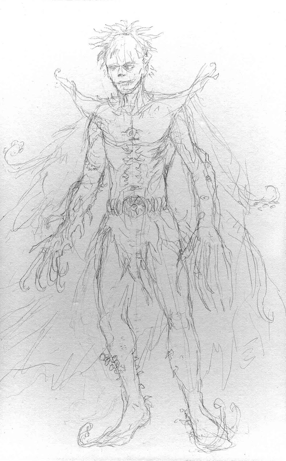
My next submission to the Official Handbook to the Marvel Universe: REDUX EDITION is Nightmare.  I went with a vaguely manga-esque appearance for Nightmare this time around.  I tried to think of a few things which would be creepy enough to be the embodiment of someone called "Nightmare", hence all the extra eyes and teeth, and sharp things.  :-)  This time around, I decided to go with a painted submission, rather than with a more pen-and-ink, cartoony style.

For Nightmare, it was very tempting to just do a picture of Neil Gaiman's SANDMAN as a submission.  ;-)  I did a two-page comic strip in the early 90's of Nightmare complaining about how popular that other white-faced manipulator of dreams is, when he's been around for a much longer time.  You know, "What's he got that I ain't got?" complaints.  
 
 * * * * *


STEP ONE:  Here is the light pencil drawing which I scanned in.  For some reason, the scanned image was a little dark. 

* * * * *


STEP TWO:  Next, I put in an initial wash of color.

* * * * *

STEP THREE:  Then I started tightening up some of the shapes and putting in some darks.

* * * * *


STEP FOUR:  I started to go back in and paint the space around the tentacular cape and work on a few more details.  I also fixed the left leg, which was sticking out a little weirdly.
* * * * *

STEP FIVE:   Here's the finished painting.  Unfortunately, a lot of the paper's texture scanned in for the background, which is  little distracting.  I'll take care of that in PhotoShop.  :-)

* * * * *

STEP SIX:  In PhotoShop, I blurred the background out a bit, since so much of the paper's texture was showing through.  I added  a starfield I got from the NASA on a new layer and deleted it around Nightmare's body.  For the honeycomb in the background, I took a picture of a wasp's nest I had found a while back; I put them in a new layer and set the layer to OVERLAY.  I then softened the honeycomb pattern with the ERASER brush set to 25% Opacity.  Finally, I used the PhotoShop paint brush to push some whites in the various teeth on Nightmare.  I'll call it DONE!
 * * * * *

 This was done with watercolor/gouache on 6" x 10" Stonehenge paper, which I had glued to some hardboard to prevent warping.

.

Thursday, June 21, 2012

Handbook of the Marvel Universe: Karkas

KARKAS


Here's the original entry from "The Official Handbook to the Marvel Universe".

* * *


This was done for a new Blog: Official Handbook to the Marvel Universe: REDUX EDITION, which is dedicated to redrawing each entry of "The Official Handbook to the Marvel Universe".  How could I resist something like that, when it was practically created for me?  ;-)

I used to buy every issue as they came out and I can't tell you how many hours of my (misspent) youth I spent pouring over both the "Handbook of the Marvel Universe", as well as the DC version, "Who's Who".   Both are encyclopedias of comic book characters, included backstories of the characters, detailed their powers, and generally had an entire batch of nerdly goodness I mainlined into my teenage brain.  Good times!

Unfortunately, some of the ones I really wanted (Annihilus, Galactus, Kang, Phoenix, etc.) were already taken (of course), but I was able to grab some more obscure characters I always found oddly compelling and/or visually interesting: High Evolutionary, Celestials, Captain Universe, Aquarian, Nightmare, Moon Dragon, Supreme Intelligence, and Karkas.  So, look forward to some of those in the near future, as well.

I debated what style I wanted to use: Watercolor?  Acrylic?  Pen-and-Ink?  Something more realistic or cartoony?  Well, it is now obvious which way I went with Karkas.  His head is so big in proportion to his body, it is almost impossible NOT to draw him as a sort of big-headed caricature--so I went with it as such.  :-)

* * *


STEP ONE:  I drew Karkas with brush and ink on 8-1/2" x 11" cardstock. 

* * *


STEP TWO:  I scanned the drawing into PhotoShop, set the layer above to "Multiply", and colored the drawing.  As I colored it, I sort of liked the retro feel of the coloring/pen-and-ink, and dropped the whole intricate shading I had started and went with the flat colors.

* * *

This was done with pen-and-ink on 8-1/2" x 11" cardstock, colored digitally.

.

Friday, June 15, 2012

Detective Comics #31 - Cover Recreation

DETECTIVE COMICS #31

Here's the original by Bob Kane:


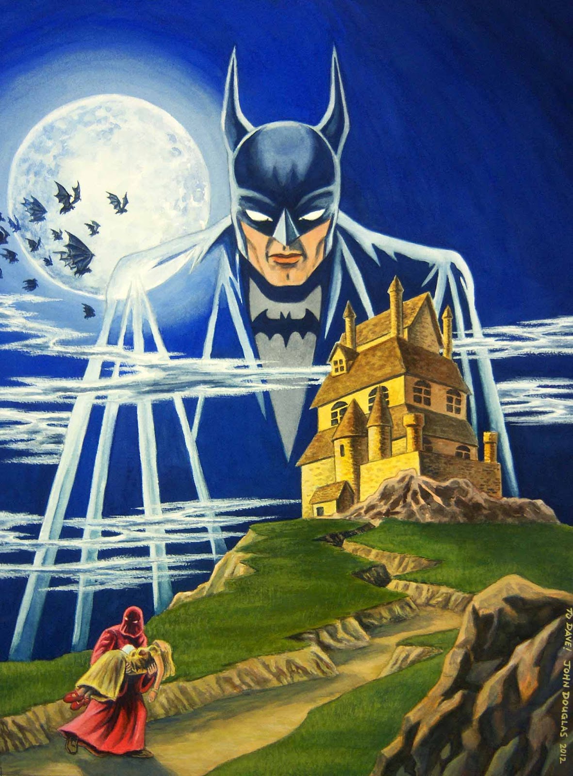
And here's my version:


I did this as a (belated) birthday present for a friend of mine, as he is a fan of Batman.  Come to think of it, I send him some drawing/painting that is Batman-related EVERY birthday... I wonder if he is getting sick of them, yet?  Well, if he is, he can just use 'em for starting his fireplace, or to keep himself warm on those cold, winter nights in Ohio.  :-)

For some reason, the blue in the sky kept shooting a little brighter than the finished painting.  I'm gonna blame my camera for that one.  :-)

Here's the process, for those even mildly interested...

* * * * *


STEP ONE:  Here are the pencils.  This time around, I used a sheet of 140# Arches Cold-Press watercolor paper.  Cold Press paper is a little more rough than I normally use, as I prefer a smoother drawing and painting surface.  But, I bought a few sheets to see if I liked it or not.  I generally like Arches, but I think I will generally stick more often with the Hot Press surface.


* * * * *


 STEP TWO:  I painted over the pencils in a light wash (darkened here so you can actually see 'em) so I could erase the pencils out.  I usually don't like the pencils showing through if I can help it, and they can blend in with the painting and make the colors a little muddy.

* * * * *


 STEP THREE:  I did a light wash to start laying in some basic color.

* * * * *


 STEP FOUR:  More painting...  Starting to work on the forms and modeling a bit more, adding some shading. 

* * * * *


 STEP FIVE:  Even more watercolor painting...

* * * * *


 STEP SIX:  This is where I was last week "On the Easel".

* * * * *


 STEP SEVEN:  Here is the finished painting.  First, I added a little more texture to the grassy areas with a fan brush and some light green and dark green gouache.  I also tried--with moderate success--to fix the graduation of color in the sky.  It is still a little streaky, but every time I would try to fix it, it would still look streaky.  Ah, well, one of the problems with watercolor/gouache, sometimes.  I'll just have to call it good, for now.

I pushed some darks/shadows and went back in with some white gouache to the clouds/fog/mist to break up the edges so they didn't seem so "cut out".  I also had finally gotten around to adding the bats in the air; I'm still "iffy" on that part.  I may either remove a few, or add some more.  I also moved the robed guy's right hand a little bit.  It was really weird, before; now it is just a little weird.

I also decided to leave stars out of the picture, as I think it would have been a little too distracting.

* * * * *

 Watercolor and gouache on 12" x 16" Arches Cold Press (140#) watercolor paper.

.

Friday, June 8, 2012

On The Easel - June 8, 2012 - Batman

On the Easel - Detective Comics #31 Cover Recreation

I know, this is a bit of a cheat, but here's something on the easel at the moment!  It is a (belated) birthday present for a friend (Sorry, Dave!).  I have at least one more pass for most of the painting and put some finishing touches here and there, but I am hoping to have it finished next week and will post the process steps then.  


It is a recreation of Detective Comic #31 in watercolor/gouache on 12" x 16" Arches Cold Press (140#).

.

Friday, May 11, 2012

Mars Attacks!

Mars Attacks!


This time around, I thought it would be amusing to do a portrait of a martian from "Mars Attacks!".  It is more based on the card series, rather than the movie.  But, both are malevolently amusing in their own twisted ways.

* * * * *


STEP ONE:  I used a mixture of size (glue) and gesso and primed a 8-1/2" x 10" piece of hardboard which I had cut down.  I then penciled the image of the martian from "Mars Attacks!" as if he were sitting for a typical portrait pose.

* * * * *


STEP TWO:  I did a quick under-painting of the penciled image in Burnt Sienna.  I almost wanted to leave the painting in sepia-tone, giving it that old-tymey, daguerreotype feel to it.  Maybe I'll revisit this idea in the future...

* * * * *


STEP THREE:  I began laying in some color over the underpainting.

* * * * *


STEP FOUR:  I added finishing touches, highlights, etc...

* * * * *

This was done with Acrylic paint on 8" x 10" sized and gessoed hardboard panel.

.

Tuesday, May 1, 2012

The Breakfast Club (Fruit Brute)

Fruit Brute


Well, I **FINALLY** got around to finishing the last of the Monster Cereals.  For Fruit Brute, I decided to go in an opposite direction.  Rather than a monstrous werewolf, I figured having him as an effete and cultured character would be more amusing.

I hope Limpey isn't too disappointed... :-)

* * * * *


STEP ONE:  To try and keep everything somewhat consistent, I used a mixture of size and gesso on a 5" x 7-1/2" Crescent illustration board.  I drew everything out with vine charcoal, charcoal pencil, and carbon pencil, and used my kneaded eraser to lift out highlights and sharpen any areas which got a bit smudgey (one of the dangers of charcoal, after all).  When I was finished with the drawing, I scanned it into PhotoShop.

* * * * *


STEP TWO:  In PhotoShop, I created a new layer set to "Multiply" and did a gradient from orange to purple.

* * * * *


STEP THREE:  I added the flat colors on the same Layer, which was still set to "Multiply".

* * * * *


STEP FOUR:  Within the flat colors, I pushed some highlights and shadows, flattened the layers, and called it "Done!". 

* * *

This was done with charcoal and carbon pencil on a 5" x 7-1/2" Crescent 215 illustration board, then colored digitally in PhotoShop.

.