Tuesday, March 15, 2016

Happy (Belated) Pi Day!

Joe Pi Says...


It's Joe Pi--one of my favorite characters from the comic book series, "Top 10", by Alan Moore, Gene Ha, and Zander Cannon.  The premise of "Top 10" is that it is like "Hill Street Blues" in which everyone in the population has super-powers.  Joe Pi is a transfer from Turingville and has to deal with discrimination within the precinct, stereotypes, etc.  Given the humor and intelligence of the character, Joe Pi quickly became one of my favorite characters!

HERE ARE SOME HIGHLIGHTS of Joe Pi's first appearance in "Top 10" #11, giving you a flavor of what makes him so great.

Unfortunately, I thought of this a few hours too late to finish it before midnight on March 14, 2016.  However, when I put the last, finishing touch on the cartoon, I checked the clock on the corner of my computer screen; it was March 15, 2016, at 3:14am (CST).  Perfect!

* * *


STEP ONE:  Here are the digital pencils, done on a new 1,000px by 1,400px document.

* * *


STEP TWO:  The digital inks were done mostly with 5pt Hard Brush.

* * *


STEP THREE:  And here are the colors, done on a new Multiply Layer.  Done and DONE!

* * *

This was done digitally with Photoshop.

.

Sunday, March 13, 2016

Mea Culpa, Brian Bolland

Original vs. Replica 
(or Paxton vs. Pullman)


OK, this is a little strange and could almost qualify as shameless self-promotion if it weren't for the fact that, apparently, I've unknowingly become a minor headache to comic art legend, Brian Bolland... 

While checking stats for this Blog, I noticed there were several links from an article on the La Covacha website:

After hitting the "Translate to English" option in my Chrome browser (hey, I barely read and write in English, let alone another language), I read through the article "WTF | THE "COVER" OF THE KILLING JOKE IS NOT OF BRIAN BOLLAND" by Alberto Calvo.  It talked about how, many times, my replica of Brian Bolland's "Killing Joke" cover is used on websites in place of original Bolland's work.

WTF, indeed!

He lays out the basic, obvious reasons for this:

     1. It is not obscured by logos (mostly because I dislike lettering so much)
     2. The images are both online and larger in size than most

I'm also sure a lot of it has to do with some one doing a Google Image Search, seeing my picture, thinking they've found it, and grabbing the wrong one.  Y'know, like how people confuse Bill Paxton and Bill Pullman all the time.  Then, some one else sees that picture labelled as Brian Bolland's on their website, grabs it for their own, and the confusion compounds itself,   (Although, I've seen some examples where my signature is rather obvious in the picture, so that's kinds strange... You'd think they'd ask "Who the heck is this 'John Douglas' guy signing his name to Brian Bolland's cover?)

Here is a section from the article (and I will blame any quirkiness in grammar on the translation software, not Mr. Calvo):
When Brian Bolland came to Mexico a couple of years ago as a guest of La Mole Comic Con, he who made me realize that, apparently very popular, image was not its cover, but a recreation was. Some fans who have made use of services bound for filling their volumes of paperback used that image as cover, which no longer wryly funny, because some of them took to sign a copy on the cover of the original artist was replaced by a copy.
http://lacovacha.mx/noticias/wtf-la-portada-de-the-killing-joke-que-no-es-de-brian-bolland/
First, I find it terrifyingly euphoric that Brian Bolland has even seen any of my artwork.  I mean, I'm just a guy in the middle of nowhere, so the thought that one of my artistic heroes--or any comic creator for that matter--would have seen anything I did is almost too bizarre for me to wrap my mind around.  On the other hand, I am mortified if it has caused him any sort of distress, as mentioned in the article.  So, there is a half-eaten worm in that apple, if you will.  Mea Culpa!

While I understand it, I also find the confusion a little embarrassing in the "My version doesn't match nearly enough" kind of way.  I shot the finished painting with a sub-par camera, so the picture is a little blurry in a couple spots, the color is slightly shifted and washed out, and there is even a spot on the top-left where the light from the lamp reflected into the picture.  Sure, I could go back and color correct everything, but that would even cause more confusion, methinks.

I do have to admit, though, when I do stumble across my artwork out in the wilds of the internet, regardless of the context, I'm one step from clutching an imaginary Oscar and saying "You like me!  You really like me!"

All that said, it's kinda weird to read an article about yourself, especially since I had no idea it was being written.  WEIRD!  The world is a funny place, sometimes...

* * *

Oh, and one correction from an otherwise good article: I do **NOT** do cover replicas on request.  They are **HUGE** (20" x 30" / 50cm x 75cm), they take **FOREVER** to do, and it is generally a pain in the butt to try and match someone's style as closely as you can, line-by-line.  I am doing them as a favor for a friend of mine that runs a local comic book shop (speaking of which, I am currently finishing up the next one in the next couple weeks).  That said, if you are an eccentric billionaire with ridiculous amounts of cash to waste and want to have a giant comic book cover replica, please contact me. :-D

Here's a link to the Original Post featuring the creation of the "Killing Joke" Cover Replica.

.

Wednesday, March 2, 2016

March M.O.D.O.K. Madness 2016 - Part 1

March M.O.D.O.K. Madness - 2016
Mental Organism Designed Only for Killing


Well, it's that time of year again based on everyone's favorite Mental Organism Designed Only for Killing, March M.O.D.O.K. Madness!

Here is my first 2016 submission of M.O.D.O.K., visually based on Ed "Big Daddy" Roth's Rat Fink.  I am hoping to get a few more done for the March M.O.D.O.K. Madness Blog, so cross those fingers and toes!

* * *


PART ONE:  Here are the digital pencils I scribbled out on a 1,000px by 1,250px document.

* * *


PART TWO:  Here are the digital inks.  Mostly, I used a 5px hard brush.

* * *


PART THREE:  I created a MULTIPLY Layer and colorized over the top.  I kept the color scheme pretty simple... like me!  :-)

* * *

This was done digitally in Photoshop

.

Sunday, February 14, 2016

Unwanted Valentines: Collected

Happy Valentine's Day!
Or, as I like to call it, "Happy V.D."  

Just because I've been doing these over the course of a several years, here are all the "Unwanted Valentines" together in one post, for convenience.  And it gives me a cheat for an extra post this month so I don't look like a completely lazy bum!  So, it's a two-fer -- everybody wins!

(Click on a picture to embiggen!)


Face-Hugger -- By far my most popular "Unwanted Valentine".  Last year, it was even re-posted on Drowning Pool's Facebook page.  So, that was cool!

* * *


Two comic book based Valentines: Marvel Comic's Man-Thing and DC/Vertigo's "Flex Mentallo".  These were originally done for the iFanboy website as part of one of their contests.  I won a couple graphic novels out of it.  Hooray!

* * *  


Two from John Carpenter's "The Thing": "Split-Face" and "Crab-Head"

* * *
Based on "Mars Attacks", of course

* * *


Blaine the Mono from Stephen King's "Dark Tower" series, mashed-up with "The Simpsons" Ralph Wiggum's "I Choo-Choo-Choose You" card.

* * * 


The Pale Man from "Pan's Labyrinth"

* * *


 It's Roy Batty and Pris from "Blade Runner"

* * *


And Immortan Joe from "Mad Max: Fury Road" being all creepy and stalkery

* * *

Also, if you will forgive a little bit of cross-promotion, my thanks to Mike from Xombie-DIRGE and Jim from JimSmash!.  They were kind enough to feature posts of my work on their Blogs, and I thank them! :-)

.

Friday, February 12, 2016

Unwanted Valentines: Immortan Joe

Unwanted Valentines:
Immortan Joe


And, an alternate one:


These Unwanted Valentines feature Immortan Joe, from "Mad Max: Fury Road".  I really liked the movie: it was visually arresting, moved along at a good clip, and had lots of good action pieces.  The story was very simple (we're driving this way, now back again), but I don't see anything wrong with that for a fun, action movie.  And, I have to say that 70-year-old director George Miller's visual sense in the movie was so dynamic and amazing, it seemed better than most directors half his age.

For the Valentines, I wasn't sure which wording I preferred, as both seems creepy enough to fit the character.  So, when I came to that fork in the road, I took it and did both.  Also, I didn't have time to do a second Immortan Joe drawing before Valentine's Day, so I just used the same one; I feel a little guilty about that.  Oh, well.  C'est Le Vie and all that jazz.

* * *


STEP ONE:  Here are the quick, digital pencils on a 1,000px x 1,400px canvas at 200dpi.

* * *


STEP TWO:  Digital inks done mostly with a 5pt. Hard Round brush.

* * *


STEP THREE:  Colors were done over a Multiply Layer, and the lettering was added.

* * *

Done digitally in Photoshop.
.

Wednesday, February 10, 2016

Unwanted Valentines: Pris

Unwanted Valentines:
Pris


Another Unwanted Valentine based on "Blade Runner", in this case Priscilla Stratton, A.K.A. "Pris".  She was labelled as a "Basic pleasure model" on the screen used to show Deckard the escaped replicants, and activated on February 14, 2016.  So, Happy Birthentine to Pris?  Ugh, there's a portmanteau/neologism I guarantee will go to this paragraph and no further.

* * *


STEP ONE:  Here are the digital pencils on a 1,000px x 1,400px canvas at 200dpi.  Again, this was just as a quick sketch to put in the general layout.

* * *


STEP TWO:  Digital inks done mostly with a 5pt. Hard Round brush.

* * *


STEP THREE:  Colors were done over a Multiply Layer, and the lettering was added.

* * *

Done digitally in Photoshop.
.

Tuesday, February 9, 2016

Unwanted Valentines: Roy Batty

Unwanted Valentines:
Roy Batty


I'm a HUGE fan of "Blade Runner"--the movie, more so than the book, "Do Androids Dream of Electric Sheep", by Philip K. Dick.  The book is pretty good, but the movie just pulls my attention every time and I find it superior to the novel it's based upon.  I find it mildly ironic, since I almost always prefer the book to the movies.  For example, to use another Philip K. Dick work, I don't care for "Minority Report" the movie because the book/novella was perfect in the way it dealt with the contradictions made by the Precogs, and had a sense of paranoiac dread that I thought was lost in the transition to screen.

I missed Roy Batty's "birthday" last month (activated on January 8, 2016 according to the movie), so here's a Valentine about him, instead.

* * *


STEP ONE:  Here are the digital pencils on a 1,000px x 1,400px canvas at 200dpi.  Just a quick sketch to put in the general layout.

* * *


STEP TWO:  Over the digital pencils go the digital inks, don'cha know.  Mostly done with a 5pt Hard Round brush.

* * *


STEP THREE:  On a new Multiply Layer I put in the colors, and finished it off with the lettering featuring a fairly terrible pun.

* * *

This was done digitally with Photoshop

.

Thursday, February 4, 2016

Unwanted Valentines: Pan's Labyrinth

Unwanted Valentines:
Pan's Labyrinth


It's time again for those heart-shaped blights to your eyes, Unwanted Valentines!

In this case, it is based off The Pale Man from "Pan's Labyrinth".

* * *


STEP ONE:  Here are the digital pencils.  I just did a really quick, loose digital drawing.

* * *


STEP TWO:  And the digital inks done mostly with a 5 point Hard Round brush.

* * *


STEP THREE:  And here is the colored image.  I then added lettering, above, and called it DONE!

* * *

This was done with Photoshop.

.

Wednesday, January 27, 2016

OMAC (One Man Army Corps)

O.M.A.C. (One Man Army Corps)


I know I've spoken before about my extreme fondness for the Kirby created, Mohawk-wearing warrior of tomorrow, O.M.A.C. (One Man Army Corps), and even use the Charles M. Schultz mash-up of O.M.A.C. for my avatar both here and at work.  Originally, I was going to use O.M.A.C. for a New Year's picture, with the iris/pupil "O" in the eye on his chest being the "0" in 2016, but his expression seemed a little on the serious side, so I decided to move it to later in the month.  I'm sure I will be doing more with O.M.A.C. in the future.

However, there is something about my drawing of his Mohawk while looking at it straight on that sort of bothers me.  It reminds me of something... I can't quite put my finger on it.  Oh, wait, I think I know what it reminds me of...


OH, NO!  NOT THAT!  ANYTHING BUT THAT!

Sigh...  Oh, well.  For those interested, here are the steps in drawing.  

(NOTE: While I really like "Fifth Element", Chris Tucker's character, DJ Ruby Rhod, is SUPER annoying.)

* * *


STEP ONE:  Here are the digital pencils on a 1,000px by 1,400px canvas at 200dpi. 

* * *


STEP TWO:  Here is the grayscale laying out the general form, as well as some of the light and shadows.

* * *


STEP THREE:  I cut out the figure and did the background, and then did the flat colors over a MULTIPLY Layer.

* * *


STEP FOUR:  I added the final highlights and shadows over the flat colors, and painted over top of everything with several Normal Layers.

* * *

This was done with Photoshop.

.

Wednesday, January 20, 2016

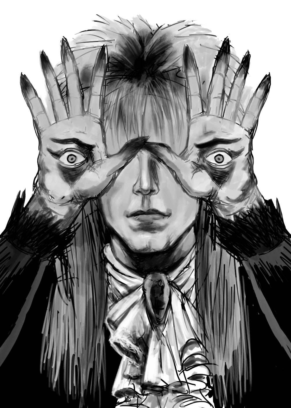
Pan's Labyrinth Starring David Bowie

Pan's Labyrinth Starring David Bowie


OK, this was an obvious mash-up of the Pale Man from "Pan's Labyrinth" and The Pale Duke, David Bowie, as Jareth from "Labyrinth".  I've had on my list of things to do for a while and given the recent news of Bowie's death, I figured I'd do it as a tribute.

I was a fan of his music, as well as acting.

* * *


STEP ONE: I did the digital pencils on a 1,000px x 1,400px canvas at 200dpi.

* * *


STEP TWO:  Next I laid down some rough values with a grayscale over-painting.  I really liked the sketchiness of the drawing at this point and almost left it at this stage and was tempted to just finish it as a black-and-white drawing.

* * *


STEP THREE:  After creating a MULTIPLY Layer, I laid down some flat coloring and decided to keep going with color.

* * *


STEP FOUR:  I created a bunch of NORMAL Layers--one for hands, one for the face, one of the hair, one for the clothes, etc. and added highlights and shadows to the flat color layer with a Oil Pastel brush in Photoshop.  And, yeah, I decided not to include Bowie's blown out pupil on his left eye (it looked--no pun intended--a little distracting).

* * *

This was done digitally in Photoshop.

.

Friday, January 8, 2016

A New Year, A New Hope...

HAPPY NEW YEAR - 2016!

A New Year, A New Hope...


Well, another year has come and gone with the usual mix of minor accomplishments and regrets.  I have made the usual retinue of resolutions to break for the New Year, and I'm sure y'all have done the same.  Here's to hoping all goes well for everyone!

I also want to take a few moments at the top of the new year to thank everyone for stopping by and gawking at my modest Blog, as well as the words of encouragement from many of you!  You are all much appreciated!  :-)

I have a stack of odd-sized, scrap pieces of hardboard which I gessoed.  From time-to-time, I'll grab one and paint a picture from a magazine that catches my eye, or something of the sort.  Nothing too fancy, just for warm-up or to try and work on some art skills for an hour or two.  Use it or lose it, don't ya know?  

In this case, it was a picture of Luke Skywalker from the original "Star Wars", which seemed like it would work on this Blog--I even thought of a semi-clever title and everything!  The painting was done with casein (it's sort of like acrylic paint, except it uses a milk-based protein as a binder) on a 4" x 5" gessoed hardboard, using a #10 Flat brush and #10 and #12 Round brushes. 

If I were smart (and I've never been accused of being such), I would have taken pictures/scans as I went along to show the progress, since many people like to see the process (I know I like seeing how they got from point "A" to point "B", myself).

If people like 'em enough, I may post more in the future.  We'll see, I guess.  :-)

* * *

Done with casein on 4" x 5" gessoed hardboard.

.