Friday, September 23, 2011

Green Lantern #76 - Cover Replica

Green Lantern #76 

Here's the original by Neal Adams:


Well, I've been extra-busy the past month, so sorry for the delays in posts.  I **FINALLY** finished the latest cover recreation for my pal, Jim, for his comic shop here in Winona, MN (Jimmy Jams).  Here's the process for those who are interested.  For those who aren't interested... well, I guess you don't have to read any further.  :-)


STEP ONE:  I glued down a sheet of 140 lb. Stonehenge paper (it is 100% cotton rag) to a 20" x 30" hardboard.  I then used a mixture of size (glue) and gesso to prepare the painting surface.  I drew out a grid and started drawing the picture.  I did some outlines in black acrylic along some of the edges so I could still see it after I started laying in colors.  Speaking of which, I then started laying in flat colors for the painting.  


STEP TWO:  I started painting in more of the flat colors areas...


STEP THREE:  And then I went back over those flat areas with line work.  


STEP FOUR:  I continued with more line work, started working on the shattered lantern, and did the lettering (I believe I have mentioned once or twice in my blog that I HATE LETTERING... It is painfully slow for me to letter).  ;-)  I also drew out the radiating lines from the lantern with a ruler and Sharpie Marker.


STEP FIVE:  I finished up the last bits of lettering (I don't think I've mentioned how much I hate lettering for a paragraph or so), Green Lantern and Green Arrow, and various bits and pieces and called it DONE.  I then treated it with a varnish for acrylic paint and delivered it to Jim.  

This was done with acrylic paint on 20" x 30" gessoed Stonehenge paper glued to hardboard.
  

Thursday, September 1, 2011

Yummy Fur #18: Cover Recreation

Here's the original cover to "Yummy Fur" #18:


Hey, Kids!  Another submission to the excellent and entertaining Covered Blog which Robert was kind enough to post today!

See?  This blog isn't all superheroes and such.  I also read some alternative comics here-and-there... and they don't get too much more alternative than the late 80's comic, "Yummy Fur".  It featured surreal adventures of Ed the Happy Clown--who generally wasn't all that happy, space aliens, vampires, serial killers, punks, an alternate universe version of Ronald and Nancy Reagan, and a bevy of out there characters.

Ed the Happy Clown was probably the most well-known character from the series for one of the most outrageous reasons: through a series of accidents, Ed winds up with a talking penis--the head of his penis is replaced by the head of Ronald Reagan from an alternate dimension.

After that story arc was finished with #18, the series mostly turned to more autobiographical vignettes, and featured backup features throughout the run from the New Testament (books of Mark and Matthew if I remember right--it's been a while since I last re-read it).

The cover to issue #18 really stuck in my head and when I saw the Covered Blog, I knew this would have to be one of the covers I would do.  The fact "Yummy Fur" was mentioned in the Submission Guides for the site sealed the deal for me.

And here's the process:


STEP ONE:  For this one, I shot a couple reference pictures of myself in roughly the same position and had it on the computer monitor next to my easel.  I taped down a 12" x 18" sheet of 80 lb. Dick Blick sulphite paper onto a drawing board I made from a cut down 1/4" sheet of hardboard.  I then used soft vine charcoal to layout where I vaguely want everything to go.  Then, moments later, I smear the whole thing to a soft, blurry mess on the paper and then begin the task of building up shadows, highlights, and mid-tones on the face.


STEP TWO:  I began tightening the drawing of the face by layered shading with vine charcoal, a 4B and 6B charcoal pencil, and using a kneaded eraser to lift out highlights and carve around shapes.  Also, for some reason I had it stuck in my head that Ed was wearing a fez.  I also notice the hand/arm is way too large and correct it to match the pose of the cover.

I guess that's what I get when I just glance quickly at the source material before trying to recreate it.  :-)


STEP THREE:  I fixed Ed's hat and made it into a derby, and finished work on the face and shirt.  Ed is wearing an ill-fitting wig, so I tried to make the hair seem as fake as possible.  Although, to be honest, it wasn't all that difficult, as hair tends to be something I have some trouble with and need to work on a LOT.  :-)  Next up, the hand holding the paintbrush.


STEP FOUR:  The hand is now done, too.  On the left-hand side, you can even see some of the very low-tack tape I used to tape it to the board.  (Manco "Perfect Release" Duck Tape, if you're wondering.  It was in a multi-color pack: Purple, Blue, and Green.)


STEP FIVE:  I imported the picture above into PhotoShop.    On a separate sheet of paper, I filled in an area about 8" square with charcoal and took a picture of that, too, rather than just using a flat black in PhotoShop.  The pattern was more interesting that way.  I used it as the dark background pattern in PhotoShop using the Clone tool.  I used the Multiply Layer to colorize the picture, added the logos and lettering, and called it "Done!"


This was done with charcoal and digital color on 12" x 18" Dick Blick 80 lb. sulphite paper.


.

Monday, August 29, 2011

Batman: Beginning, Middle, and End

 My Three Batmen
[Queue the theme song to "My Three Sons"] 

This is something I did as a bit of a joke for my pal, Dave, for his birthday last year.  I was originally going to paint it with just the very first version of Batman (with purple gloves, gun in hand, and all that) and the Dark Knight version of Batman with the giant, Kryptonite gloves.  A picture of Batman at the very beginning and a Batman at the very end of his career in comics.  But, then I realized I needed to have the 60's version of Batman in there, as well.

The camera caught the glare from the painting a little bit, so that is minorly annoying.  :-)


Looking at the picture now, there are a few things I would like to correct...  The Adam West bat symbol is a little off for some reason.  How did I not go back and fix that before I mailed it to him?  Sigh.  And the mid-section/abdomen of the Adam West Batman looks a little weird, as well.  The Dark Knight Batman's face can use a little more work, too.

It's sort of painful and embarrassing looking at parts of this now, but, on the bright side, part of improving means knowing that you could do better work now, I suppose.  

This was done with acrylic paint on 18" x 24" gessoed 1/8" hardboard panel.  

.

Saturday, August 27, 2011

Repaneld: Fantastic Four #5

Here's the original from "The Fantastic Four" #5 by Jack "King" Kirby and Joe Sinnot:

Here's yet ANOTHER submission to the delightful REPANELED Blog.  In this case, it is from "The Fantastic Four" #5, where the FF are transported back in time by Doctor Doom to get Blackbeard's treasure... it's a LONG story.  Well, not THAT long, but you know what I mean... and it's been reprinted plenty of times so go ahead and read it if you can!

Rather than my usual colorized black-and-white gouache paintings as done in some previous posts, this was done with charcoal on 12" x 18" Dick Blick Sulphite paper (80 lb).  For those of you who just can't get enough of the process, here it is.  For all the rest, be prepared to be bored!


STEP ONE:  With vine charcoal, I **VERY** loosely blocked in where I wanted everything to roughly fit on the page in an almost cartoonish manner.


STEP TWO:  And then almost immediately smeared the whole thing into an amorphous mess.  (That's the way I usually work with charcoal.)


STEP THREE:  I start to tighten up the drawing a bit with a 4B and 6B charcoal pencil and use my kneaded eraser a LOT--both to clean up the mess left by STEP TWO and to shape the form and add highlights.  Yes, kids, the eraser can ALSO be used to draw and not just erase mistakes.  :-)

I also settled on how I wanted Ben's pirate hat to look and, for my amusement, changed the original background guy in the panel to vaguely resemble a better-known pirate from a certain movie series.


STEP FOUR:  Ben Grimm (A.K.A., The Thing) is mostly done, now.  Again, this was done with continued layering of softer charcoal pencils and kneaded eraser to lift out lighter areas and highlights.  Time to work on that pirate fellow in the background...


STEP FIVE:  Well, here's the finished charcoal drawing.  I took a picture of it with my camera and then imported it into PhotoShop to colorize it.


STEP SIX:  Here it is colorized and cropped in PhotoShop, along with the added words.  It was basically the same method I used in previous posts: Over top the original picture, I added color on the Multiply Layer, as well as lightened some areas/retouched, and added a background with a generic Cloud Filter.


Done with charcoal on 12" x 18" Dick Blick Sulphite paper (80 lb.) and colorized in PhotoShop.

I realized a little too late that I didn't leave myself enough room to rotate the image a bit as I originally intended until after I had already copped it and got most of the way through colorizing.  I should have either drawn it at the tilted, Dutch-angle in the first place (preferred), or cropped it AFTER I rotate the image and BEFORE I start colorizing the image.  I'm sure there's a lesson in there somewhere for me.  :-)

Now that I look at it, I almost like the black-and-white charcoal drawing better than the colorized version.  Sigh...  On top of that, in comparison, I think Kirby did a better job of capturing the pathos of Ben Grimm (well, he **IS** the "King", after all).

.

Friday, August 12, 2011

Repaneled: Detective Comics #32 - Batman Vs. Vampire

Here is yet another submission to the delightful Repaneled site.  Poor Anthony is going to be so sick of getting my submissions... :-)  (UPDATE: It was posted on Tuesday, August 16th, 2011.  :-)

I saw this panel and did a mental double-take: Batman shooting a vampire in the face with a silver bullet?  Let me repeat that: Batman shoots a vampire in the face with a silver bullet!  How could I **NOT** do a remake of that panel?

The original by Bob Kane, from "Detective Comics" #42.


For fun, here's the process...


STEP ONE:  I did the original painting with black-and-white gouache, which is an opaque watercolor, on Arches Hot-Press 140# watercolor paper.  For things like this, I prefer the smoother surface.  I decided to forgo any sort of reference pictures for this one, too--not sure how much of a good that that is, sometimes.  I also cheated a little bit (OK, a LOT) with the perspective of the coffin: it is completely screwed up compared to the rest of the room, but that way it showcases both Batman and the head vampire.  Sometimes reality has to take a back seat to the art.  :-)

I then scanned the painting into my computer with some minor adjustments in PhotoShop.


STEP TWO:  In PhotoShop, I created a new layer and set it to "Multiply", which allows the original painting layer to remain intact/show through while adding color.  I then put down the flat colors to begin colorizing the painting.


STEP THREE:  I started putting in more highlights and shadows.  I also did some corrections to the picture, as well as adding the gun shot (which seems a little bright, now that I look at it again.  Oh, well...)


STEP FOUR:  The painting still looked a little flat, so I darkened the edges to add a little more dramatic focus.  I then put in the lettering and sent it off to Anthony's Repaneled Blog.  


  This was done with gouache on Arches Hot Press watercolor paper measuring about 5" x 8" and colorized in PhotoShop.

 ---------------------------
  
If I ever find a spare moment, I may have to do a recreation of the entire page in the future.  It is just that crazy/weird/fun!  Here's the page:


Highlights of the page include: 
  • Batman peeking around a door to check on a sleeping woman in a semi-creepy fashion.
  • Batman melting down a silver statue with a **CANDLE** (maybe an oil lamp or bunsen burner?) to make silver bullets.  Considering the melting point of silver is a little over 1,700 degrees F (over 960 degrees C), bunsen burners--let alone candles and oil lamps--generally don't get hot enough to melt silver.  Here's an interesting article about someone who tried to cast silver bullets...
  • Silver bullets killing vampire? Werewolves, sure. Vampires? That was a new one on me.  [A little research on the internet shows that apparently they can--it's a little archaic, but it was believed to kill vampires. I guess that's why he's The God Damn Batman and I'm just a doofus posting pictures on the Internets.]
  • Batman methodically walking through a crypt and shooting the lead vampire in the face.  Again, let me repeat that for emphasis: BATMAN SHOOTING A VAMPIRE IN THE FACE!
  • Batman getting the girl at the end, only to fly off to the next adventure in the next panel. 

 Fun stuff!

.

Wednesday, August 3, 2011

Halvin and Cobbes - 90's Comics Redux

I still have several things I am finishing but, once again, I wanted to be able to post something until they are ready to go up on the blog.  I stumbled across some old stuff I had laying around and thought this was mildly amusing enough to post.

(Click on the cartoon to Embiggen) 

This was a cartoon I did wwwwaaayyyyyy back in 1993 (holy crap!  Where does the time go?) as a submission for "The Comics Buyers' Guide" back when it was a weekly newspaper, rather than the current monthly magazine.  Sadly, it wasn't published.  [I did have a few other cartoons published in the CBG which I called "Dyspepsia of the Mind", and even got to do a Guest Editorial for them about collector mentality gone wrong.  Maybe I'll post those someday, as well...]

In the early 90's, ultra-violent anti-heroes and all manner of cover gimmicks (multiple-covers, holographic covers, glow-in-the-dark covers...) were going from occasional happenings to almost seeming to become the norm.  Plot and story were replaced with gritting teeth, constipated expressions, and foil-embossed covers... Well, sorta like now, I suppose, for the most part.  The more things change, the more they stay the same, I guess.

Oh, and the reference to "JSA" was the delightful 1992 "Justice Society of America" run from Len Strazewski and the late Mike Parobeck (gone too soon).  I suppose I should also say "Calvin and Hobbes" was one of the BEST comic strips out there and still remains one of my all-time favorites.

Hope you like it!  It's almost 20 years old, but seems almost as applicable today, sadly.  :-)


Pen and Ink on 8-1/2" x 14" bristol board (colored digitally)

.

Monday, July 18, 2011

Rom: Spaceknight (Repaneled, sort of...)

I was thinking about using this for another submission to Repaneled, but figured I have enough upcoming submissions coming down the pipe to make Anthony sick enough of me as it is.  :-)   Also, I have about 4-5 different paintings I'm working on at the moment and wanted to have something to post this week.  

Here is the original:


I did this painting about a year ago, loosely based on the panel above, which I always thought was a really cool introduction to a character: a meteor crashes on Earth and out walks Rom amidst flames and fused rocks.

I like the visual of Rom and, when I read it as a kid, the comic book was a sort of exercise in paranoia: Shape-shifting aliens, Dire Wraiths, would kill people and take their place... Great shades of the Pod People from "Invasion of the Body Snatchers"!  Rom would show up and banish them to Limbo with his Neutralizer, horrifying humans who had no idea their loved ones were dead and replaced by monsters.  And many probably still didn't know/believe even after Rom left.  A great book when I was a kid!

Hmmm, now that I look at the painting again after a long time of it just sitting around gathering dust, Rom's midsection looks a little off to me.  And maybe I should have put more flames around Rom, as well.  Oh, well... I suppose it is better to let it go and say "Good enough", or else it will stay on the easel forever being over-worked for all eternity.


This was done with Acrylic on 11" x 14" gessoed 1/8" hardboard.

.

Thursday, July 7, 2011

Miracleman #1 - Cover Recreation

 It's a Miracle, Man!

Here's the original cover for "Miracleman #1" by Alan Moore and Garry Leach


Before "Watchmen", a young, English bloke named Alan Moore wrote a comic which had a profound effect on me growing up, "Miracleman" (well, "Marvelman" as he was known/published in England).  "Marvelman" started off as a pretty shameless pastiche of Captain Marvel (hence the "Marvel" of Marvelman) who said "Kimota!" ("Atomic" spelled backwards--sorta) rather than "Shazam!".  But Alan Moore re-wrote the origin and the tone of the comic and set it in the "real" world, being one of the first in a long line of deconstructions of the superhero genre.  Marvel Comics later forced them to change the name of the character in America and it was published by Eclipse Comics as "Miracleman".

It was one of my favorite books, which I discovered my senior year of high school a little over 20 years ago (holy cow, could it REALLY be that long ago?).  I used to look forward to each issue, and remember having to wait a year between issues #14 and #15.  While I have all the issues, I can hardly wait for Marvel to collect and reprint the issues.  Garry Leach's art was great in the first story arc (and Alan Davis was no slouch, either), but to me, John Totleben's art completely blew away everyone else.  John Totleben's art from "Swamp Thing" (another great book which heavily influenced me) and "Miracleman" redefined what I thought comic book art could be and made me want to (someday) work in comic books.

The first issue also had a quote from a philosopher named Friedrich Wilhelm Nietzsche, who I had never heard of at the time, regarding the "Superman":

“Behold...  I teach you the Superman: He is this lightning... He is this madness!” 
Nietzsche - Thus Spoke Zarathustra 

This caused me to look up more writings from Nietzsche and, in turn, other philosophers and writers, and sparked a real intellectual curiosity in me at that time.  While many of the troupes in Miracleman may seem somewhat dated now, I still look back on the books with the same edge of wonder I felt when I first read them so very long ago.

Also, I'm sure this is heresy, but I prefer the name "Miracleman" to "Marvelman".


This was done with acrylic paint on 11" x 14" hardboard.

* * *

I also threw the logo on in Photoshop and submitted this to the great Covered Blog as a re-created cover, which Rob was kind enough to publish today.  THANKS, Rob!


.

Monday, June 27, 2011

Repaneled Submission - Tales to Astonish #63

My first submission to the Repaneled Blog was so much fun, I decided to send in another one.

I keep looking at individual comic panels out of context and thinking "Hey, that would be a great for 'Repaneled'..."  There are so many panels that I think it would be fun to recreate, so I'm sure I will be doing several more submissions in the near future.  In fact, I'm quite sure Anthony will soon be tired of me spamming his Inbox.  So, if you haven't already, you should go to his site and submit some panels of your own!  :-)

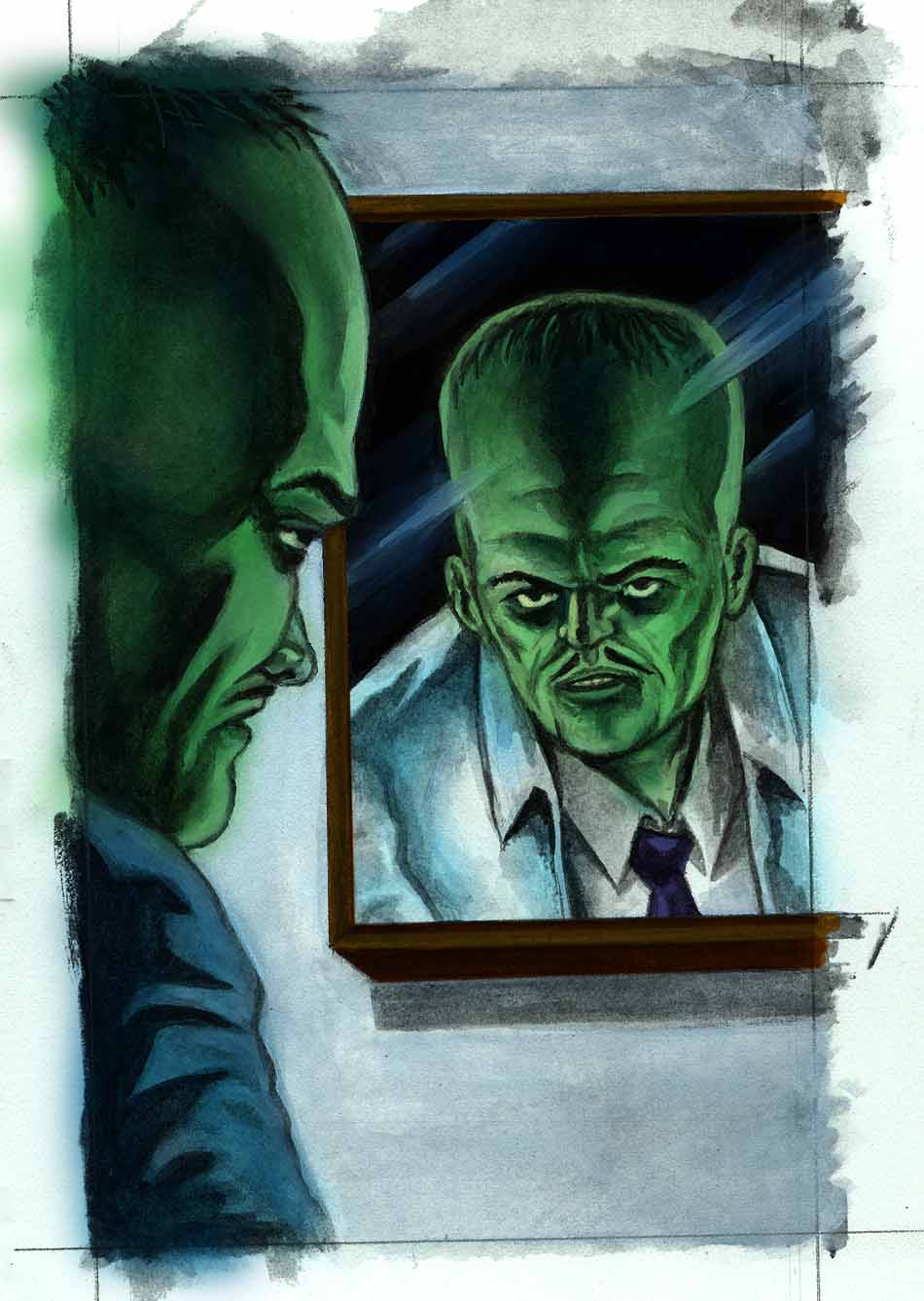
In this case, my submission is from the origin story of one of the Hulk's main nemeses, the Leader, in "Tales to Astonish" #63, drawn by Steve Ditko.


And here's my version:


For those even vaguely interested, here's step-by-step...  For everyone else, prepare to be bored!

First, I'm still new to digital painting and effects, so most of this is probably unbelievably crude to those of you who do this all the time.  I have an older verision of PhotoShop, but I'm sure almost any photo manipulation program will do, as well--GIMP, etc.  Also, my Wacom tablet is so old I had to use a driver for Vista to get it to run on my Windows 7 machine... so that's still a little funky at the moment, as well.  But, it's good enough for me to play with before I decide if I want to invest in a new tablet or not.  OK, preamble out of the way, here we go...

* * *

  
STEP ONE:  I began by ruling out the borders (which I included in these steps just to show some of the "warts and all" parts of the process) and did the painting with black and white gouache (an opaque watercolor).  It was done on 140# Arches hot press watercolor paper and the finished painting measures about 3-3/4" x 6".

Originally, I was thinking about shooting a couple reference photos and such, but decided to heck with it and painted it without any references.  I thought I had done enough figure painting over the past few years that I could wing it well enough.  Besides, I was wasting so much time thinking about how I would get the lighting setup for the references, etc. that I figured I would have the painting done by the time it was setup.  And, for the most part, I think I was right in this case.  I'm sure there's a lesson in there for me, somewhere... :-)

Once finished, I scanned the painting into my computer and imported it into PhotoShop.

* * *


STEP TWO:  Once in PhotoShop, I duplicated the layer and set it to "Multiply".  This allows you to colorize the black-and-white picture and still keep most of the blacks and whites from the original.  Here I pretty much just laid down areas of flat color.

* * *


STEP THREE:  Next, I began to add gradations to the colors as well as highlights and shadows...

* * *


STEP FOUR:  The last few highlights and finishing touches are added.  I'm no Ben Templesmith by a long shot, but I get by.  Barely.  :-)

* * *


STEP FIVE:  I took the lettering from the original panel and, using PhotoShop, sliced it up and moved it around to better fit my caption and word balloon.  I then cropped the picture, put an 8 pixel border around it, and called it "Done!".  :-)

.

Wednesday, June 22, 2011

Superman #233 - Cover Replica

  Here is my cover recreation for Superman #233 -- the great "Kryptonite Nevermore!" cover by Neal Adams.  As always, click on the pics below to embiggen!

Here is the original cover:


Just for fun, here's the process.  I took plenty of pictures step-by-step this time around and, once again, my camera seems to have done funky things as far as coloration, etc.  I did some minor color correction, but then again, my monitor isn't color-corrected so I didn't bother over doing it.  :-)

* * *


STEP ONE:  First, once again, I glued a 22" x 30" sheet of  Stonehenge paper to a 20" x 30" hardboard.  I trimmed the extra and used a combination of size (glue) and gesso to prime the board.  I then gridded out the board and started drawing the basic shapes.  I inked some of the outlines so the lines would still show up when I painted over them.  It sort of worked...

* * *


STEP TWO:   Here I started painting in the large shapes in flat colors.

* * *


STEP THREE:   More painting.  I also started doing the linework with black acrylic paint thinned with waterproof black ink.

* * *


STEP FOUR:   Lettering!  I HATE LETTERING!  :-)  I drew the letters and logo and with pencil, painted in the flat colors, and then used a Sharpie Marker to outline the letters/logo with the help of a straightedge.  Of course, as soon as I finished the outline of the logo and it was far too late to change it, I realized it should have been about a 1/2" higher. Sigh...

* * *


STEP FIVE:   Lettering and lines!  Lots and LOTS of use of the Sharpie Marker this time around.  I finished painting the letters, outlined the letters with the Sharpie, and then broke out the 18" ruler and spent several hours drawing out the radiating lines--again, with the Sharpie.

I decided to use Sharpie for lettering and the radiating lines since I just don't trust my my ability to ink lines with a brush and ruler.  I can do it for a limited amount of times before the lines start to drift on me.  And, in this case, if I goofed up the lines at this stage, I would have pretty much had to start over again.  So, I wanted to keep as tight control as I could.

* * *


STEP SIX:   FINISHED!  The little Superman up in the corner looks a little wonky, and I wish I could move up the "Superman" Logo up about a 1/2"...  But, overall, I think this generally turned out OK.  :-)

20" x 30" on sized and gessoed Stonehenge paper glued to hardboard (Medium Density Fiberboard) and done with Acrylic Paint and Sharpie Marker.

.

Monday, June 13, 2011

Showcase #4 - Cover Replica

Showcase #4 - Original by Carmine Infantino and Joe Kubert


This was a cover recreation that Jim wanted personally for his home and was yet another proof of concept.  The size was larger (20" x 30") than the Spidey one (18" x 24") previously posted.  In this case, I used a thinner hardboard (1/8" as opposed to 1/4"), however, I was worried that the tempering of the board would be too slick and not hold the paint very well.  So, I stole--er, "borrowed"--a good idea from fantasy artist Todd Lockwood (who "borrowed" it from Donato Giancola) and decided to glue a large sheet of paper to the hardboard.  That way, rather than having to worry about paint not sticking to the tempered hardboard, if the board is too slippery all that happens is that the paper detaches and the painting is still intact.
In this case, I mixed size (glue) and gesso and used it to glue a sheet of Stonehenge paper (100% cotton paper normally used for printing) to the hardboard, and then used the same mixture to prime the board for penciling and painting.

Here is the process.  Once again, due to the size of the paintings, my camera did some funky stuff with the coloring and light/dark.  As always, click on the pictures to embiggen:


STEP ONE:  Prepped with size and gesso, I gridded out the drawing and did the lettering (did I mention I **HATE** lettering in paintings? :-) and got everything planned out.  I now save all lettering for last, btw, which saves me quite a bit of time--particularly on paintings which have graduated colors.


STEP TWO:  Painting, painting, painting.  The most difficult part was trying to get the graduated tones around the Flash.  Particularly around the lettering.  Bleh.


STEP THREE:  Here it is, completed.  I finished all the painting and lettering.  For the lettering, I used a Sharpie Marker.

20" x 30" Acrylic painting (with an assist from Sharpie) on Stonehenge paper glued to 1/4" hardboard. 

.