Sunday, July 4, 2021

May the Fourth of July Be With You...

 May the Fourth (of July) Be With You!

OK, this is really, REALLY late for May the Fourth, but just in time (barely) for the Fourth of July!  So... yeah, it still kinda works.  Kinda, sorta.

And, of course, apparently my Quixotic Quest of seeing Jaxxon become Star Wars canon has sorta happened, with him appearing in the "Star Wars Adventure" comics aimed at all-ages.  So, I guess that's cool.  Anyhoo, I shall continue to flog this dead equine of a joke next year, and the year after, as well, I'm sure.  Onward to the next project!

* * *

STEP ONE: Here are the digital pencils, scribbled onto a 5,000px x 7,500px canvas @ 300dpi.  Why such a large canvas?  I have no idea what I was thinking...  That's probably why it took so long... 😀

* * *

STEP TWO: And here are the digital inks.

* * *

STEP THREE: Finally, the colors and letters!  I output them as "Normal" sized 1,000px x 1,500px pictures.

* * *

Done digitally with Clip Studio Paint.

.

Wednesday, June 30, 2021

Sheena - Queen of the Jungle

Sheena - Queen of the Jungle

Hey, it's been a while!  A cross between being super-busy with non-art-related things, and just feeling that minor existential crisis of not knowing what to do next mixed with everything I was working on just felt like it wasn't going anywhere.  So, lots and lots of projects started and abandoned (some of which I will probably pick up again).  Of course, not being able to get anything finished also added to that feeling of just not knowing what to do next.  Ugh...  Heisenberg would be proud that I was simultaneously busy as heck and getting nothing done at the same time!

But, one foot in front of the other, it's time to get back in that saddle again, sally forth, and all that other B.S.

This time it is a commission of sorts for Sheena, Queen of the Jungle.

One of the mildly amusing things about this drawing is that while I didn't have a photo reference, by the end it looked a heck of a lot like one of the regular models we used at the Figure Drawing Sessions I used to run before COVID (alas, she moved to another state and we are still waiting to see when/if we will have Figure Drawing again).

* * *

Done with Colored Pencil on 8-1/2" x 11" toned cardstock.

.

Wednesday, March 31, 2021

March M.O.D.O.K. Madness 2021 #6

March M.O.D.O.K. Madness 2021
(Mental Organism Designed Only for Killing)

* * *

Hey, hey, hey, just under the wire, it's my final submission this year for the March M.O.D.O.K. Madness Blog!  This time, I decided to create a M.O.D.O.K. Paper Doll.  Unfortunately, I realized a little too late that his face is a little... normal looking.  Oh, well, by the time you paste on the Mechno-Chair, hair, and assorted accessories, you won't be able to tell.

While I was working on this, I thought it would be fun to include M.O.D.A.M. (Mental Organism Designed for Aggressive Maneuvers), the female version of M.O.D.O.K. (yeah, comic books...) as part of the Paper Doll, but I knew I just wouldn't have time to finish it before the end of the day.  Of course, I was also tempted to include another page of "Mix and Match Accessories", but had to abandon it for the same reason.  Maybe next year if people are interested.  Maybe next year...

Anyhoo, I've included a Higher-Resolution .jpg (3,000px x 2,100px), for those interested/demented enough to actually want to print it off and use the paper dolls.  Shine on you crazy diamonds!  😁

* * *

Done digitally in Clip Studio Paint.

.

Monday, March 29, 2021

March M.O.D.O.K. Madness 2021 #5

March M.O.D.O.K. Madness 2021
(Mental Organism Designed Only for Killing)


* * *

It's another submission for the March M.O.D.O.K. Madness Blog!  In this case, it's a parody of Bazooka Joe comics.  That's right, kids, I'm old enough for remember getting small briquettes of gum which was hard as a rock and wrapped in a small, wax paper comic!

The comics in question weren't all that great, to be honest (I was a dumb kid, so they were good enough for me).  So, the real challenge of this parody wasn't making sure comic strip was based on a bad joke--something at which I accel--but it had to be the right kind of bad joke.  Luckily, this is something at which I also accel.

No time for a Work in Progress--I've gotta get going on the last submission for March M.O.D.O.K. Madness!

* * *

Done digitally with Clip Studio Paint
(with an assist from Photoshop with a Color Halftone filter)

.

Monday, March 22, 2021

March M.O.D.O.K. Madness 2021 #4

March M.O.D.O.K. Madness 2021
(Mental Organism Designed Only for Killing)

Hey, look!  It's another submission for the March M.O.D.O.K. Madness Blog!  Not too much to say about this one, other than I started with a random doodle to test out some brushes in ArtStudio Pro and it turned into M.O.D.O.K...  which seems to happen quite a bit in March, now that I think about it.  Oh, well, 'Tis the Season, after all!

I'm hoping to get another two-or-three M.O.D.O.K. submissions in before it's done at the end of March.  Here's to hoping!

* * *

STEP ONE:  Here are the very quick digital pencils and digital paint scribbles as well, done on a 3,500px x 5,000px canvas @ 300dpi in ArtStudio Pro.

* * *

STEP TWO:  I continued on with it, working on his lumpy face and head.  Also, I thought it was a bit too much of a close-up, so shrunk it down a little bit and worked on it some more.

* * *

STEP THREE:  And I put in some glowy bits and bars, some straggled hair, and assorted cleaning of edges and called it good enough.  Although, while I generally like the face, I realized the painting eventually worked itself back to a straight-ahead view, as well as using the Symmetry Drawing Tool to do the chair and whatnot.  I have way too many drawings and paintings of M.O.D.O.K. straight on.  I'll have to do a self-imposed ban and do something different pose-wise for the next few years, methinks.

Funnily enough, all three Work-in-Progress digital paintings look like they could each be a completely different submission to the March M.O.D.O.K. Madness Blog.  Oh, well, speaking of--Time to work on the next one!

* * *

Done digitally in ArtStudio Pro.

.

Sunday, March 14, 2021

March M.O.D.O.K. Madness 2021 #3

March M.O.D.O.K. Madness 2021
(Mental Organism Designed Only for Killing)

HAPPY PI DAY!

OK, technically it's **STILL** Pi Day as I write this (11:20pm CST), so I think it counts...

Anyhoo, it's yet another spam submission for the March M.O.D.O.K. Madness Blog!  This time, what better way is there to celebrate Pi Day than to eat a big 'ol piece o' cake?  I mean PIE!  A big ol' piece o' PIE!  Don't ask about the crust, though...  Hey, wait-a-minute--M.O.D.O.K. eats pie the same way I do!

Alas, this idea rolled into my head last night while I was working on a different picture of M.O.D.O.K..  As usual, my brain waits until the least opportune time to think of something vaguely applicable and gives it to me at the very, VERY last minute.  I barely had time to finish this up before the clock strikes midnight and I turn into a pumpkin.  Or something like that...

Oh, look, minutes to spare!  My stupid brain.  Sigh...

* * *

STEP ONE:  Here are the very quick digital pencils, done on a 3,500px x 5,000px canvas @ 300dpi in Clip Studio Paint.

* * *

STEP TWO:  And the digital inks.

* * *

STEP THREE:  Let there be color!  Alas, it was sorta thrown together quickly, so a few things here and there will be wrong, or in some way bug the crap outta me at a later date.

* * *

Done digitally in Clip Studio Paint.

.

Sunday, March 7, 2021

March M.O.D.O.K. Madness 2021 #2

March M.O.D.O.K. Madness 2021
(Mental Organism Designed Only for Killing)

Hey, it's another submission for the March M.O.D.O.K. Madness Blog!  This time, it's a more moody, Film Noir look to everyone's favorite Big-Headed Brain Blaster.

Alas, no "Work in Progress" this time--so bullet dodged.  I created a 3,500px x 5,000px canvas @ 300dpi in ArtStudio Pro, used the color bucket to fill it with black, turned on the Symmetry Tool, used a combination of black and white charcoal brushes and just started to doodle.  And this is how it ended...

On to the next one!

* * *

Done digitally in ArtStudio Pro

.

Monday, March 1, 2021

March M.O.D.O.K. Madness 2021 #1

March M.O.D.O.K. Madness 2021
(Mental Organism Designed Only for Killing)

It's time again for the best known (if not only) March-based celebration of which I am aware:
March M.O.D.O.K. Madness 2021 Edition.

Here's the first of what I hope will be many submission to the March M.O.D.O.K. Madness Blog.  Go over and pay them a visit to see some of the other artists who also enjoy the exploits of everyone's favorite big-brained Marvel Character designed for killin'.

* * *


STEP ONE:  Here are the digital pencils, done on a 2,500px a 3,500px canvas @ 300dpi.  I also figured I'd have M.O.D.O.K. be a little excited about the date on the calendar.  For some reason, replacing the "A" in "Damn" with an "at" symbol amuses me.  I guess I'm just an e-L337-ist.  Hooboy, after that terrible, terrible pun, I better sit down.

* * *


STEP TWO:  And followed by the digital inks.  I figured I'd throw in a fist pump to show how excited M.O.D.O.K. is about the start of March, as well as the "YES!"  This submission had the added pain in the keister of having to re-create a March 2021 Calendar, which I then distorted and placed into the background.

* * *


STEP THREE:  And after a bunch of different color layers, here's the finished drawing.  Onward to the next one!

 * * *

Done digitally in Clip Studio Paint.

.

Sunday, February 21, 2021

Shameless Self-Promotion: Oculus Rot

 Shameless Self-Promotion
"Oculus Rot" by Buried

It's another bit of Shameless Self-Promotion!  As I obliquely mentioned in my MF Doom Memoriam posting, this is a shout out to my friend, Joel, and his bandmates for their new album which dropped on Valentine's Day (yeah, I know, I'm a little slow, sometimes): "Oculus Rot" by Buried.  

When it comes to my taste in music, I'm pretty omnivorous: I listen to everything from Abba to Zappa, if you will, and everything in between.  And while I will admit that Death Metal isn't my go to when I'm chillin' at home, it does find its way into rotation when the mood strikes.  As does Classical Music, Opera, Alternative, Thrash, Hip Hop, Trip Hop, Pop, Metal, Ska, Punk, Rap... Oh, you get the idea.  A little bit of everything.  Stuff that would alternately bore you to death and scare the life outta you.

Anyhoo, it started many years ago when Joel contacted me to see if they could use my Facehugger Valentine drawing for their T-Shirt.  Sure!  As a follow up, he was kind enough to ask me to do the cover for their new Album, Oculus Rot.  It just so happens, doing a cover to a Heavy Metal/Death Metal album/T-Shirts was high up on my Bucket List.  So, that's kinda cool!

I also did a pastiche of a "Tales From the Crypt" cover, which included the caricatures of Joel, Steve, Robbert, and Marc, and it is used on the Mutoid Maniac shirts.  (I did the caricature of Joel as an alien in "They Live" during my first "31 Days of HELL-O-Ween" which he got it as a tattoo on his leg--so he has a history of questionable decisions.)  

BTW, the stereotype of Death Metal band members being among the nicest, kindest people out there seems to be true in my experience (all the stories about nihilistic hooliganism are usually associated with Black Metal, which is a different genre altogether).  Many times when I was writing to Joel, he'd mention it was a sunny day and he was out with his family, hiking, rescuing cute woodland critters injured by other careless hikers, picking wildflowers, and reenacting the opening scene to "The Sound of Music" with him in the role of Julie Andrews, to which I'd think "Hmm, that's not very metal..."  (While I am engaged in mild hyperbole to give Joel a bit of a comedic roast, it is shocking how close to reality it is!  Shocking, I tell you!)

So, my best to Joel and his bandmates!  Here's to hoping my meager Blog helps even a little bit.  Thanks for the opportunity letting me do the cover art, gents--much appreciated!

Here's a link to their FACEBOOK Page and a link to a REVIEW from RocknLoadMag, which gave them 8 out of 10 stars!

If you like what you hear, buy 10 copies so they can become world-famous and I can maybe trick them into letting me do another cover or bit of promotional art!  If you hate it, buy 20 copies to remove it from the market and make sure no one else can get a copy!  Oh, and maybe just get a bunch of T-Shirts, too, while your at it for the same reasons listed above. 😁

.

Sunday, February 14, 2021

Unwanted Valentines: Ex Machina (2014)

 Unwanted Valentines:
Ex Machina (2014)

Another Unwanted Valentine!  This time, it's based on the 2014 movie, "Ex Machina", which I liked quite a bit.  It's the age-old question about what it means when you can't really tell the difference between "real" human emotions and the machine equivalent.  Are the robots in the movie actually conscious, or just programmed to think they are conscious?  Is there a way to tell the difference?  Is there even a difference to tell?  After all, my brain--the seat of my alleged consciousness--is the most important organ in my body; I know this because my brain tells me so.

I often think we'll be disappointed when machine learning truly passes the Turing Test.  Not because they will be so smart and clever, but rather because they will be so dumb and annoying that we will think only humans could be so stupid and bothersome.

* * *

STEP ONE:  Here are the digital pencils, created on a 5,000px x 7,100px @ 300dpi canvas in Clip Studio Paint.

* * *

STEP TWO:  And the digital inks.  I had a hexagonal pattern, which I was able to warp around a little bit to minimally follow the form.  I then traced over the pattern to give it a more hand-drawn feel.  And, boy, did that take a long time!

* * *

STEP THREE:  And here is the finished color, which was done beneath the inks.

* * * 

Done digitally in Clip Studio Paint.

.

Sunday, February 7, 2021

Unwanted Valentines: The Incredible Melting Man (1977)

 Unwanted Valentines:
The Incredible Melting Man (1977)

Hey, it's that time of year when I post a couple-a-few Valentines so nerdy and/or grotesque (or perhaps GORE-tesque in this case) that no one would be all that pleased to receive them.

Yes, I did a painting of "The Incredible Melting Man" in the 30 Days of HELL-O-Ween but, ironically, I had the idea for this Unwanted Valentine last year before I even did the 30 Days of HELL-O-Ween.  I mentioned in that post I owned a copy of "Famous Monsters" featuring "The Incredible Melting Man", the cover image of which transfixed me as a kid.  So, here it is again!

* * *

STEP ONE:  Here are the scribbled digital pencils.  I've recently decided to work with larger canvases, so this was done as a 5,000px x 7,100px @ 300dpi.

* * *

STEP TWO:  And the digital inks as well as the lettering.

* * *

STEP THREE:  And here are the various color layers, under the inking layer.  I subdued the reds a little bit, going with more rust colors, so it didn't visually blend into the lettering too much.

* * *

Done digitally in Clip Studio Paint.

.

Saturday, January 23, 2021

Batman-uary: Rainbow Batman

Batman-uary
Rainbow Batman

That's right, I'm still trying a bit too hard to make a dumb portmanteau of "Batman" and "January" into "Batman-uary" a thing.

Anyways, so many Silver Age Batman costumes to choose from... How 'bout Rainbow Batman?   No, really--Batman had to wear a rainbow version of his costume to... Oh, never mind.  You wouldn't believe me if I told you.  It involves wearing the various colorful costumes to draw attention away from Robin and toward himself while hunting down mobsters.  I'll leave it at that.

It's Rainbow Batman in action from "Detective Comics #241" (1957) and the cover to "Batman: The Dark Knight Returns #2"

So, another mash-up with a "Batman: The Dark Knight Returns" cover--this time Issue #2.  Speaking of #2, is it just me or in this cover does Batman look like he is just really, really constipated?  (Yeah, I put the "assy" in "Classy"...)  The mash-up between the Dark and Gritty Batman and Rainbow Batman costume amused me.  Once again proving it really doesn't take much to amuse me at all.

* * *

STEP ONE:  I created a 3,000px x 4,500px @ 600dpi canvas in Clip Studio Paint and here are the digital pencils on a Blue-Line Layer.

* * *

STEP TWO:  And here are the inks and grayscale shadows...

* * *

STEP THREE:  The colors overtop in a series of layers.

* * *

Done digitally in Clip Studio Paint.

.

Saturday, January 16, 2021

Batman-uary: Bat-Baby

Batman-uary
Bat-Baby

Ah, the Silver-Age of comics... back when Batman could be turned into a baby (well, in this case, a child about four-years old) and still go out and fight crime in the dark streets of Gotham.  Sure, why not?  It's Batman #147 (1962), wherein one of the stories, 'Batman Becomes Bat-Baby", features a sci-fi ray which de-ages Batman into the titular Bat-Baby.  It's exactly the kind of story you would expect it to be.

The original covers to Batman #147 (1962) and Batman: The Dark Knight Returns #1 (1986)

Yes, this is an actual panel from Batman #147

It's Bat-Baby, complete with short-pants and suspenders--this time as a parody of the iconic "Batman: The Dark Knight Returns" first issue cover.  Again, sure, why not?  It amuses me... and Lord knows it doesn't take much to amuse me.

There are so, so many different Batman costumes and transformations from which to choose--some of which I shall highlight in January.  It's another dumb thing I'm starting that I'm sure will become another yearly tradition on my even dumberer Blog--like the Unwanted Valentines, March M.O.D.O.K. Madness, 31 Days of HELL-O-Ween, Sithmas, and so forth.  Ugh, I think I'm trying too hard.

For all those people who complain about whether something is canon or not... it's a Fool's Game.  Just enjoy the parts you like, ignore the parts you don't; both will be changed in the future, for better or worse.

* * *

STEP ONE: I created a 3,000px x 4,500px canvas at 600dpi in Clip Studio Paint and did the digital pencils in a light blue layer color.  The composition seems so weird to me, without the sky and lightning in the background.

* * *

STEP TWO:  Here are the inks.

* * *

STEP THREE:  And here are the colors, including the iconic lightning background.  I could have gone with the silhouette, but that would sort of obscure the fact it is supposed to be Bat-Baby, which is kind of the purpose of this mad exercise...

* * *

Done digitally in Clip Studio Paint.
.

Saturday, January 9, 2021

MF Doom

MF Doom

OK, show of hands: who likes audio clips of the 1960's "Fantastic Four" cartoons with their Hip-Hop?  Or skits using sound clips from "Godzilla Vs. Monster Zero" and "Scooby Doo, Where Are You"?  When it comes to music, my tastes are pretty wide-ranging.  I like to say I listen to everything from Abba to Zappa, and things which would either bore you to death and scare the life out of you.  (Humble Brag: I even have a friend who is making some of the music to scare the life out of you... but more on that at a later date--Shout out to Joel.  ;-)

Quite a while ago, I stumbled across MF Doom--at the time he was one of the few singers/songwriters that reveled in his comic book kitsch and nerdiness on his albums and it drew me in.  I mean, he had Doctor Doom with a mic on his first MF Doom release; c'mon, how could I resist?  His albums are smooth and flowing, off kilter rhyme schemes, and the way they fit together all kept me listening.  And those audio clips from "Fantastic Four" and "Godzilla Vs. Monster Zero"... chef's kiss!  To me, they are the special sauce in the albums.

Daniel Dumile (aka MF Doom / Viktor Vaughn / King Geedorah) died on Halloween 2020, but his death wasn't announced until December 31, 2020.  I figured he was nominally connected to my nerdly interests, so I thought I'd do up an In Memoriam for him.  He even got a shout out on "Democracy Now with Amy Goodman" news cast, so that was mildly surprising about his reach.  He worked around the edges of pop culture, but a surprising number of people knew his work.

My personal favs: "Operation: Doomsday" (1999), "Take Me to Your Leader" (as King Geedorah) (2003), "Madvillainy" (with Madlib) (2004), and "Mm.. Food (2004)".

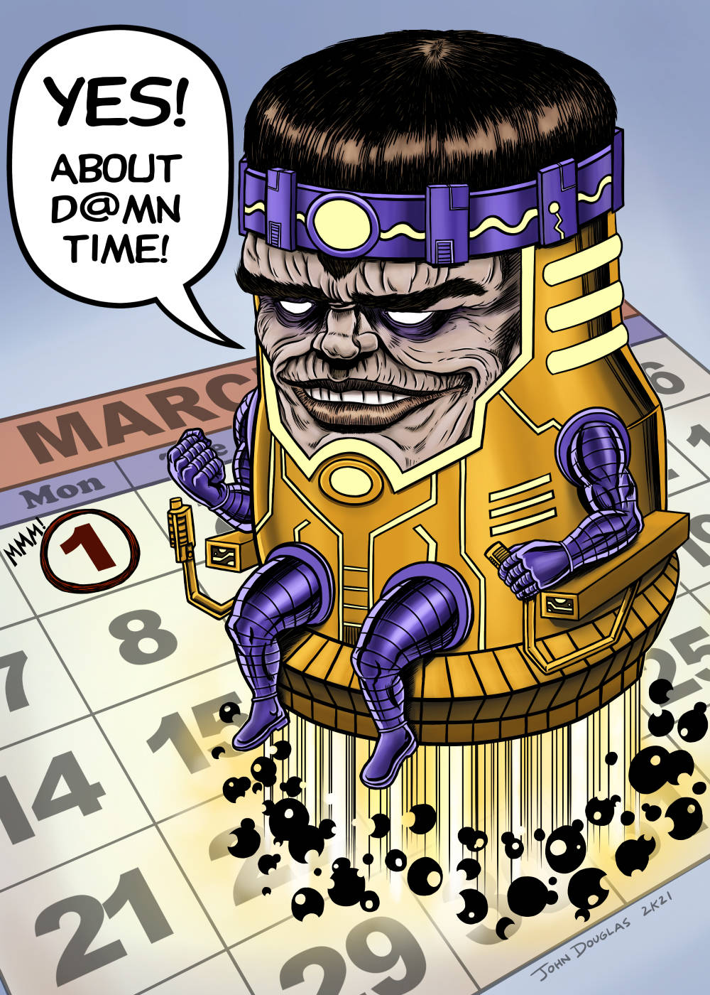
He also sent out Doombots to perform for him sometimes if he didn't want to do a show... which is exactly something Dr. Doom would do.  Sure, if I paid to see him and it was a Doombot instead, I'd be more than a little ticked off, but I also have a part of me that would kinda admire the grift.  He **DID** model his character on a super-villain, after all.  And Doombots are straight out of the "Fantastic Four", so there's that, too.

BTW, I can't be the only one who was surprised (and a little disappointed) that the "MF" in MF Doom was for "Metal Fingers" and "Metal Face", rather than something Samuel Jackson would say on a plane that had some sort of slithering reptiles on board.

* * *

STEP ONE I did a very light blue pencil sketch on 9" x 12" Daler-Rowney The Langton Prestige Watercolor Paper - Hot Press (#140), then went over it with blue ink and crowquill.  

* * *

STEP TWO:  Here is the first coat of watercolor, just to give the next layers something to "stick" to.

* * *

STEP THREE:  I realized I should have the coat and background be green to go more with Doctor Doom visual aesthetic.  Also, in the original picture reference, his left cheek was obscured by faux fur of the collar on the coat and it didn't read right.  So, I'd better draw that in...  Also, that background seemed like it would work better as light, so time to bust out the Titanium White.

* * *

STEP FOUR:  Several coats of paint and a left jawline later, it was mostly done.  There were a few things which I still wanted to adjust, but was out of town.  So, out comes the iPad to fix some of the lines needed to be gone over, minor adjustments to the eyes, a few areas to darken a bit more, and the textured airbrush to focus more attention to the center of the painting.

I was somehow hoping to integrate the blue ink drawing into the painting a bit more, but that was largely... mixed in results.

* * *

Done with watercolor/gouache on 9" x 12" Daler-Rowney The Langton Prestige Watercolor Paper - Hot Press (#140) and minor digital touch-ups in ArtStudio Pro.

.

Wednesday, January 6, 2021

Happy (Belated) New Year 2021...

Happy New Year 2021!

My first post of the New Year... It still has that New Year smell and everything!  Better late than never, I guess.  Anyhoo, here's to hoping a New Year sweeps clean!

I want to take a few moments to thank everyone who has stopped by and gawked at my modest Blog.  Any attention is greatly appreciated!  (Wait, did that sound half of desperate as it seemed as I wrote it out?  Nah, couldn't be...)  Thank you, all!

I hope everyone stays safe and well this year!

* * *

STEP ONE:  Here's the original rough idea, scribbled in Clip Studio Paint on the iPad.  I used a 1,500px x 2,250px document @ 600dpi.  It was going to be a far more of a straight up parody cover of "Fantastic Four #49", with various notes to myself.  This is definitely an early version when I was still kicking ideas around, so it's more of a peek behind the curtain.  Also, you get to see some of the lame jokes you missed!  Bullet dodged!

The way it played out in my head was to have Galactus as the stand in for 2021 destroying the previous, cursed year of 2020.  Hence the 2-0-2-0 on the chests of each of the Fantastic Four.

* * *

STEP TWO:  After a lot of other noodling about (including entertaining other well-known comic covers to parody), I decided just focus on the more iconic part of the cover, with Galactus towering over the New Year.  Also, the "2-0-2-1" seemed to not show up very well, so I went with replacing the Fantastic Four with the actual numbers to spell out the year, but still left them with their arms and legs.  So, here's the digitally inked page.

* * *

STEP THREE:  And, many color layers later, here's the finished pic.  I even remembered to write 2021... which I usually don't remember to write the New Year until mid-June, most of the time.  (Sadly, not kidding as much as I would like.  Sigh...)  ;-)

* * *

Done digitally in Clip Studio Paint on an iPad Pro.

.