Monday, April 14, 2014

Sheena: Queen of the Jungle #1 - Cover Replica

Sheena: Queen of the Jungle #1


Here's the original cover by Dave Stevens.

* * *


And here's my Cover Replica of the Sheena: Queen of the Jungle cover.  (The coloration is a bit washed out in the picture, but given the size of the cover replicas, they are always a bit tricky to photograph.)

Well, I **FINALLY** finished another GIANT cover re-creation for my pal, Jim, from Jimmy Jams Comics and Games here in Winona, MN.  It is yet another painting which took far too long to finish.  The weird thing is it took longer to finish the Sheena cover than the Brian Bolland "Killing Joke" cover I did, which seems to be far more involved than this one.  Sigh...

As usual, here are the Step-By-Step's for those interested... :-)

* * *


STEP ONE:  I glued a sheet of (140#) Stonehenge paper to a 20" x 30" (that's 50.8cm x 76.2cm to those of you who use the Metric System) piece of hard board/medium density fiberboard using matte medium.  Then I used a mixture of gesso and matte medium to serve as a ground for the painting.  I ruled out a 1" grid and then used a blue pencil to draw out the picture.

* * *


STEP TWO:  I began to fill in some of the general flat colors using acrylic paint.  Then I thought I should go ahead and use a drybrush technique right away for the shading on Sheena.  I masked off the area around her back and legs with some low-tack tape that wouldn't stick to the painting too much, to try and minimize the amount of drybrushed paint from over-running the background and build up too much.  Later, it turned out that drybrush technique didn't work out quite as well as I wanted and was very difficult to color-match for any mistakes/changes made... 

* * *


STEP THREE:  Here are most of the background colors and tree/vine work.

* * *


STEP FOUR:  And here it is a little further along...

* * *


STEP FIVE:  I painted over the drybrush effects on Sheena from earlier, as it was just becoming too much of a problem trying to match everything whenever I would goof up some line or shaded region (it happens, unfortunately).  So, instead I used thin layers of acrylic paint mixed with acrylic mediums to blend the colors, instead.  It seemed to work out well enough.  I used the same effect for the color blending on the log she is standing on.

Once the underpainting was done, I went over top with the linework using black acrylic paint thinned down with water and blending medium.  I used Krylon Matte Finish as a fixative, as well as a separate UV-protecting finish, and called it **DONE**!

* * *

This was done with acrylic paint on 20" x 30" gessoed Stonehenge paper glued to hardboard.

.

Tuesday, April 1, 2014

March MODOK Madness 2014 (Part 2)! - Colorized

M.O.D.O.K.
(MENTAL ORGANISM DESIGNED ONLY for KILLING)


Here's the colorized version of the submission to the March MODOK Madness Blog I posted yesterday.  The Blog is closed for submissions for this year, so I guess I'll have to send it out for 2015... :-)

* * *


STEP ONE: Here's the digital painting of M.O.D.O.K. from yesterday.

* * *


STEP TWO:  I added solid colors over a MULTIPLY Layer.

* * *


STEP THREE:  I built up the darks and lights in the MULTIPLY Layer.  While great for colorizing black-and-white pictures, the colors can be a bit less vibrant in the MULTIPLY Layer and the highlights can be muted.

* * *


STEP FOUR:  Lastly, on a New Layer which was set to NORMAL, I added the brightest highlights.

* * *

This was done digitally in PhotoShop.
.

Monday, March 31, 2014

MODOK - March MODOK Madness 2014 (Part 2)!

M.O.D.O.K.
(MENTAL ORGANISM DESIGNED ONLY for KILLING)


Hey, everyone, it's a second submission to the March MODOK Madness Blog!  This was going to be color, but, alas, I ran out of time before the final buzzer is set to go off later this evening.  I'll just have to colorize it at a later date, I'm sure.

Anyhoo, here is the process for those who are mildly interested...

* * *


STEP ONE:  I did a quick sketch of the layout I was going to use: a forced perspective of his arm on the joystick of his chair.  I did the sketch using a blue pencil on a scrap piece of copy paper.  As usual, I think there is a certain energy to the quick sketch which I almost prefer to the finished picture.  Oh, well.

* * *


STEP TWO:  I used a chalk brush in PhotoShop and began to lay out the lights and darks, as well as form for M.O.D.O.K.

* * *


STEP THREE:  More of the same.  Here it is a little further along.  :-)

* * *


STEP FOUR:  Here it is a little further along.  I decided to crop it a little bit to get tighter on M.O.D.O.K.'s face.  I also painted over the three stripes on the side of his metallic body armor, intending to paint it back in when I was finished with the lighting on his body.  However, in the rush to get this finished, it looks like I forgot to add them back in again (Sigh...).  I also added some Kirby Krackle.

* * *


STEP FIVE:  This is the finished picture of M.O.D.O.K.  I cropped in even tighter on his face, which seemed to increase the dramatic feel for the picture.  I also finished up the work on his hand and some of the metallic shine for his body armor, as well as some other bits and pieces.  As the window of time was closing fast (today is the last day), I called it good enough and sent out the submission.

* * *

This was done digitally in PhotoShop.
.

Wednesday, March 5, 2014

MODOK - March MODOK Madness 2014!

M.O.D.O.K.
(MENTAL ORGANISM DESIGNED ONLY for KILLING)


Greetings!  Here's a submission for the March MODOK Madness Blog.  Every year they open up their Blog to all manner of drawings of M.O.D.O.K.  It's great fun and I encourage everyone to take a look (or, better yet, submit something for yourself).  :-)

For those of you interested, here's the Step-by-step...

* * *


STEP ONE:  I did up a quick sketch of what I wanted to do with a charcoal pencil and some India ink on a piece of newsprint.  I figured an extreme close-up of M.O.D.O.K. would be cool.

* * *


STEP TWO:  Here's a midpoint black-and-white digital under-painting.  I mostly just use a chalk brush in PhotoShop, as it has a good texture and gives more of a natural feel to the digital painting.

I did make one significant change to the planned layout in that I included a bit more of his face, deciding it included a little more expression.  I'm still going back-and-forth on deciding if I like it with more of his face showing, or if I should have just cropped it off as I originally intended.  Decisions, decisions... 

* * *


STEP THREE:  Here's the finished black-and-white painting.

* * *


STEP FOUR:  I used a MULTIPLY Layer to do most of the colorizing of the black-and-white painting.  For additional highlights, as well as some of the glowing light effects, I used a NORMAL Layer overtop in addition to the Blur Filter.  I then sent a copy off to the March MODOK Madness Blog.  I'm hoping to get one more submission done for March M.O.D.O.K. Madness (fingers crossed).  :-)

* * *

This was done digitally in PhotoShop.
.

Friday, February 14, 2014

Unwanted Valentines: Blaine the Mono

Unwanted Valentines:
Blaine the Mono


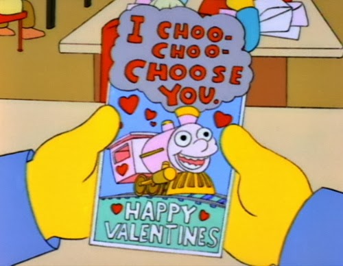
This Unwanted Valentine is a mash-up of Stephen King and "The Simpsons".  Blaine the Mono is the (dare I say it?) crazy train from King's "Dark Tower" series--a twisted, self-aware monorail that loves riddles and is on a suicide run hoping to take Roland and his Ka-Tet with him.  

From "The Simpsons", it's the awesome card Ralph Wiggum gets from Lisa Simpson for Valentine's Day after she takes pity on him.  Ralph takes the card as an invitation to be Lisa's boyfriend.  A very sweet episode, all around.  And it contains one of my Top 20 favorite lines from "The Simpsons": 

RALPH: "The doctors said I wouldn't have so many nose bleeds if I kept my finger outta there."


Here is a screen capture of the famous card that Lisa Simpson gave to Ralph Wiggum.

Now, of course one cannot have a mash-up of Blaine the Mono and "The Simpsons" without invoking the much beloved song from "Marge vs. The Monorail".  (The song begins about one minute into the video.)

Also, Blaine is a Pain. :-)

* * *


STEP ONE:  Here are the pencils for Blaine and Mono, done with blue lead on a sheet of card stock.  I also included one of the skull/hearts I was going to insert into the card, as well.  I even accidentally had the foresight to draw only a single rail on the train tracks, just to head off any comments about Blaine being a MONORAIL.  ;-)

* * *


STEP TWO:  I did the inks with a Sharpie bleed-proof pen and scanned it into PhotoShop.

* * *


STEP THREE:  I figured it would be more creepy to do a more realistic skull on the cartoonish train, so I added a layer and did a more painted-looking skull overtop the train's face.

* * *


STEP FOUR:  Here's everything all together.  I colored everything with a MULTIPLY Layer, with some extra highlights on the skull done over top a New Layer.  I also duplicated the skull/hearts and scattered them about to match the "I Choo-Choo-Choose You" card.

* * *

Done with pen-and-ink on 8-1/2" x 11" cardstock and colored digitally.
.

Thursday, February 13, 2014

Unwanted Valentines: Mars Attacks!

Unwanted Valentines:
Mars Attacks!


Well, Valentine's Day sneaked up on me this year, so I'll only have a couple "Unwanted Valentines" this time around.

This one came about from the obvious joke of "Men are from Mars".  :-D

* * *


STEP ONE:  I pencilled the Mars Attacks! Martian's head as a heart-shape on a piece of cardstock.  I then scanned it into PhotoShop.

* * *


STEP TWO: I move the pencils a a top Layer and set it to MULTIPLY.  I then started to use the chalk brush in PhotoShop to digitally paint the Martian's head.

* * *


STEP THREE:  Here it is about halfway done and without the guide over top of it.  I was far enough along to jettison the guidelines altogether by this point.

* * *


STEP FOUR:  This is the finished Martian's heart-shaped head.  I added the lettering above (OK, as it was just an "I" and a "U", that barely counts as lettering), and used a 25 pixel line around 'em and called the card above "DONE!"

* * *

Done digitally in PhotoShop.
.

Wednesday, February 12, 2014

Celestials: Tiamut the Dreaming Celestial (Part 2)

Celestials: 
Tiamut the Dreaming Celestial


To continue from the previous post, here is the golden armored version of the Dreaming Celestial, formerly Tiamut the Communicator before his "Fall from Grace".  I find the story of the Dreaming Celestial to be something which captures my imagination and would like to work on further.  Aw, heck, I'm just a fan of the Celestials in general and will definitely be doing more with them in the future.

However, for now I will be taking a little break from this series and finish off most of the major Celestials at a later date.


Here is the original version of Tiamut.  I've included both the Kirby version from his original Eternals series in the 1970's (Issue #18) and a more recent version that I used as the primary reference.

* * *


STEP ONE:  I used a blue lead 0.5mm mechanical pencil on 8-1/2" x 11" cardstock for the pencils.

* * *


STEP TWO:  The inking was done with a fine point Sharpie Non-Bleed pen and a PITT Brush tip pen to fill in the black areas and add some line variation.

* * *


STEP THREE:  I scanned the image into PhotoShop and colorized it with a MULTIPLY Layer, keeping the color scheme somewhat consistent to the previous Celestials entries I did for the Official Handbook to the Marvel Universe: REDUX EDITION.

* * *

This was done with pen-and-ink on 5-1/2" x 8-1/2" cardstock and colored in PhotoShop.

.

Friday, February 7, 2014

Celestials: Tiamut the Dreaming Celestial (Part 1)

Celestials: 
Tiamut the Dreaming Celestial


There are essentially two versions of Tiamut: The Dreaming Celestial.  This one is from the mid-80's, where I first encountered the story of The Dreaming Celestial in the pages of the 12-Part Eternals mini-series.  The story involved a Deviant, Ghaur, attempting to tap into the energies of a "Dreaming Celestial" to become a godlike being, crush his enemies, and establish himself as master of all he surveyed.  Y'know, the usual.

There is also a golden armored version who appeared for 2 pages in the original Jack Kirby Eternals series (Issue #18, if you're interested), and then made his appearance again in another Eternals series in the mid-2000's.  And, since there are two versions, I will be doing the golden-armored Tiamut in my next post.


Here's the original pic.  While he was drawn in the mini-series with two circular eyes and some lines across his face plate, I sorta liked the nebulous energy idea and gave his face a Kirby Crackle, instead.

* * *


STEP ONE:  I used a blue lead 0.5mm mechanical pencil on 8-1/2" x 11" cardstock for the pencils.

* * *


STEP TWO:  The inking was done with a fine point Sharpie Non-Bleed pen and a PITT Brush tip pen to fill in the black areas and add some line variation.

* * *


STEP THREE:  I scanned the image into PhotoShop and colorized it with a MULTIPLY Layer, keeping the color scheme somewhat consistent to the previous Celestials entries I did for the Official Handbook to the Marvel Universe: REDUX EDITION.

* * *

This was done with pen-and-ink on 5-1/2" x 8-1/2" cardstock and colored in PhotoShop.

.

Thursday, January 30, 2014

Celestials: Scathan the Approver

Celestials: 
Scathan the Approver


Hey, it's my 100th Post, and who better to feature than the Celestial, Scathan the Approver.  Apparently, he is Celestial from an alternate future, first appearing in the "Guardians of the Galaxy" (1994).  Unlike Arishem, he doesn't Judge, per se, but he approves or disapproves of certain, pivotal situations.  Which, to be honest, seems like a minor distinction at best.  :-)


Here is Scathan the Celestial from his appearance in the "Guardians of the Galaxy" (1994).  The image above became a minor meme, used whenever a person would post something which was met with disapproval.  Bless you, Nerds, everywhere!  :-)

* * *


STEP ONE:  I did the pencils with a blue lead .05 Mechanical Pencil on 8-1/2" x 11" cardstock.

* * *


STEP TWO:  The inks were done with a Fine Point, Bleed-Proof Sharpie pen, with a little help from a PITT Brush Pen for some of the heavier blacks.

* * *


STEP THREE:  I scanned it into PhotoShop and colorized it over a MULTIPLY Layer.  Once more, I kept the color scheme very simple to match the previous Celestials entries I did for  the Official Handbook to the Marvel Universe: REDUX EDITION.  Y'know, just to keep things consistent.

* * *

Hey, Scathan, what do you think of my 100th Post?


Ah, well, a SCATHING review of my Blog from Scathan the Approver.  Better luck next time, I guess...

* * *


This was done with pen-and-ink on 5-1/2" x 8-1/2" cardstock and colored in PhotoShop.

.