Friday, December 30, 2016

Princess Leia

Princess Leia


Just 'cuz 2016 needed to get in one more knee to the groin of my childhood...

The year 2016 on my Blog started with a painting of Luke Skywalker, looking pensively off into the future, and ends with a drawing of Princess Leia (nee the late Carrie Fisher).  

It is a fearful symmetry that I find strangely fitting: My Blog started the year with "A New Hope", and ended with a loss of "Hope" (with an intentional nod to "Rogue One").

* * *


STEP ONE:  I roughed in a line drawing with a charcoal pencil on an 8-1/2" x 11" gray, toned cardstock.

* * *


STEP TWO:  Here is the (mostly) finished charcoal portion of the drawing, showing the shading and modelling the features.  

* * *


STEP THREE:  I used a white chalk pencil to create highlights and the white areas.  Here is a secret: do your black-and-white drawings on a toned paper to give it an extra "pop".  It gives you three values (dark, medium tone, light) for the price of two (black-and-white).  It's almost like cheating!

Also, the right-eye was a little off, so I re-drew it.  It's still not perfect, but vastly improved.

* * *


STEP FOUR:  In Photoshop, I created a MULTIPLY Layer to colorize the drawing; on a NORMAL Layer, I did final highlights over top.  I decided keep the colors muted and let most of the grain from the charcoal to show through, and just keep the background as is.

* * *

This was done in charcoal and colorized in Photoshop.

.

Friday, December 16, 2016

Digital Quick Paint - K-2SO

K-2SO


In honor of "Rogue One: A Star Wars Story", here's a digital quick paint of one of my favorite characters from the movie: K-2SO, a reprogrammed Imperial Droid.  His deadpan delivery and steady sarcasm made him one of my favorite characters in the movie.

I won't give any spoilers, but "Rogue One: A Star Wars Story" really put the "War" in "Star Wars".  There are quite a few Easter Eggs and surprise cameos scattered throughout the movie, and the last 5-10 minutes of the movie will bring an excited glee of recognition to the hearts of any "Star Wars: A New Hope" fan.  I'll give it 4-1/2 out of 5 Kyber Crystals.

I suppose "quick paint" is a relative term, as this was done over the course of 2-1/2 hours or so.

* * *


STEP ONE:  Here is the quick digital pencils and color layout on a 900px x 900px canvas.

* * *


STEP TWO:  Well, I guess I could have put in a few more in-between steps...  Oh, well.  In the background, I just used a textured brush to to give the illusion of a sandstone type surface.  From there, I built up the colors on K-2SO, trying to make him look like a matte, gun-metal surface with light and shaded areas, and built toward refining the details.  I would have liked to run another pass over the drawing to fix his collar area and fill in a few more details, but unfortunately ran out of time and so had to call it "Good 'nuff".  

* * *

Done digitally in Photoshop.

.

Tuesday, November 1, 2016

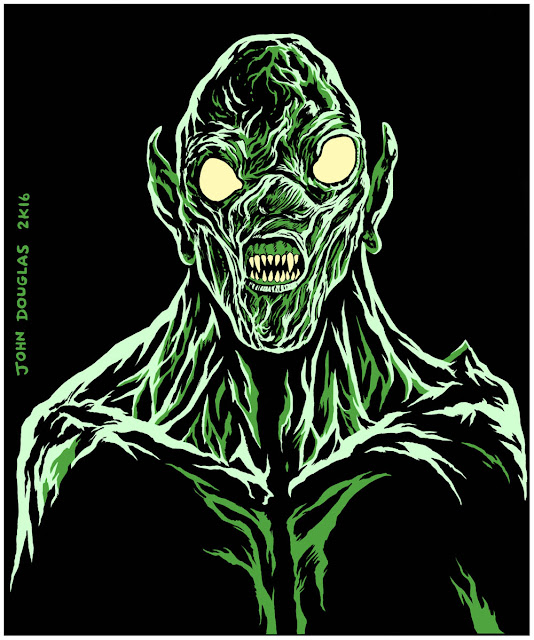
Inktober 2016 (Belated) - Killers from Space (1954)

Killers from Space


I technically had this one finished yesterday (October 31st, 2016) for Inktober, but wasn't totally done with the toned coloration, so I decided not to post it right away.  I finished it up and thought I'd post it today, instead (and update the Round-Up post, as well).  

No, they aren't invaders from the Planet Marty Feldman!  The googly-eyed aliens had a plan to wipe out humanity because... something, something?  Oh, who are we kidding, the plot was the least interesting aspect of the movie.  To me, the best part was the fact their unblinking, ping-pong ball eyes were always pointing in different, odd directions at any given time.

* * *


STEP ONE:  The pencils were done with a .5mm mechanical pencil on 8-1/2" x 11" cardstock.

* * *


STEP TWO:  The inks were done with a #10 brush and ink.

* * *


STEP THREE:  Finally, I scanned it into Photoshop and did a toned overlay.

* * *

This was done with pen-and-ink and digitally colored in Photoshop.

.

Monday, October 31, 2016

Inktober Halloween Round-Up - 2016

Inktober 2016

Well, here are all the pen-and-ink scans for 2016's Inktober/Halloween drawings in one post.  One could say that it sort of defeats the purpose of Inktober by colorizing the pen-and-ink, but that's never stopped me before (and won't in the future, either, of course).

So, without further ado, and with further adon't, here they are in their black and white gory!  Er, glory!

HAPPY HALLOWEEN!


* * *

All were done with pen-and-ink with a No. 10 brush on 8-1/2" x 11" cardstock (with a minor assist with a Pilot Precise v7 pen for the "They Live" drawing).

.

Friday, October 28, 2016

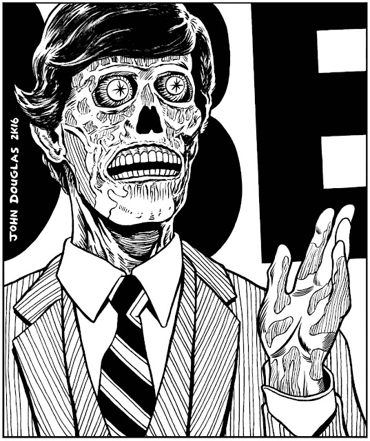
Inktober 2016 - They Live (1988)

They Live


Sure, "They Live" has been a meme for this year's election, so why not join in the fun?

I always liked John Carpenter's "They Live", being a fun, action/paranoid movie involving aliens disguising themselves among human society.  They are controlling humans with subliminal messages embedded within all media to "CONSUME", "BUY", "SLEEP", "OBEY", etc.  If you have special glasses, you can see the aliens and the messages they are propagating.

And, of course, it has one of the best lines in cinema, from Rowdy Roddy Piper: "I have come here to chew bubblegum and kick @$$...and I'm all out of bubblegum."  Oh, 80's movies, don't ever change!

* * *


STEP ONE:  Here are the pencils, done with a .5mm mechanical pencil on 8-1/2" x 11" cardstock.

* * *


STEP TWO:  The inks were done with a #10 brush and ink, and the stripes on the suit were done with a V7 Precise pen.

* * *


STEP THREE:  After it was scanned in, I imported it into Photoshop and colorized it.

* * *

This was done with pen-and-ink and digitally colored in Photoshop.

.

Monday, October 24, 2016

Inktober 2016 - Hellraiser (1987)

Hellraiser


In the mid-80's, I binged through some of Clive Barker's books--particularly his short story collections "Books of Blood", "The Inhuman Condition", and "In the Flesh".  I even read "The Hellbound Heart", so I already had a passing familiarity with Clive Barker and the story the "Hellraiser" was based on.

What can I say about Pinhead that hasn't been said already?  One of the most iconic monsters to come out of 80's horror, right up there with Jason, Freddy, and Mike Meyers.  Although, maybe I should have gone with some of the more obscure Cenobites, like Butterball, Chatterer, or The Female...  Maybe next year.

* * *


STEP ONE:  The pencils were done with a .5mm mechanical pencil on 8-1/2" x 11" cardstock.  I actually started over and re-drew everything several times to get Pinhead even vaguely right.

* * *


STEP TWO:  The inks were done with a #10 brush and ink.

* * *


STEP THREE:  I scanned in the inks and colorized it in Photoshop.

* * *

This was done with pen-and-ink and digitally colored in Photoshop.

.

Friday, October 14, 2016

Inktober 2016 - Killer Klowns From Outer Space (1988)

Killer Klowns from Outer Space


I remember when I first saw the VHS box for "Killer Klowns From Outer Space" back in the 80's, I just sort of rolled my eyes at the title (I checked it out, of course).  However, when I watched it, I thought it was a clever, amusing, and a whimsical horror movie.  I mean, it has killer balloon animals, pop-corn guns, cotton candy cocoons, and people-eating shadow puppets!  What else do you people want in a movie?  They were a sort of circus version of "Mars Attacks".

Gee, I haven't watched it in quite a while... I think I'm gonna have to watch it again.

* * *


STEP ONE:  The pencils were done with a .5mm mechanical pencil on 8-1/2" x 11" cardstock.

* * *


STEP TWO:  Here are the inks, done with a #10 brush and ink.

* * *


STEP THREE:  I scanned in the inks and colorized it in Photoshop.

* * *

This was done with pen-and-ink and digitally colored in Photoshop.

.

Thursday, October 13, 2016

Inktober 2016 - C.H.U.D. (1984)

C.H.U.D.
Cannibalistic Humanoid Underground Dweller


It's another Inktober/Horror B-Movie drawing!  In this case, it is the 1984, um, classic, "C.H.U.D." (Cannibalistic Humanoid Underground Dweller).  As a teen, the VHS cover to C.H.U.D. was ubiquitous in everyplace you could rent movies and was nigh impossible to avoid (not that I did, of course).

And, yeah, I know the alternate for C.H.U.D. is Contamination Hazard Urban Disposal, but Cannibalistic Humanoid Underground Dweller beats that into the ground.  I mean, c'mon, it isn't even a fight for that one.  :-)

C.H.U.D.'s even made appearances in "The Simpsons", one of which I quote shockingly often:


Onward!

* * *


STEP ONE:  Here are the pencils, using a .5mm mechanical pencil on 8-1/2" x 11" cardstock.

* * *


STEP TWO:  The inks were done with a #10 brush.

* * *


STEP THREE:  After I scanned it in, I colorized it in Photoshop.  Originally, I went with a red color scheme, but then thought better of it and a changed it to green.

* * *

Done with pen-and-ink and colorized in Photoshop.

.

Friday, October 7, 2016

Inktober 2016 - Rondo Hatton (Part 2)

Rondo Hatton (Part 2)


For fun I decided to do another Ronda Hatton pen-and-ink sketch as a warm-up (about one hour).  It turned out well enough I thought I could get away with posting it as another Inktober post on the Blog.  In fact, there are parts of this drawing that I like better than the previous Rondo Hatton I slaved over for several hours--it's more loose and has a sketchy quality.  That's the way it works, I guess.

I just did really quick, scribbled pencils and didn't even bother scanning them in, since I didn't plan on posting this picture.  So, here are the inks:


The inks were done with a No. 8 round brush and the colors were thrown on in Photoshop.

* * *

Done with pen and ink; colored in Photoshop.

.

Thursday, October 6, 2016

Inktober 2016 - Rondo Hatton

Rondo Hatton


Hey, it's October/Inktober!  Starting it off with a pen-and-ink drawing of B-Movie actor, Rondo Hatton.  He suffered from Acromegaly, giving him his distinctive look which he used to parlay roles in B-Movie thrillers and horror movies.

* * *


STEP ONE:  Here are the pencils on 8-1/2" x 11" cardstock, done with a .5mm 2B mechanical pencil.

* * *


STEP TWO:  The inks were done with a No. 8 round brush.

* * *


STEP THREE:  I used Photoshop to put in some stylized shadows, etc.

* * *

Done with pen and ink; colored in Photoshop.

.

Thursday, September 22, 2016

Mini-Paint: Imperator Furiosa

Imperator Furiosa


Here's another Mini-Paint, this time of Furiosa from "Mad Max: Fury Road".  "Fury Road" was a visual spectacle and a fun, action movie (OK, I know it's a two hour car chase, but it's still cool to look at).  Since everyone and their sibling on the Internetz has done a drawing or painting of Furiosa, this is my "Everyone else is doing it, why can't I?" moment.  :-)

Here's the palette I used:  Titanium White, Zinc White, Alizarin Crimson, Cadmium Red Deep, Terra Rosa, Cadmium Yellow, Naples Yellow, Yellow Ochre, Raw Umber, Burnt Umber,  Burnt Sienna, Ultramarine Blue, Anthraquinone Blue, Dioxazine Purple, Paynes Gray, and Lamp Black.

Total painting time was about 7 hours for this one.  Lots and lots of corrections and repainting.

* * *


STEP ONE:  On a 6" x 8" piece of gray gessoed hardboard, I vaguely laid out the colors and shapes using a #10 flat brush for the first 90 minutes or so.  At this point, there are a lot of things wrong with the painting: the eyes are too high on the head, the nose is crooked, etc.

Ugh, kind of embarrassing at this point, and I was half-tempted to pretend it didn't exist.  But, everyone's paintings and drawings go through that awkward phase where everything is gangling, out of proportion, and awkward looking.  Y'know, puberty.  Better to show the awkward phase and how it can be overcome, rather than pretend that everything turns out just the way you planned from the beginning, IMHO.

* * *


STEP TWO:  I thought I was finished with the painting, even signing my name.  However, something about the right-eye bothered me.  And, the more I looked at it, the more it bothered me.  It looked a little lower than it should.  At first I was tempted just to fix it in Photoshop--move it up a little and cover my tracks, as I **FINALLY** got the eye to look vaguely right after an hour or so of frustrated noodling around, and it would probably be a lot of work to fix it.  But, it felt like Photoshop would be taking the easy way out.  So, back to the easel to fix it.

* * *


STEP THREE:  I think this is a pretty good illustration about how much of a different an 1/8" (or, about 2mm) give-or-take can make in the way a painting turns out.  After repainting the eye, I think it improved the likeness substantially.  Of course, it's still not perfect and there are plenty of other things which could also be fixed, but one victory at a time.  (If you click on the picture, it should launch the picture viewer/Lightbox and let you toggle back and forth between the two paintings to see just how much of a difference it makes.)

So, kids, I think the lesson here is never be afraid to fix something which is wrong--even if it seems like a pain in the butt and/or covers a part of your work which you kinda-sorta like.  You did it once, theoretically you can do it again.

* * *

This was done with acrylic paint on 6" x 8" gessoed hardboard.

.

Wednesday, September 7, 2016

Mini-Paint: Ming the Merciless

Ming the Merciless


For no reason, here's a Mini-Paint of Ming the Merciless.  The cult-classic, 1980 movie is over-the-top in camp, but I do have a warm fondness for it.

Here's the palette I used:  Titanium White, Zinc White, Alizarin Crimson, Cadmium Red Deep, Terra Rosa, Cadmium Yellow, Naples Yellow, Yellow Ochre, Raw Umber, Burnt Umber,  Burnt Sienna, Ultramarine Blue, Anthraquinone Blue, Dioxazine Purple, Paynes Gray, and Lamp Black.

For the past couple Mini-Paints, I've decided to just paint until it is done, rather than trying to stop at an arbitrary time limit.  I figured I'd rather have something done which I'm not too embarrassed to post, and give me more of an opportunity to work out and problems and try to focus on improving painting a likeness, etc.  In this case, it was about 7 hours total for the painting, give-or-take.

* * *


STEP ONE:  On a 6" x 8" piece of gray gessoed hardboard, I vaguely laid out the colors and shapes using a #10 flat brush for the first 90 minutes or so.

* * *


STEP TWO:  When the first layer dried, I noticed the eyes looked a little low on the face, so repainted them and moved them up about a half-inch higher.  I used the #10 flat and #10 round brush to keep painting.  This is about 4 hours into the painting.

* * *


STEP THREE:  The last few hours were spent painting and re-painting the face, as well as the highlights, shading, and the textures on the collar.  And, of course, the guy-liner around his eyes.

* * *

This was done with acrylic paint on 6" x 8" gessoed hardboard.

.

Wednesday, August 31, 2016

Mini-Paint: Willy Wonka

Willy Wonka


I had planned on doing a Mini-Paint of Willy Wonka in the near future.  Hearing about the passing of Gene Wilder moved that up (I and probably every other person who can hold a pencil or paintbrush).  There was something deliriously crazed--yet compelling--about "Willy Wonka and the Chocolate Factory" which stuck with me as a youngster.

Mildly amusing anecdote: my youngest daughter had a job working at a local candy factory when she was younger.  She also owned a cloth coat which was purplish in color which she wore through the winter.  I'm sure you can guess the rest, but it involves me chanting "Oompa Loompa Doompety Doo..." every time she left for work.  She got tired of it in a hurry; I did not.  :-)

To this day, I am likely to break out with "You get nothing!  You lose!  Good day, sir!", as well as numerous other quotes from "Willy Wonka and the Chocolate Factory".  And chant "Oopa Loompa Doompety Doo..." of course.

I bought some new M. Graham acrylic paints I was testing out, so I used more colors than my usual limited palette for these Mini-Paints:  Titanium White, Zinc White, Alizarin Crimson, Cadmium Red Deep, Terra Rosa, Cadmium Yellow, Naples Yellow, Yellow Ochre, Raw Umber, Burnt Umber,  Burnt Sienna, Ultramarine Blue, Anthraquinone Blue, Dioxazine Purple, and Paynes Gray.

This was done over the course of about 8 hours.  Yeah, this one took a LOT longer than my usual Min-Paints, too.  Partly 'cuz I was playing around with new paints, partly because I wanted to work on it a little more and try to get it right.  Skills only grow through being challenged, I guess.

* * *


STEP ONE:  I started with a 6" x 8" piece of hardboard coated with a mixture of gray gesso and matte medium.  The first 90 minutes or so was spent just roughing everything out with a #10 flat brush, laying in the colors and general layout.  Although, at this point, it looks more like Michael Caine dressed as Willy Wonka than Gene Wilder's titular role...

* * *


STEP TWO:  This was about 3 hours later, using a #10 flat and #10 round brushes.  Closer to Gene Wilder, but there was something about the placement of the left-eye which seemed a little off.  It's one of those things where being an 1/8" off in any direction can ruin the portrait. 

* * *


STEP THREE:  I decided to repaint the the left eye, moving it down and a little to the left.  From there, I spent several hours painting and repainting, trying to get it right.  After painting this for about 8 hours off-and-on over a couple days, I figured I had taken it about as far as I could and called it "Good 'nuff".

* * *

This was done with acrylic paint on 6" x 8" gessoed hardboard.

.