
31 Days of HELL-O-Ween 2021:
The Invisible Man

Hey, it's the Invisible Man--NOT the one I will have to use if I completely blow it and am not able to get a posting done in time (it's the Invisible Man, naked in a snowstorm right next to a polar bear!). For this one, I decided to take a more Virgil Finlay / John Totleben (American comic book artist best known for inking "Swamp Thing" in the 80's--and in my personal Top Five of best Comic Book Artists) approach to the drawing and work more with the line width and variation to get an image. They used stippled lines, varying line weight to give an almost etched look to their drawings.
* * *

STEP ONE: Here are the digital pencils in Clip Studio Paint on a 1,500px x 2,100px canvas. I did the background in black and did the blue "pencils" in a normal layer.
* * *

STEP TWO: Here's about the halfway point. Rather than use white as the pen color, in Clip Studio Paint I prefer to use the Transparent color, which acts like an eraser tool to carve away the black background--it's easier to pick the color, than to switch tools back-and-forth, IMHO. When I use my Wacom at home, I have the first button set to switch colors between the Primary, Sub, and Transparent, so it's just a couple button clicks to get to it even easier.
I did a series of dots across the face and in other places to know where to aim the thicker lines to add more highlights ont he drawing. To be honest, with the lines underneath, I wasn't able to see the digital pencils properly. So, a lot of it was just trying to match up somewhat closely to the reference picture.
* * *
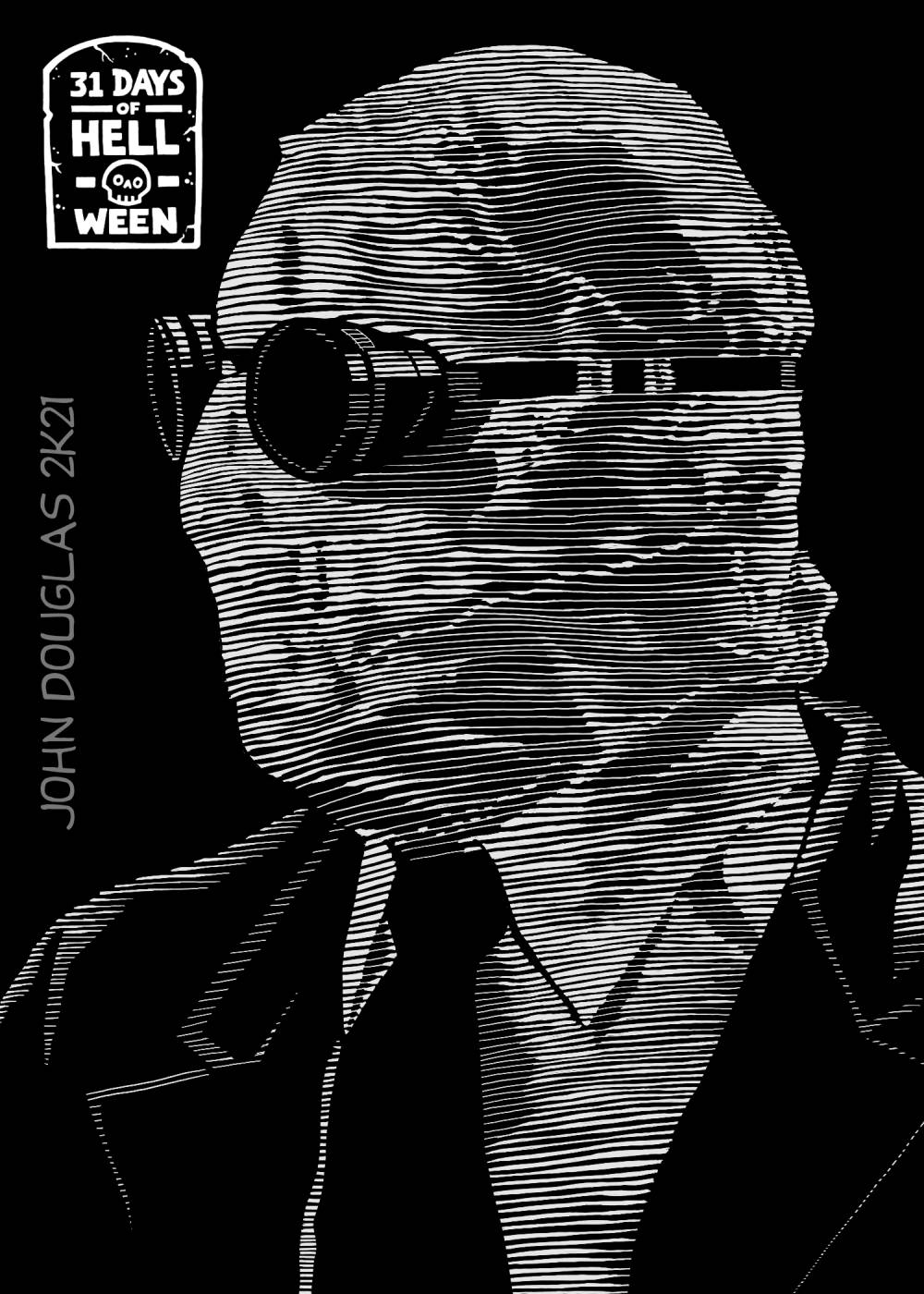
STEP THREE: And, after lots and LOTS of noodling, here's the finished drawing. I think it has a more ghostly, ethereal look to it by using the series of varied line-width, although I do want a few more darks in the facial features of the head. Tsk.
* * *

STEP FOUR: Behind the scenes special footage: This is about the half-way point on the first attempt at the digital scratchboard, but it seemed a little bland. While I do think I like some of the dark areas a little more to give more contrast, the gray areas are just kind of "dead" and uninteresting. Nothing really wrong with it, per se, but nothing really right with it, either. So, I abandoned ye all hope who scratched here and started over again.
* * *
This was done digitally in Clip Studio Paint.
.
No comments:
Post a Comment